> ## Documentation Index
> Fetch the complete documentation index at: https://domoinc-openapi-sync-dataflows.mintlify.site/llms.txt
> Use this file to discover all available pages before exploring further.
# Stacked Bars
### **Step 1: Set Up Your Pro-Code Environment**
1. **Create a New Project in Pro-Code Editor**:
Ensure that Pro-Code Editor is enabled in your Domo instance.
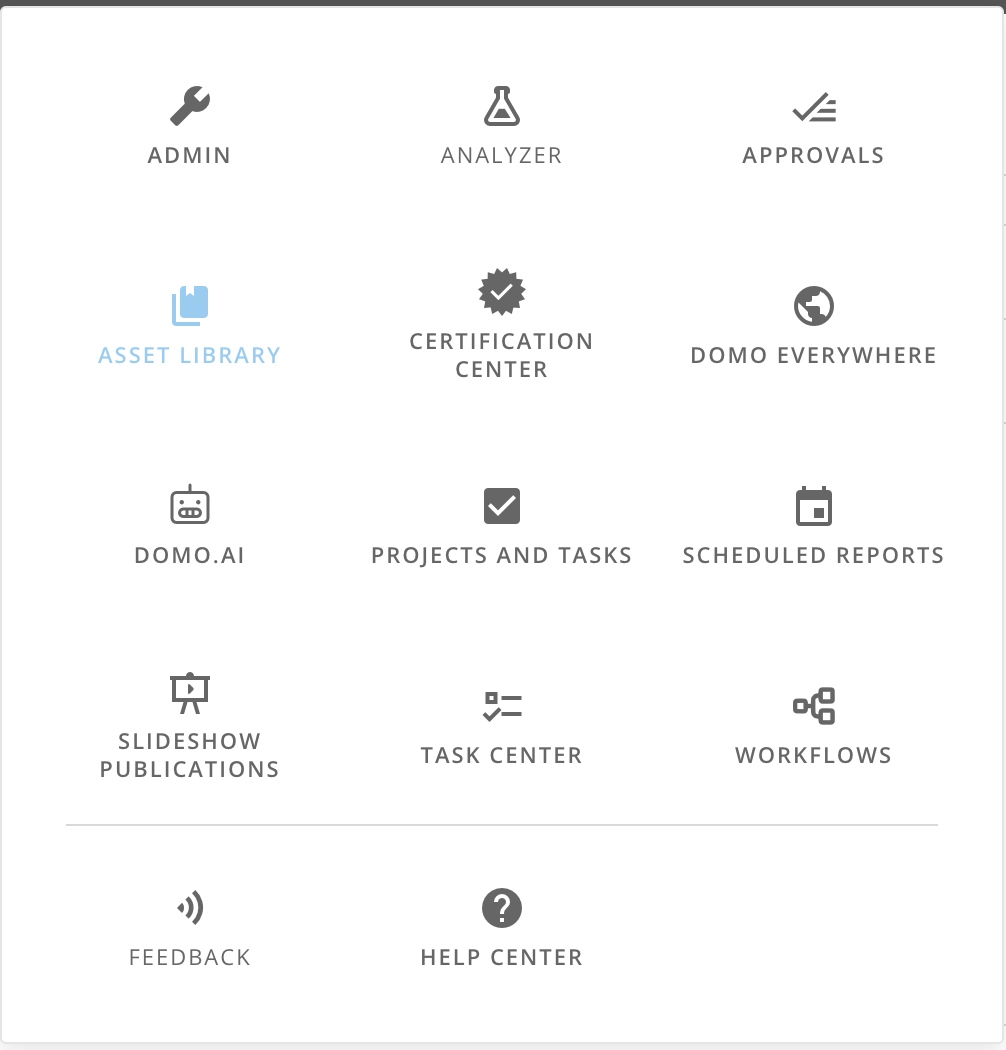
Navigate to your Asset Library.
Click on 'Pro-Code Editor' in the top right corner of your screen to open the editor in your browser.
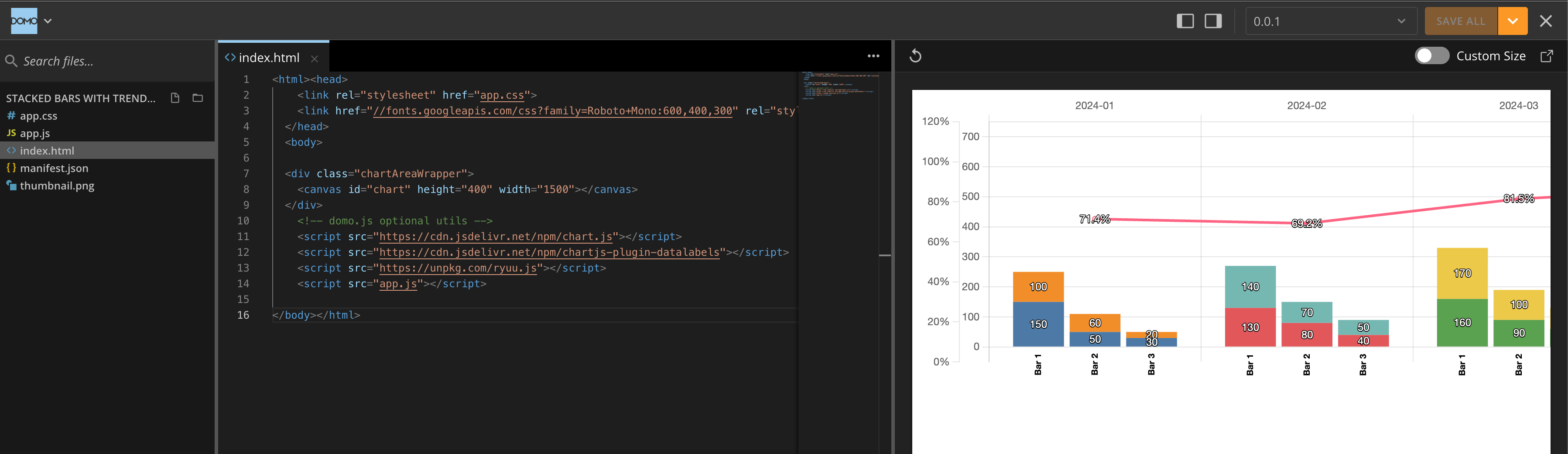
You can now edit the files in your project.
1. **File Structure**:
* The following files are created automatically in your project:
* `index.html`
* `app.js`
* `app.css`
* `manifest.json`
* You can modify the `manifest.json` using the JSON Editor by clicking 'Edit in JSON Editor' at the top right of the file, or by using the GUI by using the GUI Editor. This will be explained in the next section.
***
### **Step 2: Define the Manifest File (`manifest.json`)**
The `manifest.json` file defines your app's metadata and data mappings in Domo. Update it according to your dataset's structure.
```json theme={"dark"}
{
"id": "26b83850-ac08-43d0-a90c-338005da39e3", // Unique ID created by pro-code editor
"name": "Stacked Bars with Trended Line",
"version": "0.0.1",
"size": {
"width": "6",
"height": "2"
},
"mapping": [
{
"dataSetId": "182e83f3-b09a-4def-8ae1-b2b9d2685a61", // Example dataset
"fields": [
{
"alias": "Stacks",
"columnName": "Stacks",
"type": "STRING"
},
{
"alias": "Bar1",
"columnName": "Bar1",
"type": "LONG"
},
{
"alias": "Bar2",
"columnName": "Bar2",
"type": "LONG"
},
{
"alias": "Bar3",
"columnName": "Bar3",
"type": "LONG"
},
{
"alias": "Date",
"columnName": "Date",
"type": "STRING"
},
{
"alias": "Extra1",
"columnName": "Extra1",
"type": "LONG"
},
{
"alias": "Extra2",
"columnName": "Extra2",
"type": "LONG"
}
```
The underlying dataset should have the following structure:
* `Stacks` - the name of the stack (e.g. "Stack A", "Stack B", etc.)
* `Bar1` - the value for the first bar
* `Bar2` - the value for the second bar
* `Bar3` - the value for the third bar
* `Date` - the date for the data point
* `Extra1` - an extra column for additional data.
* `Extra2` - an extra column for additional data.
* Both `Extra` are used for the trended line calculation.
For example, here's some data:
| Stacks | Bar1 | Bar2 | Bar3 | Date | Extra1 | Extra2 |
| ------- | ---- | ---- | ---- | ---------- | ------ | ------ |
| Stack A | 10 | 20 | 30 | 2022-01-01 | 1 | 2 |
| Stack B | 40 | 50 | 60 | 2022-01-02 | 3 | 4 |
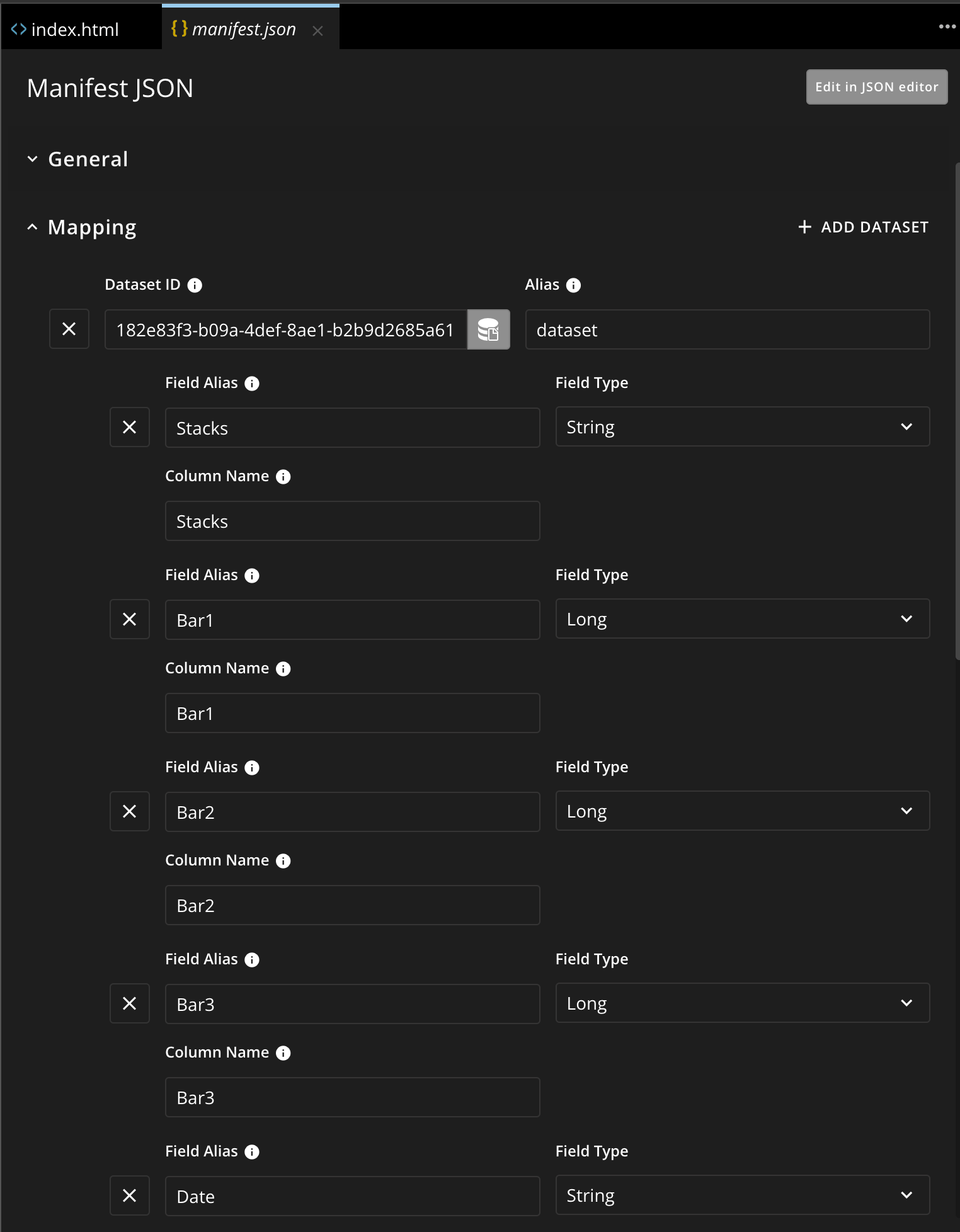
Another way of setting this up is by using the GUI Editor. Simply select the dataset and it will autopopulate the fields.
You can change the names of the field aliases. Make sure there is no spaces in the field aliases, because it will not accept it.
***
### **Step 3: Structure Your HTML (`index.html`)**
The `index.html` file contains the structure of your app, including the canvas element where the chart will be rendered.
```html theme={"dark"}
{/* Importing Chart.js */}
{/* Importing Datalabels */}
{/* Importing Ryuu.js */}
```
This code imports the [Chart.js](https://www.chartjs.org) and [Datalabels](https://chartjs-plugin-datalabels.netlify.app/) libraries, along with Ryuu.js for handling Domo-specific operations. Datalabels is a highly customizable Chart.js plugin that displays labels on data for any type of charts.
***
### **Step 4: Define the Styling (`app.css`)**
The `app.css` file will control the appearance of your chart container, including making it scrollable.
```css theme={"dark"}
body {
width: 100vw;
}
.chartAreaWrapper {
width: 3000px; /* Extend the width for scrolling */
overflow-x: scroll;
}
```
***
### **Step 5: Write the JavaScript Logic (`app.js`)**
This section covers the main logic of the app. To modularize the code and improve readability, we’ll break the logic into separate functions.
#### **Step 5.1: Fetch and Prepare Data**
```javascript theme={"dark"}
// Fetch data using domo.get() method
const query = domo.get('/data/v1/dataset').then((res) => prepareData(res));
function prepareData(data) {
const labels = [...new Set(data.map((item) => item['Date']))];
const stacks = [...new Set(data.map((item) => item['Stacks']))];
const categories = Object.keys(data[0]).filter((key) =>
key.startsWith('Bar'),
);
createDatasets(data, labels, stacks, categories);
}
```
* `domo.get('/data/v1/dataset')` retrieves the dataset from Domo.
* The `prepareData` function processes this data to extract labels, stacks, and categories.
#### **Step 5.2: Define Colors and Create Datasets**
```javascript theme={"dark"}
function createDatasets(data, labels, stacks, categories) {
const colorPalette = [
'#4e79a7',
'#f28e2b',
'#e15759',
'#76b7b2',
'#59a14f',
'#edc949',
];
const stackColors = stacks.reduce((acc, stack, index) => {
acc[stack] = colorPalette[index % colorPalette.length];
return acc;
}, {});
const datasets = categories.flatMap((category) =>
stacks.map((stack) => ({
label: stack,
data: labels.map((label) => {
const filteredData = data.filter(
(item) =>
item['Date'] === label &&
item[category] > 0 &&
item['Stacks'] === stack,
);
return filteredData.length > 0
? filteredData.reduce((sum, item) => sum + item[category], 0)
: 0;
}),
backgroundColor: stackColors[stack],
stack: category,
})),
);
calculateTrendedLine(data, labels, datasets);
}
```
* This function creates datasets for each stack and category by mapping over labels and filtering data accordingly.
#### **Step 5.3: Calculate the Trended Line Data**
```javascript theme={"dark"}
function calculateTrendedLine(data, labels, datasets) {
const trendedPercentageData = labels.map((label) => {
const billableHours = data
.filter((item) => item['Date'] === label)
.reduce((sum, item) => sum + (item['Bar1'] || 0), 0);
const extra1 = data
.filter((item) => item['Date'] === label)
.reduce((sum, item) => sum + item['Extra1'], 0);
const extra2 = data
.filter((item) => item['Date'] === label)
.reduce((sum, item) => sum + item['Extra2'], 0);
return extra1 - extra2 > 0 ? (billableHours / (extra1 - extra2)) * 100 : 0;
});
const lineData = {
label: 'Trend %',
data: trendedPercentageData,
borderColor: 'rgba(255, 99, 132, 1)',
backgroundColor: 'rgba(255, 99, 132, 0.2)',
type: 'line',
yAxisID: 'percentLine',
};
datasets.push(lineData);
createChart(labels, datasets);
}
```
* This function calculates the trend percentage for each label and adds the trended line to the datasets.
#### **Step 5.4: Create the Chart with Chart.js**
```javascript theme={"dark"}
function createChart(labels, datasets) {
const ctx = document.getElementById('chart').getContext('2d');
Chart.register(ChartDataLabels);
new Chart(ctx, {
type: 'bar',
data: {
labels: labels,
datasets: datasets,
},
options: {
responsive: true,
maintainAspectRatio: false,
scales: {
x: { position: 'top' },
y: { beginAtZero: true, offset: true },
percentLine: {
type: 'linear',
position: 'left',
beginAtZero: true,
grid: { drawOnChartArea: false },
ticks: {
callback: (value) => `${value}%`,
z: 1,
},
min: 0,
max: 120,
},
},
plugins: {
datalabels: {
labels: {
value: {
color: 'white',
font: { size: 12 },
textStrokeWidth: 2,
textStrokeColor: 'black',
formatter: (value, context) =>
context.dataset.label === 'Trend %'
? `${value.toFixed(1)}%`
: value > 0
? value
: '',
},
legend: {
display: true,
color: 'black',
anchor: 'start',
align: 'start',
rotation: -90,
font: { size: '10px', weight: 'bold' },
formatter: (value, context) => {
const { datasets } = context.chart.data;
const dataset = datasets[context.datasetIndex];
const stack = dataset.stack;
const stackLabels = categories.reduce(
(acc, category, index) => {
acc[category] = `Bar ${index + 1}`;
return acc;
},
{},
);
return datasets
.filter((ds) => ds.stack === stack)
.indexOf(dataset) === 0 && stack !== undefined
? stackLabels[stack]
: '';
},
},
},
},
legend: {
position: 'bottom',
title: { display: true, padding: 40 },
labels: {
font: { size: 12 },
boxHeight: 4,
boxWidth: 8,
generateLabels: () =>
stacks.map((item, datasetIndex) => ({
text: item,
fillStyle: stackColors[item],
})),
},
maxHeight: 300,
},
},
},
});
}
```
* This function sets up and renders the chart using Chart.js, with customizable options and [Datalabels plugin](https://chartjs-plugin-datalabels.netlify.app/) for better visualization.
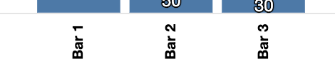
* Each `legend` object inside the `options` object configures a legend or label for the chart. For example, `plugin.datalabels.labels.legend` specifies will customize the label for each bar in the chart.
All the information to customize the labels and legends can be found by looking for the [Datalabels plugin](https://chartjs-plugin-datalabels.netlify.app/) documentation.
***
### **Step 6: Save and Test Your App**
1. **Deploy the App**:
* Save all files in the Pro-Code Editor.
* Create a new card based on the Asset created by Pro-Code Editor.
* Wire a dataset to the card within Domo.
2. **Test the App**:
* Navigate to the card.
* Verify that the chart displays correctly with the stacked bars and trended line.
### **Conclusion**
Congratulations! You've successfully built a stacked bar chart with a trended line in Domo's Pro-Code Editor. This tutorial provided you with the foundational steps to create a custom chart using JavaScript, Chart.js, and Domo's data platform. Feel free to customize and expand on this tutorial to fit your specific needs.
This guide should get you started on building more complex visualizations in Domo's Pro-Code Editor. Remember to explore Domo’s documentation for advanced features and customization options.
 Click on 'Pro-Code Editor' in the top right corner of your screen to open the editor in your browser.
 You can now edit the files in your project.
 1. **File Structure**:
* The following files are created automatically in your project:
* `index.html`
* `app.js`
* `app.css`
* `manifest.json`
* You can modify the `manifest.json` using the JSON Editor by clicking 'Edit in JSON Editor' at the top right of the file, or by using the GUI by using the GUI Editor. This will be explained in the next section.
***
### **Step 2: Define the Manifest File (`manifest.json`)**
The `manifest.json` file defines your app's metadata and data mappings in Domo. Update it according to your dataset's structure.
```json theme={"dark"}
{
"id": "26b83850-ac08-43d0-a90c-338005da39e3", // Unique ID created by pro-code editor
"name": "Stacked Bars with Trended Line",
"version": "0.0.1",
"size": {
"width": "6",
"height": "2"
},
"mapping": [
{
"dataSetId": "182e83f3-b09a-4def-8ae1-b2b9d2685a61", // Example dataset
"fields": [
{
"alias": "Stacks",
"columnName": "Stacks",
"type": "STRING"
},
{
"alias": "Bar1",
"columnName": "Bar1",
"type": "LONG"
},
{
"alias": "Bar2",
"columnName": "Bar2",
"type": "LONG"
},
{
"alias": "Bar3",
"columnName": "Bar3",
"type": "LONG"
},
{
"alias": "Date",
"columnName": "Date",
"type": "STRING"
},
{
"alias": "Extra1",
"columnName": "Extra1",
"type": "LONG"
},
{
"alias": "Extra2",
"columnName": "Extra2",
"type": "LONG"
}
```
The underlying dataset should have the following structure:
* `Stacks` - the name of the stack (e.g. "Stack A", "Stack B", etc.)
* `Bar1` - the value for the first bar
* `Bar2` - the value for the second bar
* `Bar3` - the value for the third bar
* `Date` - the date for the data point
* `Extra1` - an extra column for additional data.
* `Extra2` - an extra column for additional data.
* Both `Extra` are used for the trended line calculation.
For example, here's some data:
| Stacks | Bar1 | Bar2 | Bar3 | Date | Extra1 | Extra2 |
| ------- | ---- | ---- | ---- | ---------- | ------ | ------ |
| Stack A | 10 | 20 | 30 | 2022-01-01 | 1 | 2 |
| Stack B | 40 | 50 | 60 | 2022-01-02 | 3 | 4 |
Another way of setting this up is by using the GUI Editor. Simply select the dataset and it will autopopulate the fields.
1. **File Structure**:
* The following files are created automatically in your project:
* `index.html`
* `app.js`
* `app.css`
* `manifest.json`
* You can modify the `manifest.json` using the JSON Editor by clicking 'Edit in JSON Editor' at the top right of the file, or by using the GUI by using the GUI Editor. This will be explained in the next section.
***
### **Step 2: Define the Manifest File (`manifest.json`)**
The `manifest.json` file defines your app's metadata and data mappings in Domo. Update it according to your dataset's structure.
```json theme={"dark"}
{
"id": "26b83850-ac08-43d0-a90c-338005da39e3", // Unique ID created by pro-code editor
"name": "Stacked Bars with Trended Line",
"version": "0.0.1",
"size": {
"width": "6",
"height": "2"
},
"mapping": [
{
"dataSetId": "182e83f3-b09a-4def-8ae1-b2b9d2685a61", // Example dataset
"fields": [
{
"alias": "Stacks",
"columnName": "Stacks",
"type": "STRING"
},
{
"alias": "Bar1",
"columnName": "Bar1",
"type": "LONG"
},
{
"alias": "Bar2",
"columnName": "Bar2",
"type": "LONG"
},
{
"alias": "Bar3",
"columnName": "Bar3",
"type": "LONG"
},
{
"alias": "Date",
"columnName": "Date",
"type": "STRING"
},
{
"alias": "Extra1",
"columnName": "Extra1",
"type": "LONG"
},
{
"alias": "Extra2",
"columnName": "Extra2",
"type": "LONG"
}
```
The underlying dataset should have the following structure:
* `Stacks` - the name of the stack (e.g. "Stack A", "Stack B", etc.)
* `Bar1` - the value for the first bar
* `Bar2` - the value for the second bar
* `Bar3` - the value for the third bar
* `Date` - the date for the data point
* `Extra1` - an extra column for additional data.
* `Extra2` - an extra column for additional data.
* Both `Extra` are used for the trended line calculation.
For example, here's some data:
| Stacks | Bar1 | Bar2 | Bar3 | Date | Extra1 | Extra2 |
| ------- | ---- | ---- | ---- | ---------- | ------ | ------ |
| Stack A | 10 | 20 | 30 | 2022-01-01 | 1 | 2 |
| Stack B | 40 | 50 | 60 | 2022-01-02 | 3 | 4 |
Another way of setting this up is by using the GUI Editor. Simply select the dataset and it will autopopulate the fields.
 You can change the names of the field aliases. Make sure there is no spaces in the field aliases, because it will not accept it.
***
### **Step 3: Structure Your HTML (`index.html`)**
The `index.html` file contains the structure of your app, including the canvas element where the chart will be rendered.
```html theme={"dark"}
You can change the names of the field aliases. Make sure there is no spaces in the field aliases, because it will not accept it.
***
### **Step 3: Structure Your HTML (`index.html`)**
The `index.html` file contains the structure of your app, including the canvas element where the chart will be rendered.
```html theme={"dark"}
 All the information to customize the labels and legends can be found by looking for the [Datalabels plugin](https://chartjs-plugin-datalabels.netlify.app/) documentation.
***
### **Step 6: Save and Test Your App**
1. **Deploy the App**:
* Save all files in the Pro-Code Editor.
* Create a new card based on the Asset created by Pro-Code Editor.
* Wire a dataset to the card within Domo.
2. **Test the App**:
* Navigate to the card.
* Verify that the chart displays correctly with the stacked bars and trended line.
### **Conclusion**
Congratulations! You've successfully built a stacked bar chart with a trended line in Domo's Pro-Code Editor. This tutorial provided you with the foundational steps to create a custom chart using JavaScript, Chart.js, and Domo's data platform. Feel free to customize and expand on this tutorial to fit your specific needs.
All the information to customize the labels and legends can be found by looking for the [Datalabels plugin](https://chartjs-plugin-datalabels.netlify.app/) documentation.
***
### **Step 6: Save and Test Your App**
1. **Deploy the App**:
* Save all files in the Pro-Code Editor.
* Create a new card based on the Asset created by Pro-Code Editor.
* Wire a dataset to the card within Domo.
2. **Test the App**:
* Navigate to the card.
* Verify that the chart displays correctly with the stacked bars and trended line.
### **Conclusion**
Congratulations! You've successfully built a stacked bar chart with a trended line in Domo's Pro-Code Editor. This tutorial provided you with the foundational steps to create a custom chart using JavaScript, Chart.js, and Domo's data platform. Feel free to customize and expand on this tutorial to fit your specific needs.
 This guide should get you started on building more complex visualizations in Domo's Pro-Code Editor. Remember to explore Domo’s documentation for advanced features and customization options.