> ## Documentation Index
> Fetch the complete documentation index at: https://domoinc-openapi-sync-dataflows.mintlify.site/llms.txt
> Use this file to discover all available pages before exploring further.
# Design with App Studio Themes
export const InlineImage = ({src, alt = '', height = '1.6em'}) => {
return  ;
};
### Intro
When you [create an App Studio app](https://domo-support.domo.com/s/article/000005295?language=en_US#create_app), the first task is to choose a theme.
;
};
### Intro
When you [create an App Studio app](https://domo-support.domo.com/s/article/000005295?language=en_US#create_app), the first task is to choose a theme.
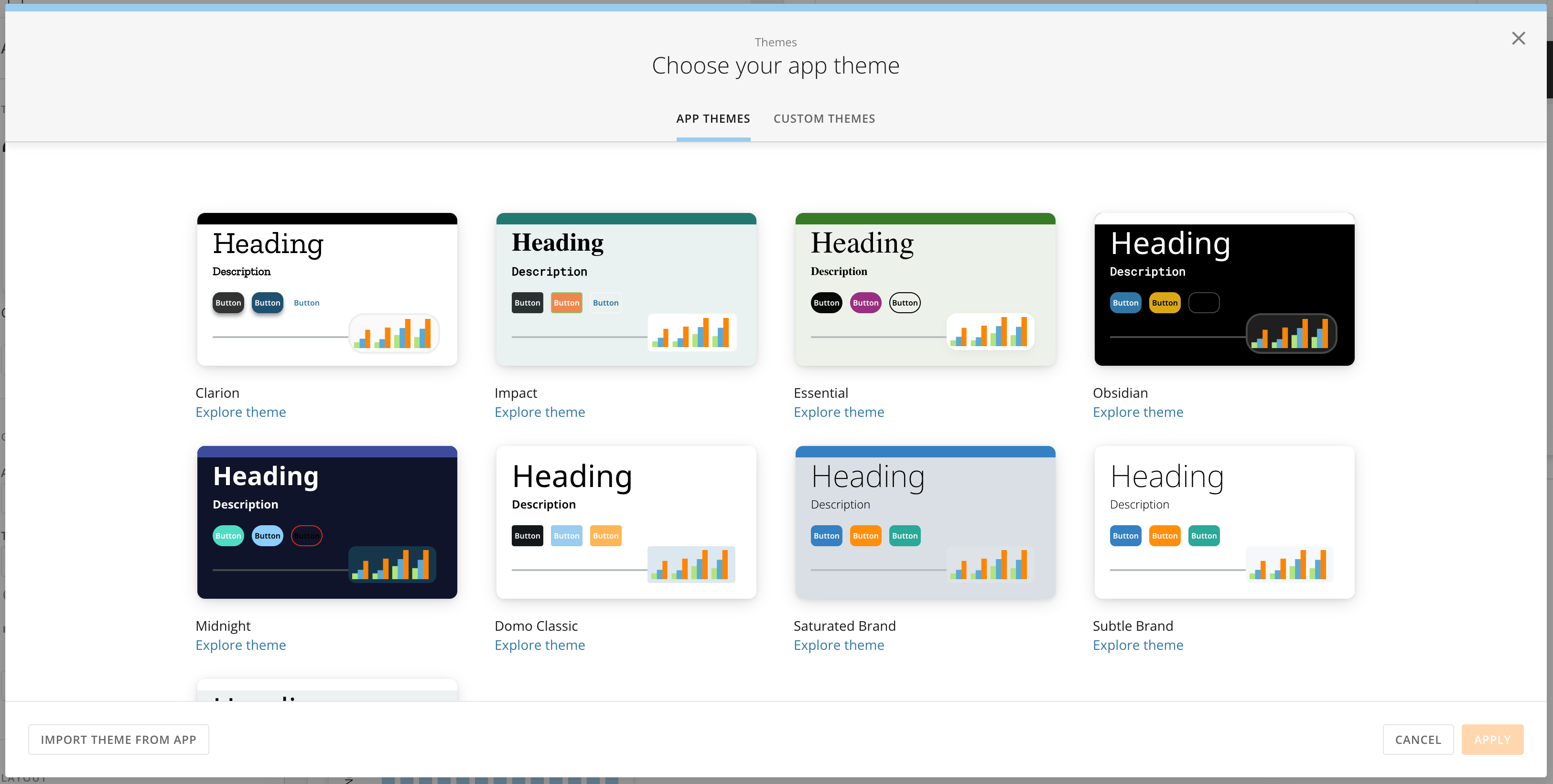 Themes determine how your app displays to users, including elements like the following:
* Fonts
* Colors
* Card and table styling
* Tabs
* Rounded corners
Themes are divided into two types: app themes and custom themes.
This article covers choosing and editing themes, as well as how to copy and reuse themes between App Studio apps.
***
### App Themes
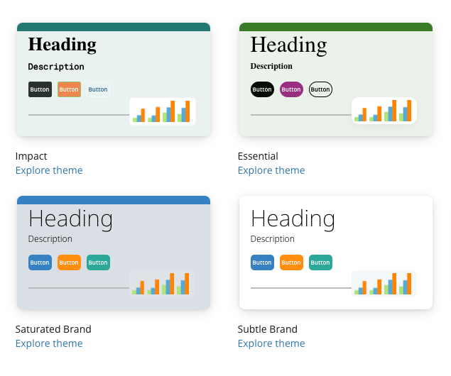
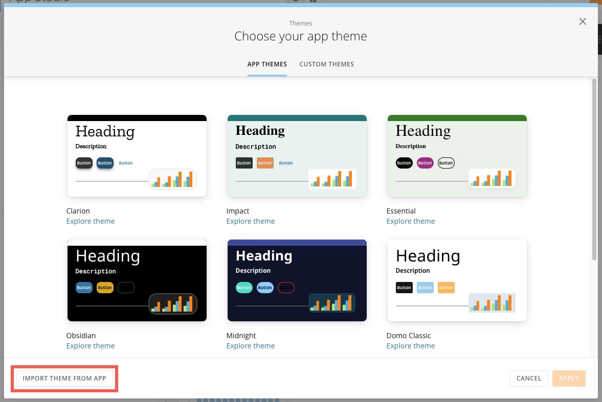
App Studio comes with several pre-built packages that include fonts, colors, and styles—these packages are called app themes. They display in the first tab of the themes modal and have names like Essential and Saturated Brand.
Either select a **theme tile** > **Apply** to apply the theme to your app and open the [app editor](https://domo-support.domo.com/s/article/000005295?language=en_US#edit_app) or select **Explore theme** to learn more about a certain theme.
Themes determine how your app displays to users, including elements like the following:
* Fonts
* Colors
* Card and table styling
* Tabs
* Rounded corners
Themes are divided into two types: app themes and custom themes.
This article covers choosing and editing themes, as well as how to copy and reuse themes between App Studio apps.
***
### App Themes
App Studio comes with several pre-built packages that include fonts, colors, and styles—these packages are called app themes. They display in the first tab of the themes modal and have names like Essential and Saturated Brand.
Either select a **theme tile** > **Apply** to apply the theme to your app and open the [app editor](https://domo-support.domo.com/s/article/000005295?language=en_US#edit_app) or select **Explore theme** to learn more about a certain theme.
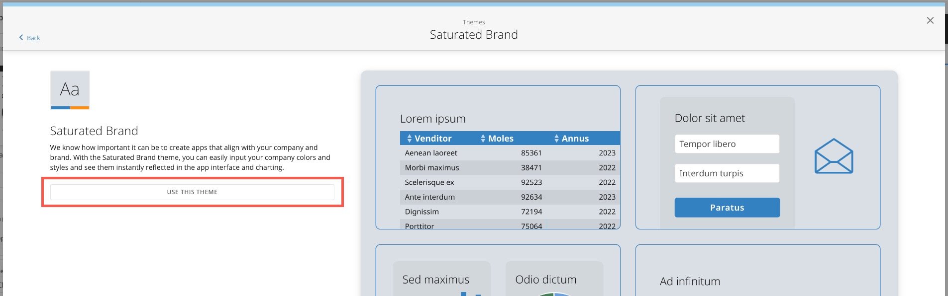
 When you explore a theme, you can see more samples from the package.
Select **Use This Theme** to apply it to your app and open the [app editor](https://domo-support.domo.com/s/article/000005295?language=en_US#edit_app). You can edit a theme or [switch to another theme](https://domo-support.domo.com/s/article/000005543?language=en_US#change_theme) at any time.
When you explore a theme, you can see more samples from the package.
Select **Use This Theme** to apply it to your app and open the [app editor](https://domo-support.domo.com/s/article/000005295?language=en_US#edit_app). You can edit a theme or [switch to another theme](https://domo-support.domo.com/s/article/000005543?language=en_US#change_theme) at any time.
 ### Custom Themes
The other tab in the themes modal is **Custom Themes**.
###
### Custom Themes
The other tab in the themes modal is **Custom Themes**.
###
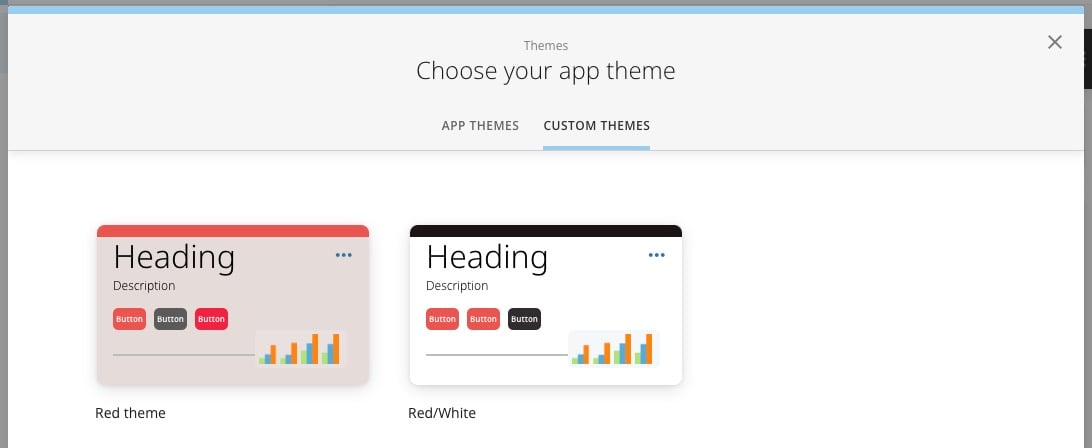 When you first use App Studio, there are no custom themes available. You can create custom themes by choosing a pre-built [app theme](#app_themes), making changes to it, and saving it as a custom theme. Your custom themes display in the **Custom Themes** tab of the themes modal for that app. You can [reuse a custom theme](#copy_custom_theme) in another app. After you create at least one custom theme, you can duplicate it, edit it, and save it as another custom theme.
# Save a Custom Theme
These steps describe how to save a theme to your **Custom Themes** after you have made changes to an app theme or another custom theme.
1. After making changes to a theme in the
[app editor](https://domo-support.domo.com/s/article/000005295?language=en_US#edit_app), go to **App theme**.
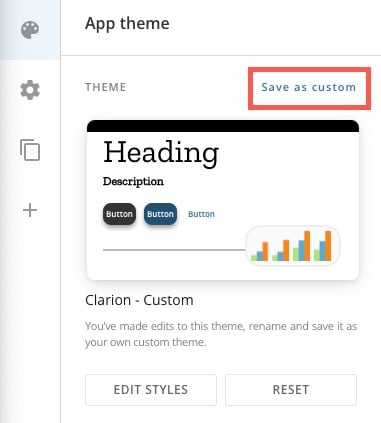
2. Under **Theme**, select **Save as custom**.
**Note:** This option doesn't display until you make changes to the theme.
When you first use App Studio, there are no custom themes available. You can create custom themes by choosing a pre-built [app theme](#app_themes), making changes to it, and saving it as a custom theme. Your custom themes display in the **Custom Themes** tab of the themes modal for that app. You can [reuse a custom theme](#copy_custom_theme) in another app. After you create at least one custom theme, you can duplicate it, edit it, and save it as another custom theme.
# Save a Custom Theme
These steps describe how to save a theme to your **Custom Themes** after you have made changes to an app theme or another custom theme.
1. After making changes to a theme in the
[app editor](https://domo-support.domo.com/s/article/000005295?language=en_US#edit_app), go to **App theme**.
2. Under **Theme**, select **Save as custom**.
**Note:** This option doesn't display until you make changes to the theme.
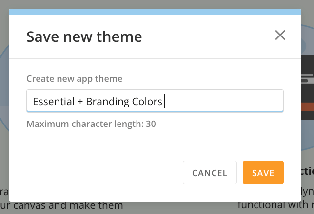
 3. Name your new Custom Theme and save. The max character length is 30.
 Your new theme now displays in the **Custom Themes** tab of the themes modal.
### Edit Your Theme
When you open the app editor, the **App theme** area of the left navigation is open by default.
Your new theme now displays in the **Custom Themes** tab of the themes modal.
### Edit Your Theme
When you open the app editor, the **App theme** area of the left navigation is open by default.
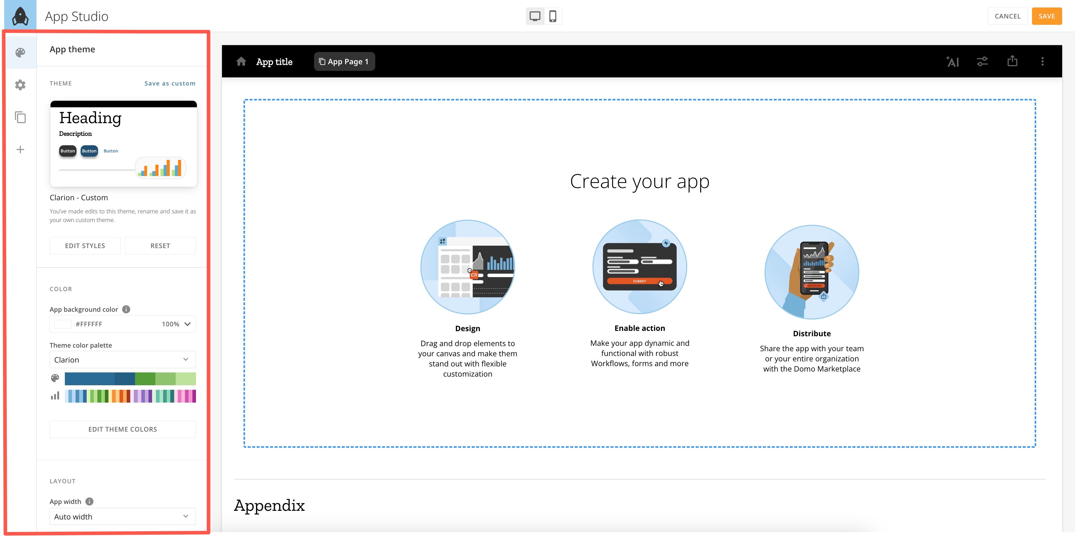 In this area, you can preview a thumbnail of the preview and choose a different theme, edit the current theme, and set [defaults](#configure_defaults) for new app elements.
# Change Theme
In the **App theme** area, hover over the preview thumbnail and select **Change Theme**.
In this area, you can preview a thumbnail of the preview and choose a different theme, edit the current theme, and set [defaults](#configure_defaults) for new app elements.
# Change Theme
In the **App theme** area, hover over the preview thumbnail and select **Change Theme**.
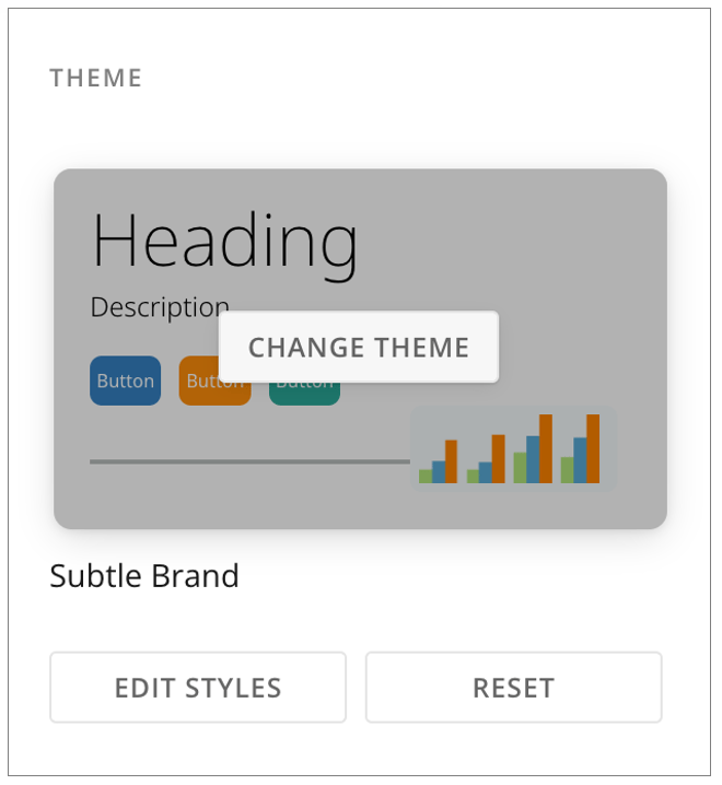 This opens the themes modal. Choose whether to use an [app theme](#app_themes) or a [custom theme](#custom_themes).
If you instead want to use a custom theme from another app, learn how to copy and [reuse themes](#copy_custom_theme).
# Edit Current Theme
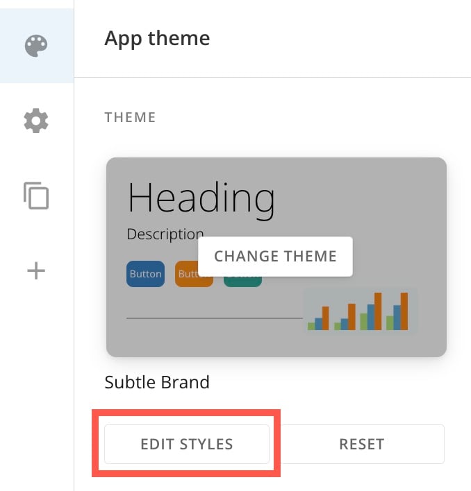
To edit your current theme, navigate to the **App theme** area and select **Edit Styles** below the preview thumbnail.
This opens the themes modal. Choose whether to use an [app theme](#app_themes) or a [custom theme](#custom_themes).
If you instead want to use a custom theme from another app, learn how to copy and [reuse themes](#copy_custom_theme).
# Edit Current Theme
To edit your current theme, navigate to the **App theme** area and select **Edit Styles** below the preview thumbnail.
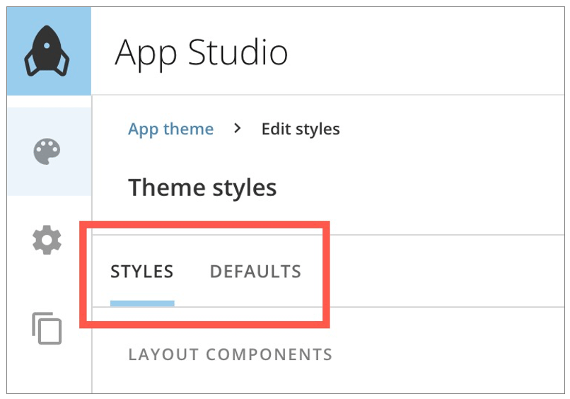
 The **Theme styles** interface has two tabs: **Styles** and **Defaults**.
 **Important:** After making your style changes, you can [save them as a custom theme](#save_a_custom_theme) available in the themes modal.
In the **Styles** tab, make style choices for app layout, cards, buttons, and more. For a full list, see this article's.
#### Configure Defaults
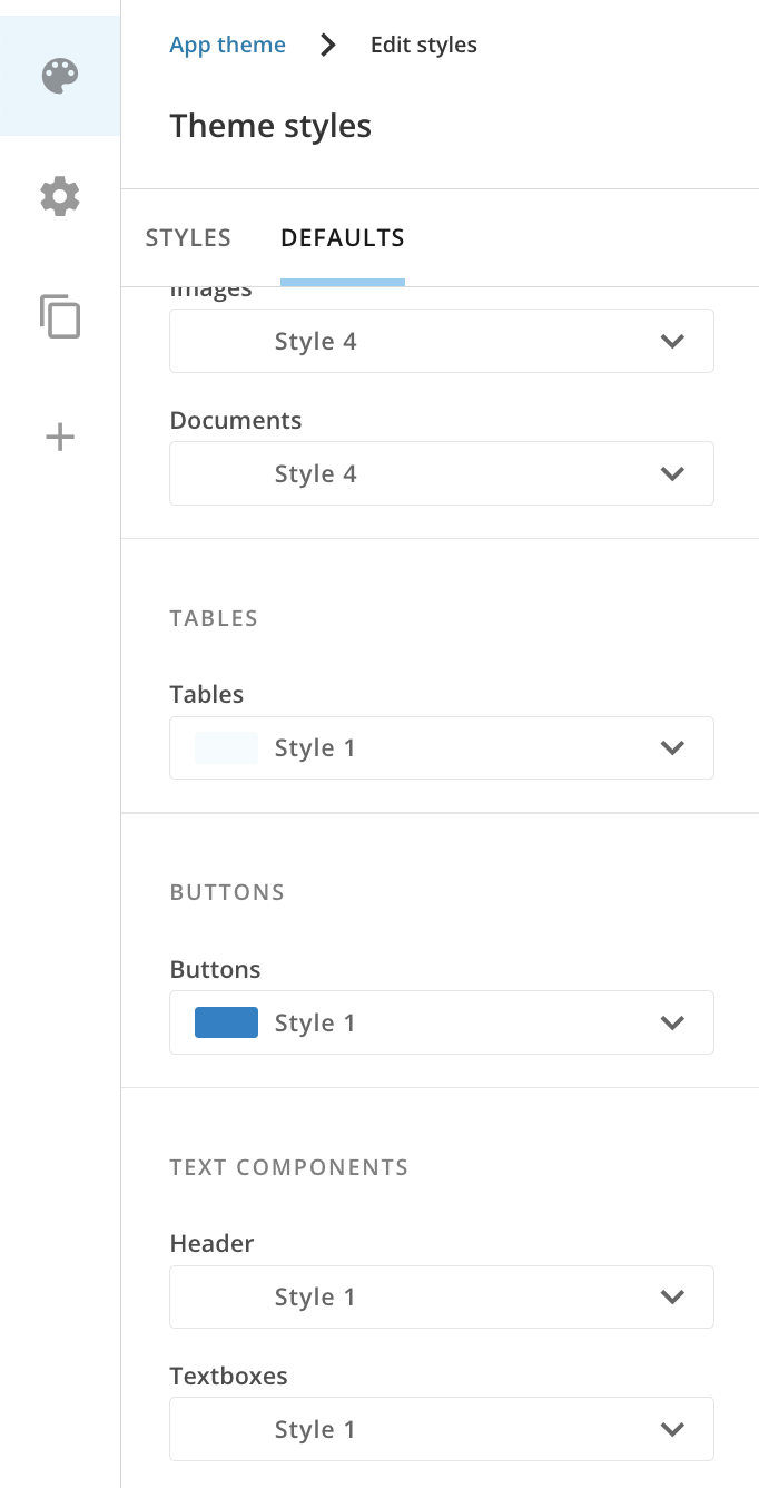
The **Defaults** tab (**App theme** > **Edit Styles** > **Defaults** \[tab]) lets you choose how the following elements appear as you add them to the app. You can always edit the elements after adding them.
* App navigation
* Tabs
* Cards (single value, charts, controls, images, and documents)
* Tables
* Buttons
* Header
* Text headers and boxes
* Fonts
* Forms
**Important:** After making your style changes, you can [save them as a custom theme](#save_a_custom_theme) available in the themes modal.
In the **Styles** tab, make style choices for app layout, cards, buttons, and more. For a full list, see this article's.
#### Configure Defaults
The **Defaults** tab (**App theme** > **Edit Styles** > **Defaults** \[tab]) lets you choose how the following elements appear as you add them to the app. You can always edit the elements after adding them.
* App navigation
* Tabs
* Cards (single value, charts, controls, images, and documents)
* Tables
* Buttons
* Header
* Text headers and boxes
* Fonts
* Forms
 #### Style Layout
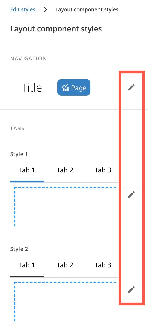
Layout settings determine the style of the app's main navigation and tabs. Under **App theme** > **Edit Styles** > **Styles** (tab) > **Layout Components**, s elect **Edit Styles** to make changes.
#### Style Layout
Layout settings determine the style of the app's main navigation and tabs. Under **App theme** > **Edit Styles** > **Styles** (tab) > **Layout Components**, s elect **Edit Styles** to make changes.
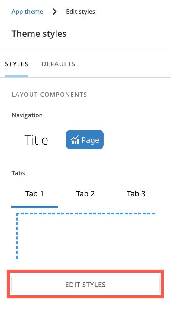 In the style editor, you can select **Edit** for each element.
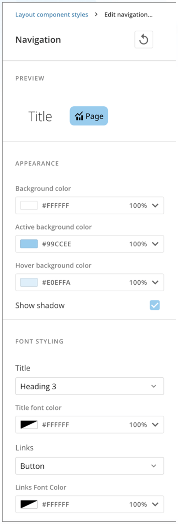
 For each element, make choices about color, font, links, and more. (Learn about [color](#choose_colors) in App Studio.)
Checking the box for **Show shadow** includes a subtle shadow with the element.
Select **Reset** at the top of the panel at any time to reset all settings to their default values.
For each element, make choices about color, font, links, and more. (Learn about [color](#choose_colors) in App Studio.)
Checking the box for **Show shadow** includes a subtle shadow with the element.
Select **Reset** at the top of the panel at any time to reset all settings to their default values.
 ##### Edit App Layout
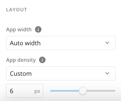
Under **App theme** > **Layout**, you can change the following settings for the entire app:
* **App width —** App width changes the way all app pages fill space across different screen sizes. You can choose to use auto width or fixed width.
* **Auto width —** Margins are fixed and the page flexibly fits the screen.
* **Fixed width —** Page width is fixed and margins are flexible to fit screen.
* **App density —** App density determines the space between objects in the app. The options are default (4 px), comfortable (8 px), compact (2 px), nil (0 px), and custom.
##### Edit App Layout
Under **App theme** > **Layout**, you can change the following settings for the entire app:
* **App width —** App width changes the way all app pages fill space across different screen sizes. You can choose to use auto width or fixed width.
* **Auto width —** Margins are fixed and the page flexibly fits the screen.
* **Fixed width —** Page width is fixed and margins are flexible to fit screen.
* **App density —** App density determines the space between objects in the app. The options are default (4 px), comfortable (8 px), compact (2 px), nil (0 px), and custom.
 #### Style Cards
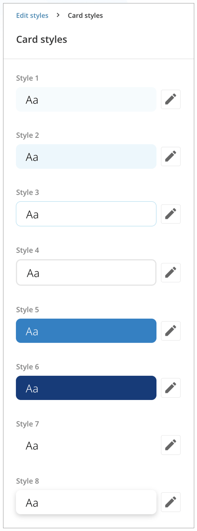
You can customize up to eight different card styles to match your app's branding when you bring cards into the app.
Under **App** **theme** > **Edit Styles** > **Styles** (tab) > **Cards**, select **Edit Styles**.
In the panel, s elect **Edit** to customize each card style individually. (Learn about [color](#choose_colors) in App Studio.)
Select **Reset** at the top of the panel at any time to reset all settings to their default values.
#### Style Cards
You can customize up to eight different card styles to match your app's branding when you bring cards into the app.
Under **App** **theme** > **Edit Styles** > **Styles** (tab) > **Cards**, select **Edit Styles**.
In the panel, s elect **Edit** to customize each card style individually. (Learn about [color](#choose_colors) in App Studio.)
Select **Reset** at the top of the panel at any time to reset all settings to their default values.
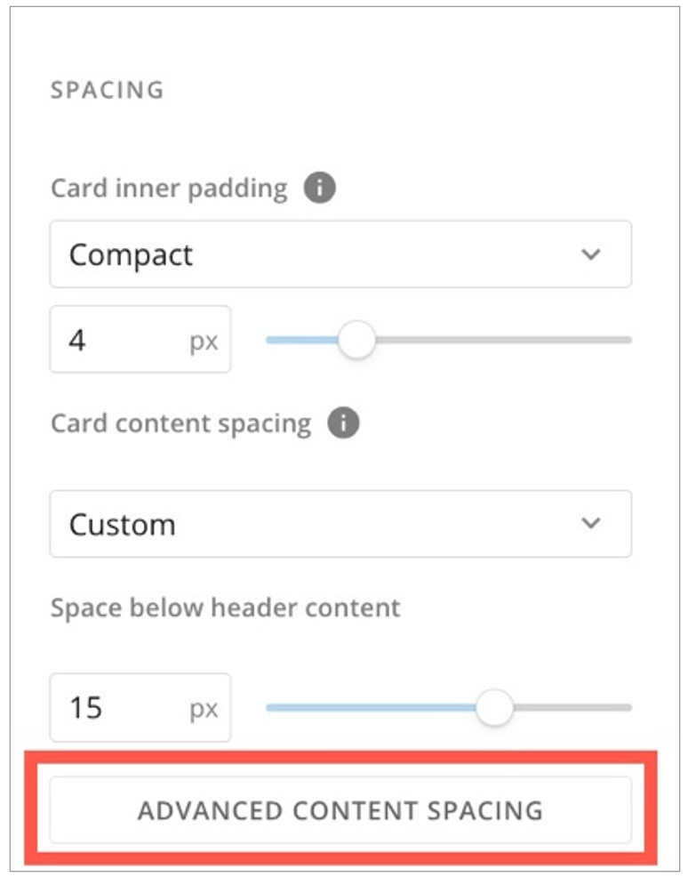
 **Spacing controls —** The spacing controls for cards and other elements allow you to customize the following:
* **Card inner padding (default, comfortable, compact, micro, and custom) —**
This padding adjusts the space between the edge of the element and the content within it.
* **Card content spacing (default, comfortable, compact, and nil) —**
This padding adjusts the space between card text and controls, tables, or visualizations in your card.
* **Space below header content —**
This is the space between the element header and other content.
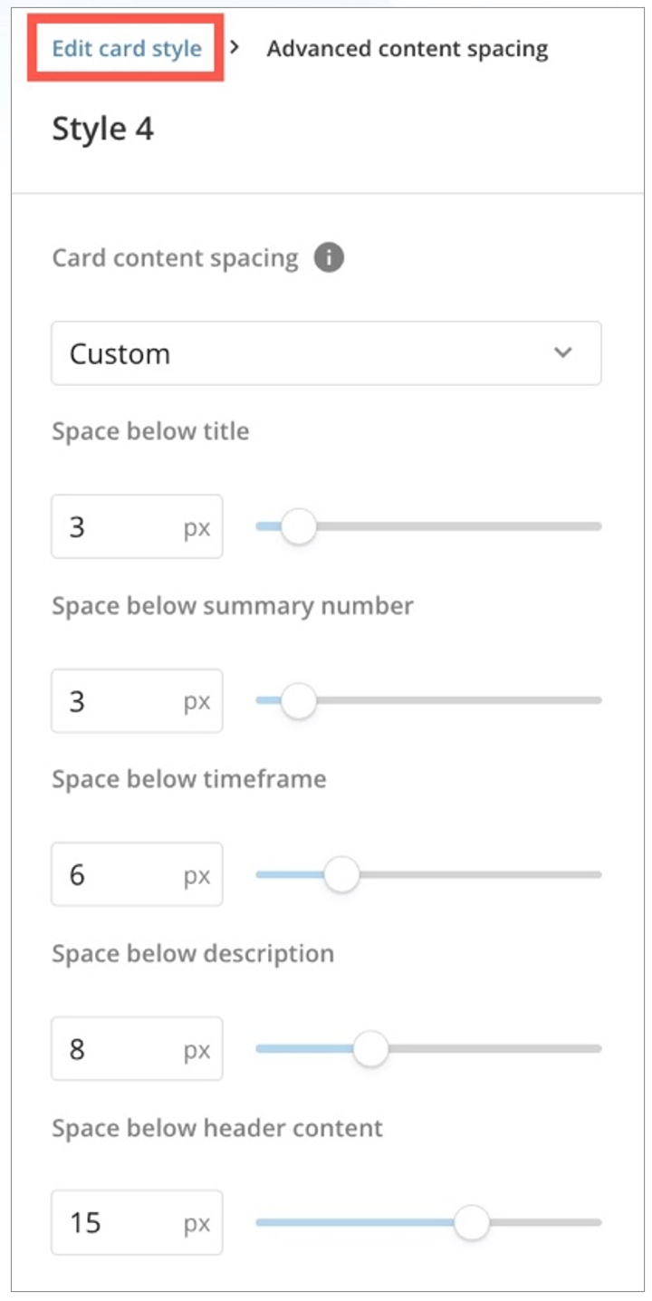
Selecting **Advanced Content Spacing** displays the following controls:
* Card content spacing (default, comfortable, compact, and nil)
* Space below title
* Space below Summary Number
* Space below timeframe
* Space below description
* Space below header content
**Spacing controls —** The spacing controls for cards and other elements allow you to customize the following:
* **Card inner padding (default, comfortable, compact, micro, and custom) —**
This padding adjusts the space between the edge of the element and the content within it.
* **Card content spacing (default, comfortable, compact, and nil) —**
This padding adjusts the space between card text and controls, tables, or visualizations in your card.
* **Space below header content —**
This is the space between the element header and other content.
Selecting **Advanced Content Spacing** displays the following controls:
* Card content spacing (default, comfortable, compact, and nil)
* Space below title
* Space below Summary Number
* Space below timeframe
* Space below description
* Space below header content
 **Note:** **There is no preview available for these advanced controls**.
When you are finished making changes to the advanced controls, return to the card style controls by selecting **Edit card style** in the breadcrumbs at the top of the panel.
**Note:** **There is no preview available for these advanced controls**.
When you are finished making changes to the advanced controls, return to the card style controls by selecting **Edit card style** in the breadcrumbs at the top of the panel.
 #### Style Tables
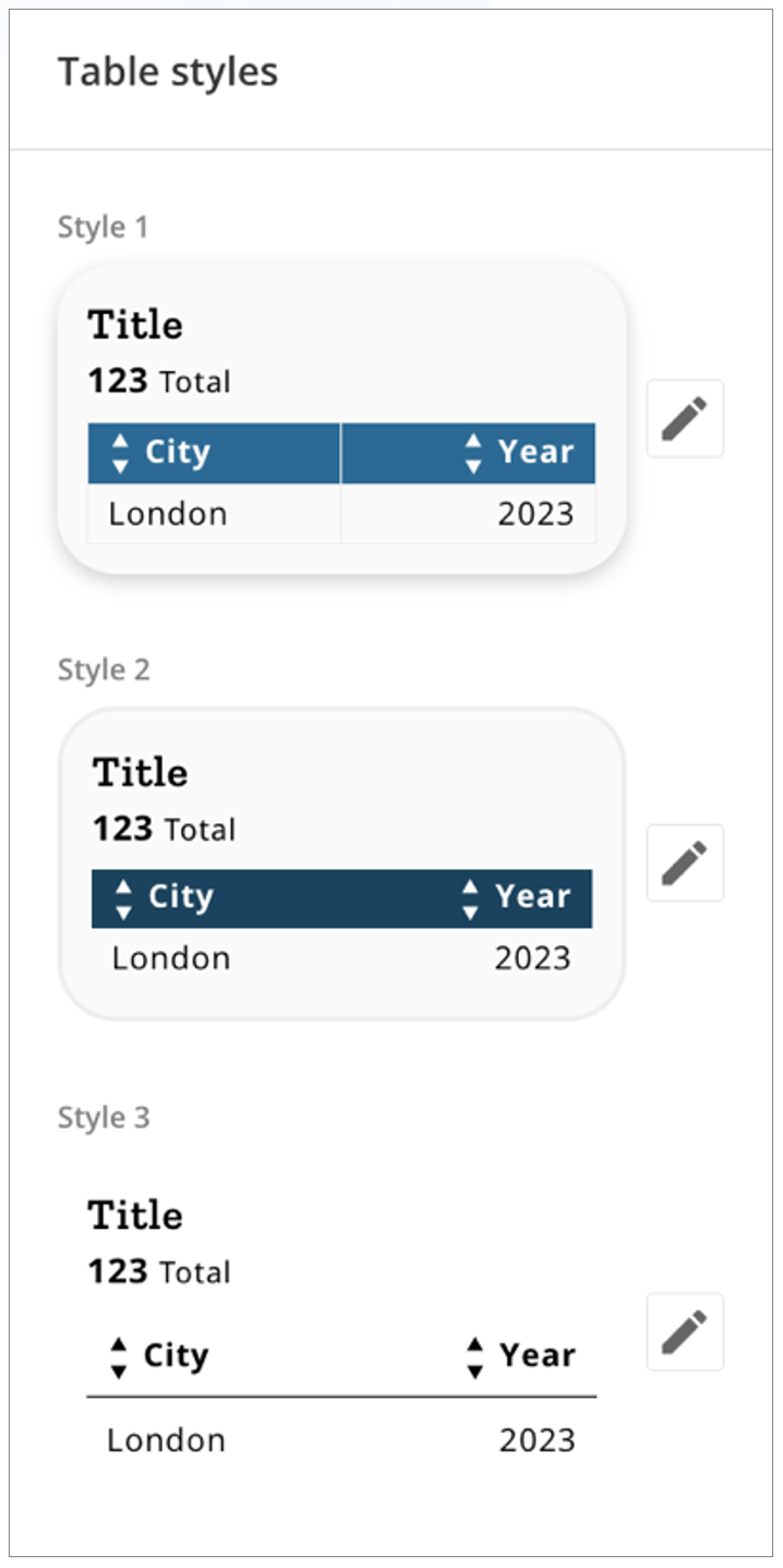
You can customize up to three different table styles.
Under **App** **theme** > **Edit Styles** > **Styles** (tab) > **Tables**, select **Edit Styles**.
In the panel, s elect **Edit** to customize each table style individually. Learn about [color](#choose_colors) and [spacing controls](#spacing) in App Studio.)
Select **Reset** at the top of the panel at any time to reset all settings to their default values.
#### Style Tables
You can customize up to three different table styles.
Under **App** **theme** > **Edit Styles** > **Styles** (tab) > **Tables**, select **Edit Styles**.
In the panel, s elect **Edit** to customize each table style individually. Learn about [color](#choose_colors) and [spacing controls](#spacing) in App Studio.)
Select **Reset** at the top of the panel at any time to reset all settings to their default values.
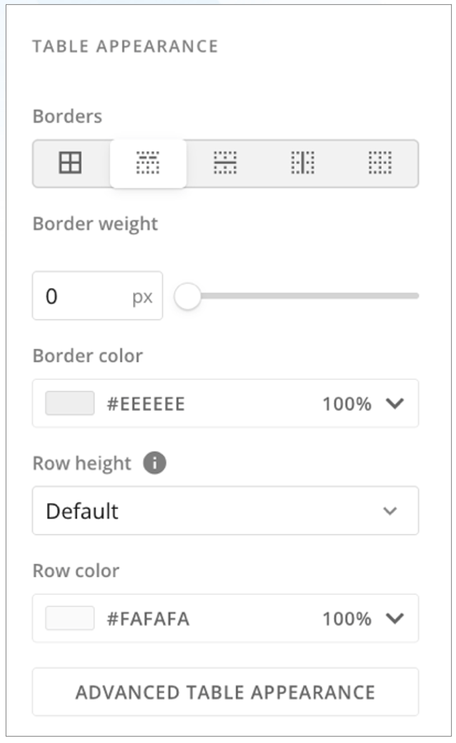
 Controls for **Table Appearance** allow you to select the borders affected by your changes. (The options are all table borders, the border below the header, all horizontal borders, all vertical borders, or to remove table borders.)
After selecting which borders to customize, you can choose
* Border weight (0–4 pixels)
* Border color\*\*
* Row height (default, comfortable, or compact)
* Row color\*\*
Controls for **Table Appearance** allow you to select the borders affected by your changes. (The options are all table borders, the border below the header, all horizontal borders, all vertical borders, or to remove table borders.)
After selecting which borders to customize, you can choose
* Border weight (0–4 pixels)
* Border color\*\*
* Row height (default, comfortable, or compact)
* Row color\*\*
 Selecting **Advanced Table Appearance** allows you to customize the following:
* Toggle alternating row color
* Configure alternating row color
* Choose a separate font for column headers
* Header font color
* Header background color
* Total row font
* Total row font color
* Total row background color
* Subtotal row font
* Subtotal row font color
* Subtotal row background color
* URL font color
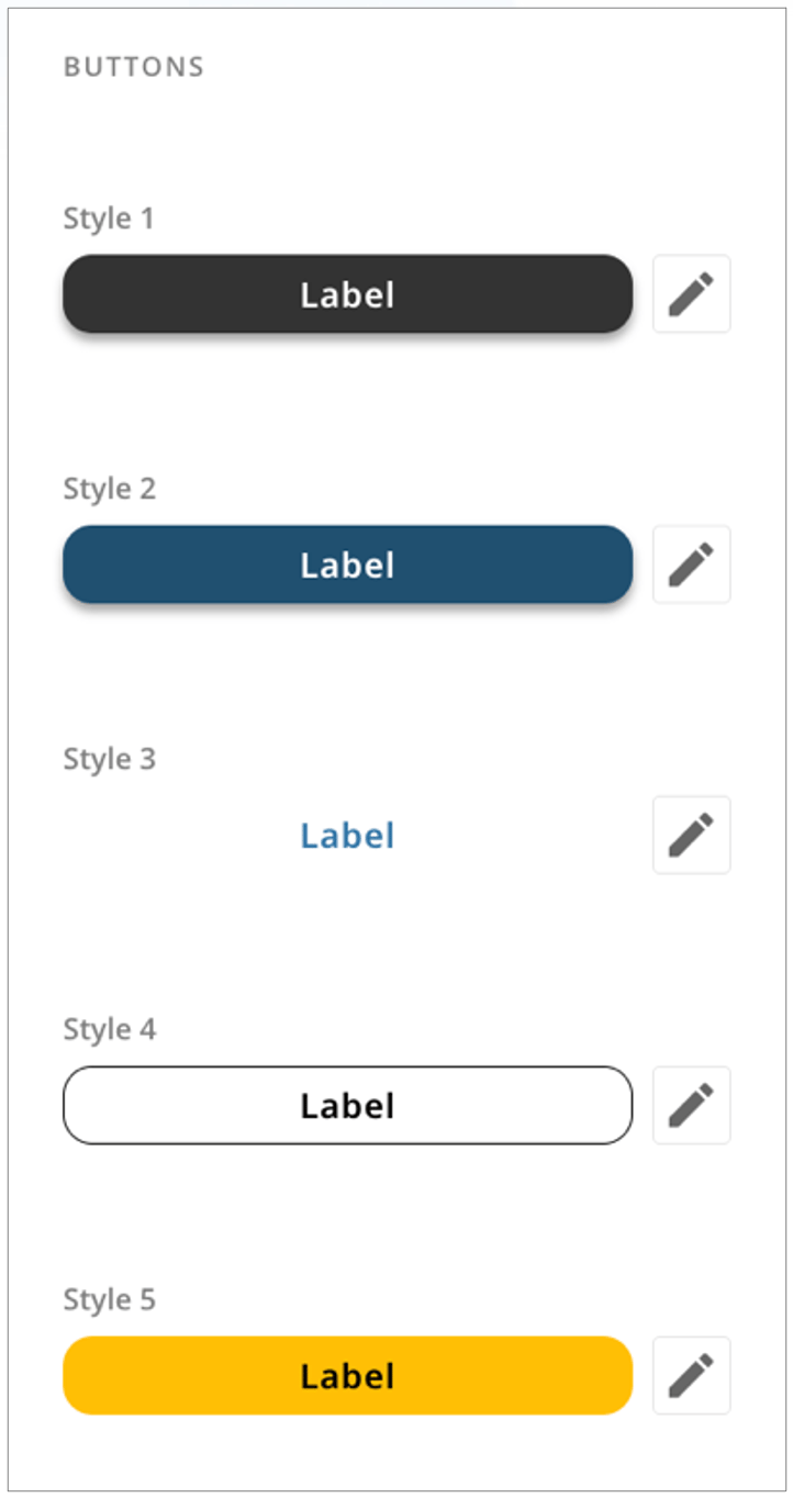
#### Style Buttons
You can customize five different button styles.
Under **App** **theme** > **Edit Styles** > **Styles** (tab) > **Buttons**, select **Edit Styles**.
In the panel, s elect **Edit** to customize each button style individually. (Learn about [color](#choose_colors) in App Studio.)
Select **Reset** at the top of the panel at any time to reset all settings to their default values.
Selecting **Advanced Table Appearance** allows you to customize the following:
* Toggle alternating row color
* Configure alternating row color
* Choose a separate font for column headers
* Header font color
* Header background color
* Total row font
* Total row font color
* Total row background color
* Subtotal row font
* Subtotal row font color
* Subtotal row background color
* URL font color
#### Style Buttons
You can customize five different button styles.
Under **App** **theme** > **Edit Styles** > **Styles** (tab) > **Buttons**, select **Edit Styles**.
In the panel, s elect **Edit** to customize each button style individually. (Learn about [color](#choose_colors) in App Studio.)
Select **Reset** at the top of the panel at any time to reset all settings to their default values.
 #### Style Text Components
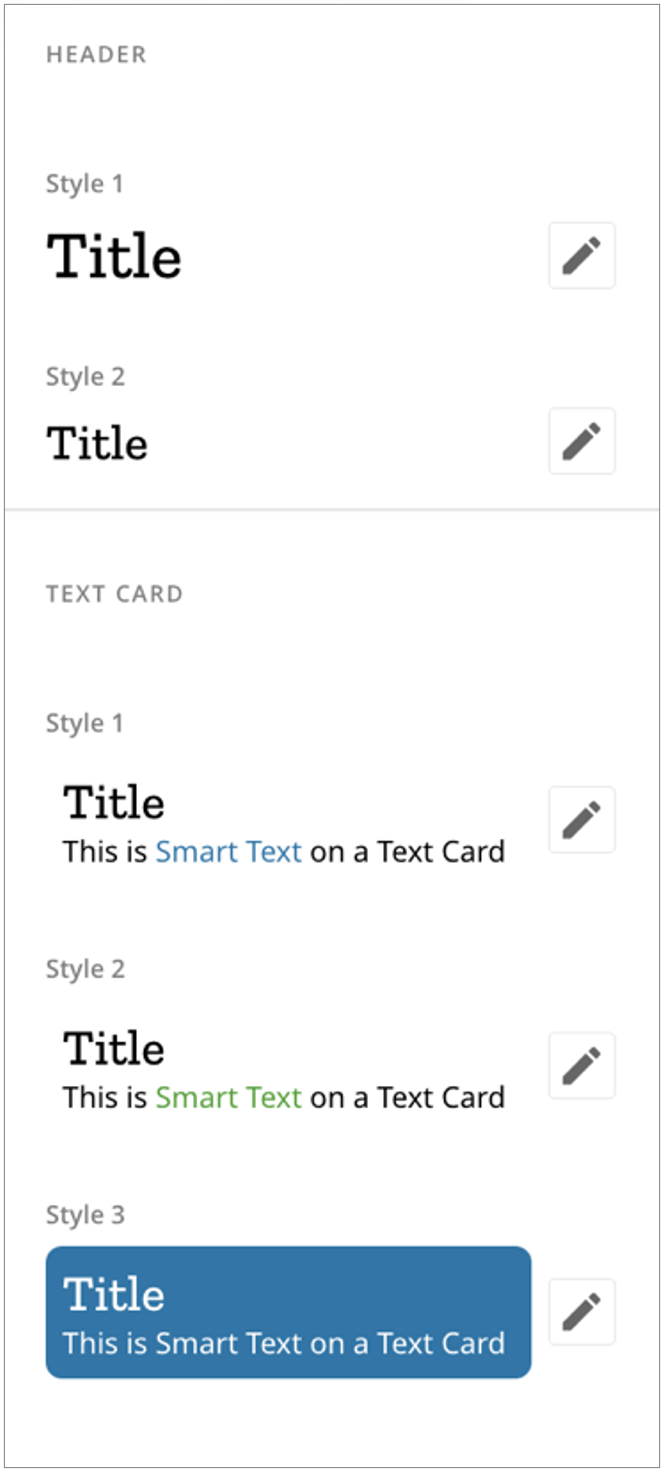
This section allows you to configure two header styles and three card styles. Header styles include only font and color. Card styles have more options, including [spacing](#spacing). (Learn about [color](#choose_colors) in App Studio.)
Under **App** **theme** > **Edit Styles** > **Styles** (tab) > **Text Components**, select **Edit Styles**.
#### Style Text Components
This section allows you to configure two header styles and three card styles. Header styles include only font and color. Card styles have more options, including [spacing](#spacing). (Learn about [color](#choose_colors) in App Studio.)
Under **App** **theme** > **Edit Styles** > **Styles** (tab) > **Text Components**, select **Edit Styles**.
 #### Style Fonts
You can customize five different heading styles and one style each for body, paragraph, and buttons.
Under **App** **theme** > **Edit Styles** > **Styles** (tab) > **Font Styles**, select **Edit Styles**.
#### Style Fonts
You can customize five different heading styles and one style each for body, paragraph, and buttons.
Under **App** **theme** > **Edit Styles** > **Styles** (tab) > **Font Styles**, select **Edit Styles**.
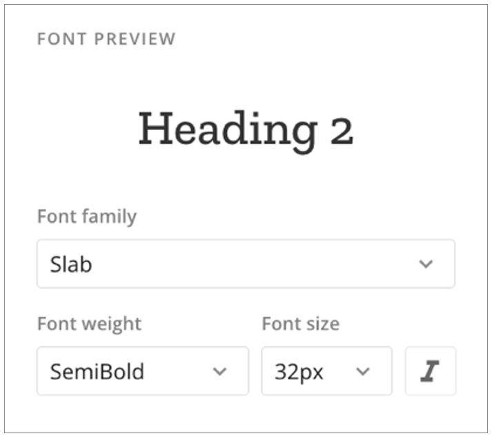
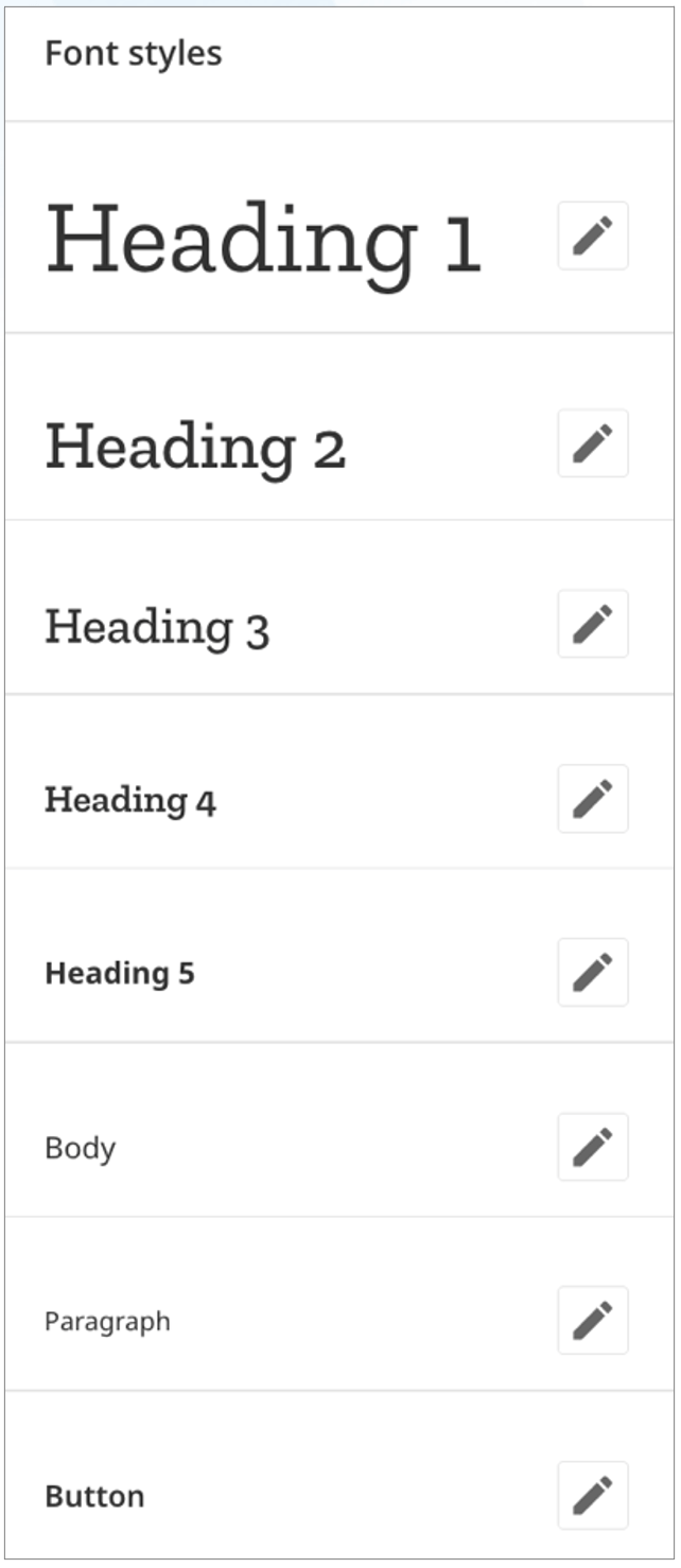 Selecting **Edit** for any of the styles allows you to choose a font family (condensed, monospace, sans, serif, or slab), font weight, font size, and whether to italicize.
 #### Style Forms
You can customize three styles for forms.
Under **App** **theme** > **Edit Styles** > **Styles** (tab) > **App Components**, select **Edit Styles**.
#### Style Forms
You can customize three styles for forms.
Under **App** **theme** > **Edit Styles** > **Styles** (tab) > **App Components**, select **Edit Styles**.
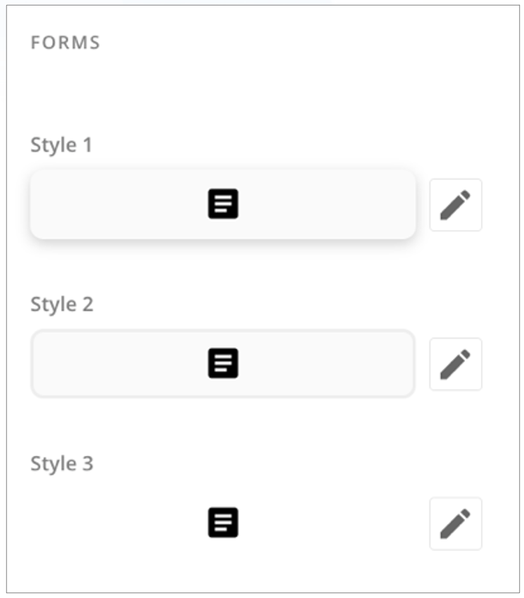 Selecting **Edit** for any style displays a preview of form appearance, card appearance, padding, and font style controls.
**Form Appearance** controls allow you to customize the following:
* **Form primary button —** Allows you to choose one of the available [button](#style_buttons) styles.
* **Form secondary button —** Allows you to choose one of the available [button](#style_buttons) styles.
* **Form controls color and opacity —** The color is applied to form input field controls, including checkboxes and radio selections.
**Padding** controls allow you to customize the inner padding of a card (default, comfortable, compact, micro, or custom). This adjusts the space between the edge of the card and its content.
#### Choose Colors
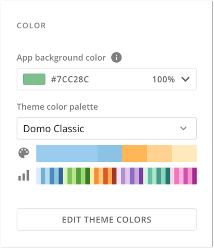
Under **App** **theme** > **Color**, you can choose an app background color and choose a pre-built color palette. The pre-built color palettes include a set of theme colors and a set of chart colors. If you would rather create your own palette, select **Edit Theme Colors**.
Selecting **Edit** for any style displays a preview of form appearance, card appearance, padding, and font style controls.
**Form Appearance** controls allow you to customize the following:
* **Form primary button —** Allows you to choose one of the available [button](#style_buttons) styles.
* **Form secondary button —** Allows you to choose one of the available [button](#style_buttons) styles.
* **Form controls color and opacity —** The color is applied to form input field controls, including checkboxes and radio selections.
**Padding** controls allow you to customize the inner padding of a card (default, comfortable, compact, micro, or custom). This adjusts the space between the edge of the card and its content.
#### Choose Colors
Under **App** **theme** > **Color**, you can choose an app background color and choose a pre-built color palette. The pre-built color palettes include a set of theme colors and a set of chart colors. If you would rather create your own palette, select **Edit Theme Colors**.
 ##### Set App Background Color
The app background color allows you to set a color fill or an image fill.
* **Color Fill —** See [Color Picker](#color_picker). Selecting **Edit in theme** expands the **Theme Colors/Chart Colors** palettes.
* **Image Fill —** The image fill allows you to choose an image from your machine to use as the background.
You can also select **Default Color** to fill the background with white (HEX: FFFFFF).
##### Set App Background Color
The app background color allows you to set a color fill or an image fill.
* **Color Fill —** See [Color Picker](#color_picker). Selecting **Edit in theme** expands the **Theme Colors/Chart Colors** palettes.
* **Image Fill —** The image fill allows you to choose an image from your machine to use as the background.
You can also select **Default Color** to fill the background with white (HEX: FFFFFF).
 ##### Theme Color Palette/Chart Color Palettes
Under **App Theme** > **Color**, selecting **Edit Theme Colors** displays the Theme Colors and Chart Colors palettes.
The **Theme color palette** dropdown contains eight pre-built color palettes. Each color palette contains a primary color and three accent colors, with a predefined gradient for each color.
##### Theme Color Palette/Chart Color Palettes
Under **App Theme** > **Color**, selecting **Edit Theme Colors** displays the Theme Colors and Chart Colors palettes.
The **Theme color palette** dropdown contains eight pre-built color palettes. Each color palette contains a primary color and three accent colors, with a predefined gradient for each color.
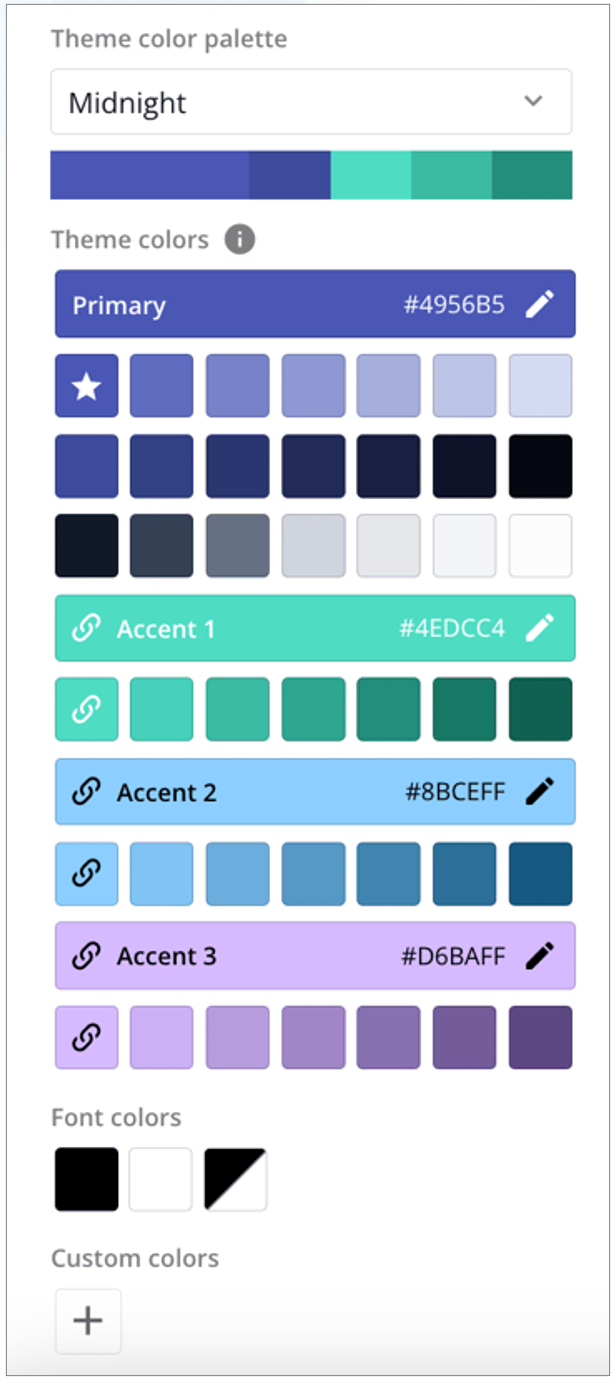 All colors are editable; **however, the three base accent colors are used in charting, and any changes to them affect the way charts display.** You can change any of the color palettes to your brand colors to personalize your app.
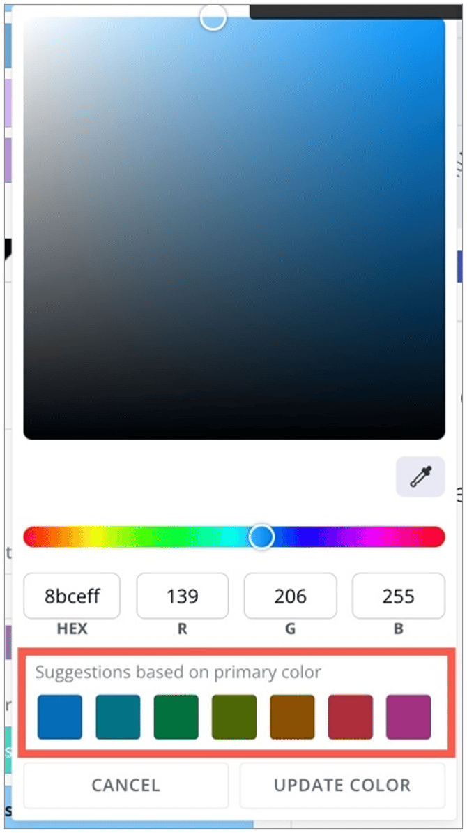
Editing any of the included colors or selecting **Add** under **Custom colors** opens the [color picker](#color_picker). Editing an included accent color displays suggestions for accent colors based on the primary color.
All colors are editable; **however, the three base accent colors are used in charting, and any changes to them affect the way charts display.** You can change any of the color palettes to your brand colors to personalize your app.
Editing any of the included colors or selecting **Add** under **Custom colors** opens the [color picker](#color_picker). Editing an included accent color displays suggestions for accent colors based on the primary color.
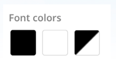
 You can choose to use black or white font throughout the app or choose **Automatic**, which changes the font based on the background color behind it.
 The **Chart color palette** dropdown contains 11 pre-built color palettes for charting.
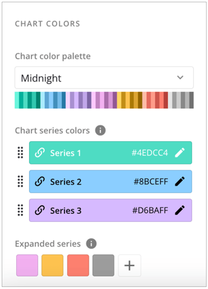 The chart color palette determines what colors appear and in what order for bar, line, or pie charts, depending on the number of series in those charts. Each color palette comes with colors for three series. If you need more than three series colors, you can manage these under **Expanded series**.
###### Expanded Series
The **Expanded series** of chart colors is used as the number of series in charts increases, or in some cases on line charts. You can add to and edit colors in the expanded series. Selecting **Add** under **Expanded series** displays a specialized [color picker](#color_picker) with colors from the chosen theme.
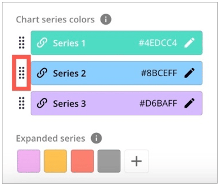
Reorder the series colors by dragging the handles of the colors into the order you want.
The chart color palette determines what colors appear and in what order for bar, line, or pie charts, depending on the number of series in those charts. Each color palette comes with colors for three series. If you need more than three series colors, you can manage these under **Expanded series**.
###### Expanded Series
The **Expanded series** of chart colors is used as the number of series in charts increases, or in some cases on line charts. You can add to and edit colors in the expanded series. Selecting **Add** under **Expanded series** displays a specialized [color picker](#color_picker) with colors from the chosen theme.
Reorder the series colors by dragging the handles of the colors into the order you want.
 **Color Picker**
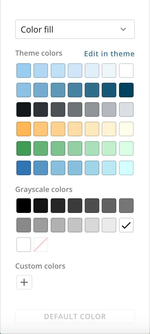
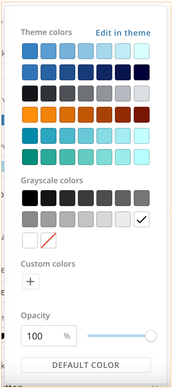
Selecting any dropdown for color throughout App Studio displays a palette of colors in your current theme and a palette of grayscale colors.
You can also adjust the opacity of the currently selected color.
Selecting **Edit in theme** opens the **Color** section, where you can make changes to the theme color palette. Learn about color below.
**Color Picker**
Selecting any dropdown for color throughout App Studio displays a palette of colors in your current theme and a palette of grayscale colors.
You can also adjust the opacity of the currently selected color.
Selecting **Edit in theme** opens the **Color** section, where you can make changes to the theme color palette. Learn about color below.
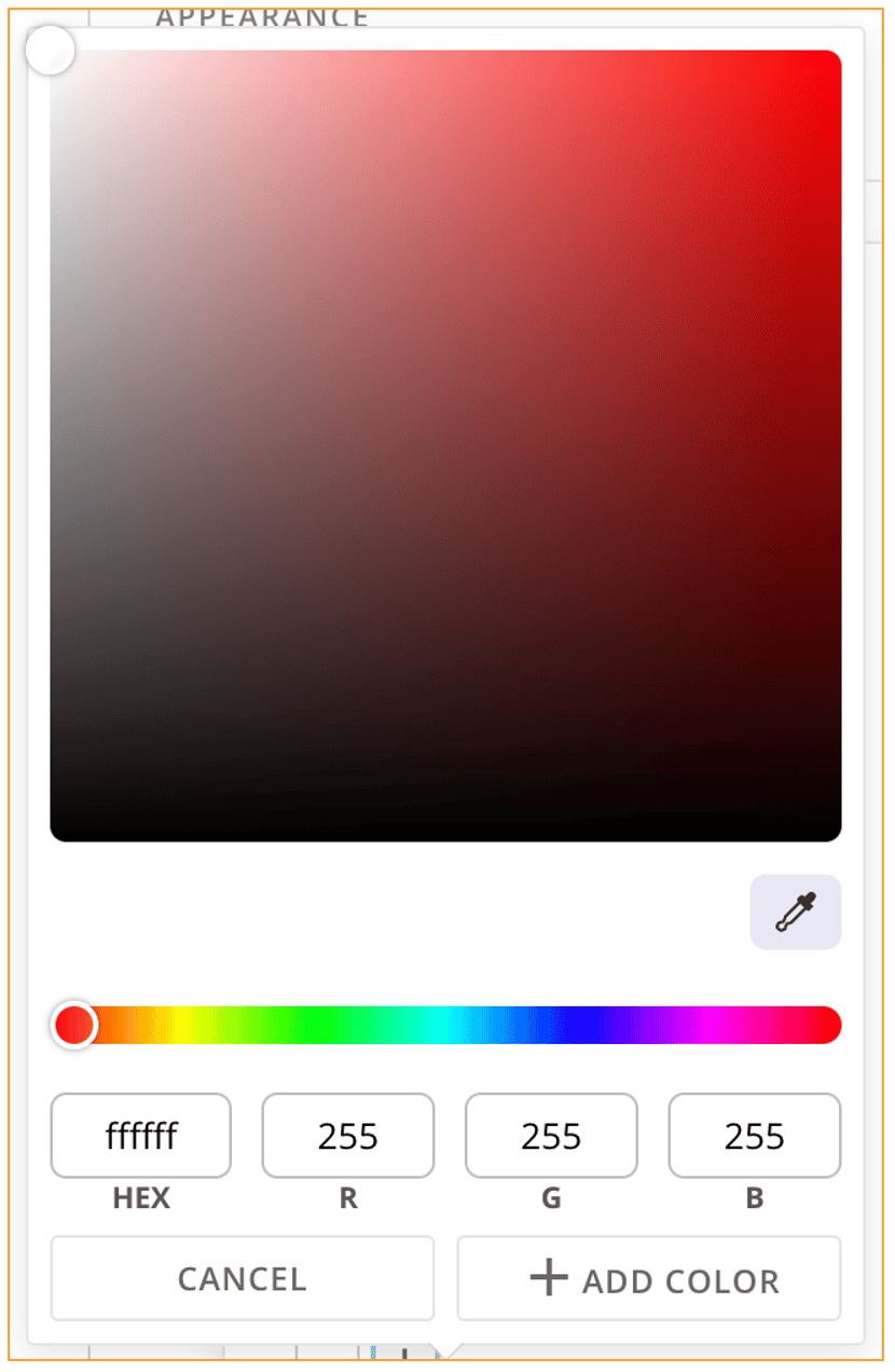
 Selecting **Add** under **Custom colors** displays a color picker with an eyedropper to allow you to pinpoint your color selection. The color picker also accepts HEX and RGB values.
After using the eyedropper or entering a color value or values, select **+ Add Color** to add the color to the palette of custom colors in the color picker or **Cancel** to discard your changes.
Selecting **Add** under **Custom colors** displays a color picker with an eyedropper to allow you to pinpoint your color selection. The color picker also accepts HEX and RGB values.
After using the eyedropper or entering a color value or values, select **+ Add Color** to add the color to the palette of custom colors in the color picker or **Cancel** to discard your changes.
 ### Copy a Custom Theme
Unless an app is [locked](https://domo-support.domo.com/s/article/000005295?language=en_US#app_configuration), app owners and editors can choose to reuse a [custom theme](#custom_themes) created in another App Studio app to preserve your branding. They can also download a custom theme as a JSON file for future use. If an app is locked, only owners can copy and reuse themes.
To copy or reuse a custom theme, you must complete two processes: downloading and uploading. These processes are described below, depending on whether you download from the [Apps Home](#download_custom_theme_apps_home) or [inside the app](#download_custom_theme_inside_app) and whether you upload to a [new app](#upload_custom_theme_json_file) or to an [existing app](#import_from_existing_app).
**Notes:**
* The JSON theme file only includes information
about the theme styles, colors, and app branding. It does not include any other app or data-related information.
* When you import a theme from another app, it imports and applies the theme currently live in the other
app. If you want to use a previous theme stored in that app's custom theme library, go to the app and [download the JSON theme file](#download_custom_theme_inside_app). Then you can upload it to any app.
**Note:** Theme background images are *not* copied over and must be applied individually if required.
# Download a Custom Theme From the Apps Home
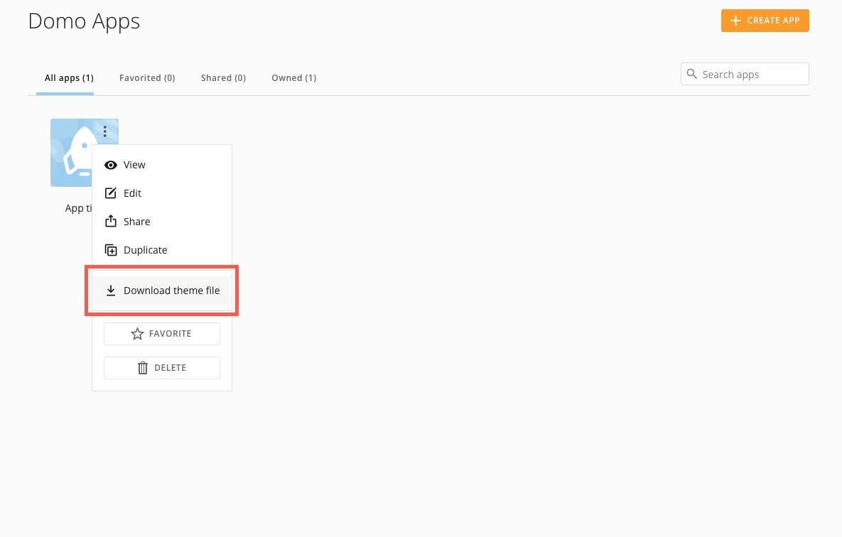
1. Navigate to the Apps Home and find the app with the custom theme you want to download.
2. Hover over the app and select **More** (vertical three-dot menu) > **Download** **theme file**.
This downloads a JSON file of the custom theme being used in the app with all the current customizations. If you want to use an older theme with different customizations, see [downloading a custom theme from inside an app](#download_custom_theme_inside_app).
### Copy a Custom Theme
Unless an app is [locked](https://domo-support.domo.com/s/article/000005295?language=en_US#app_configuration), app owners and editors can choose to reuse a [custom theme](#custom_themes) created in another App Studio app to preserve your branding. They can also download a custom theme as a JSON file for future use. If an app is locked, only owners can copy and reuse themes.
To copy or reuse a custom theme, you must complete two processes: downloading and uploading. These processes are described below, depending on whether you download from the [Apps Home](#download_custom_theme_apps_home) or [inside the app](#download_custom_theme_inside_app) and whether you upload to a [new app](#upload_custom_theme_json_file) or to an [existing app](#import_from_existing_app).
**Notes:**
* The JSON theme file only includes information
about the theme styles, colors, and app branding. It does not include any other app or data-related information.
* When you import a theme from another app, it imports and applies the theme currently live in the other
app. If you want to use a previous theme stored in that app's custom theme library, go to the app and [download the JSON theme file](#download_custom_theme_inside_app). Then you can upload it to any app.
**Note:** Theme background images are *not* copied over and must be applied individually if required.
# Download a Custom Theme From the Apps Home
1. Navigate to the Apps Home and find the app with the custom theme you want to download.
2. Hover over the app and select **More** (vertical three-dot menu) > **Download** **theme file**.
This downloads a JSON file of the custom theme being used in the app with all the current customizations. If you want to use an older theme with different customizations, see [downloading a custom theme from inside an app](#download_custom_theme_inside_app).
 # Download a Custom Theme From Inside an App
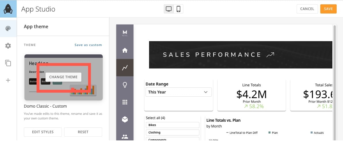
1. From inside the app editor, go to
**App theme**, hover over the preview thumbnail and select **Change Theme** to open the themes modal.
# Download a Custom Theme From Inside an App
1. From inside the app editor, go to
**App theme**, hover over the preview thumbnail and select **Change Theme** to open the themes modal.
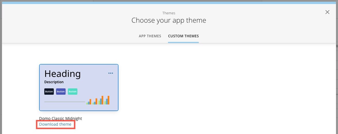
 2. Go to the **Custom Themes** tab of the modal and select **Download theme** for the theme you want to download.
The custom theme's JSON file downloads to your machine.
2. Go to the **Custom Themes** tab of the modal and select **Download theme** for the theme you want to download.
The custom theme's JSON file downloads to your machine.
 # Upload a Custom Theme to a New App — JSON File
To reuse a custom theme in a different app, you must first create the new app so that it displays in the Apps Home.
1. Navigate to the Apps Home and find the app from which you want to reuse the custom theme.
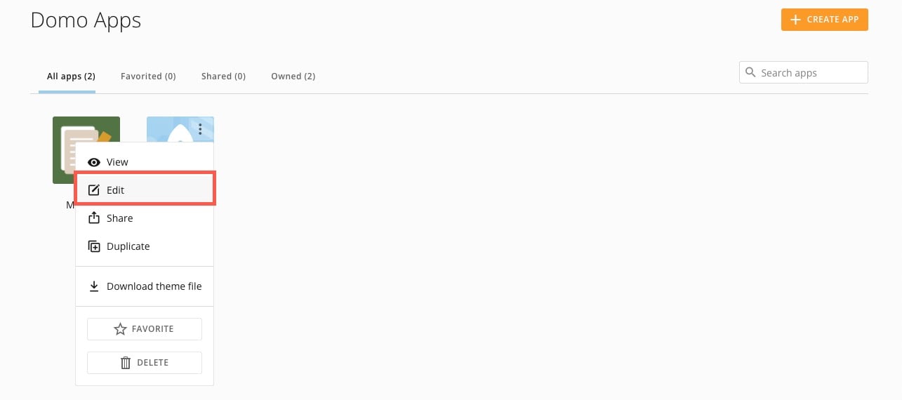
2. Hover over the app and select **More** (vertical three-dot menu) > **Edit**.
The app editor opens.
# Upload a Custom Theme to a New App — JSON File
To reuse a custom theme in a different app, you must first create the new app so that it displays in the Apps Home.
1. Navigate to the Apps Home and find the app from which you want to reuse the custom theme.
2. Hover over the app and select **More** (vertical three-dot menu) > **Edit**.
The app editor opens.
 3. In the left navigation under
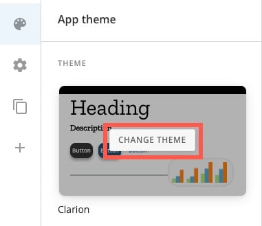
**App theme**, hover over the preview thumbnail and select **Change Theme** to open the themes modal.
3. In the left navigation under
**App theme**, hover over the preview thumbnail and select **Change Theme** to open the themes modal.
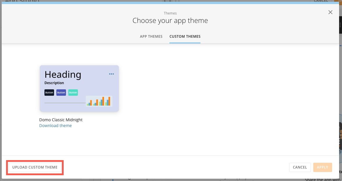
 4. Go to the **Custom Themes** tab of the modal and select **Upload Custom Theme**.
 5. Choose your downloaded JSON file. After your theme uploads successfully, it displays in the **Custom Themes** tab of the modal.
**Important:** The theme file must be less than 150 KB. If the file is too large, you'll receive an error.
6. Select the theme thumbnail and then **Apply** to bring the uploaded theme into your app.
7. Select **Save** in the app editor to ensure your theme changes are complete.
# Import a Custom Theme From an Existing App
1. Open the app editor for the app to which you want to apply a custom theme.
2. In the left navigation under
**App theme**, hover over the preview thumbnail and select **Change Theme** to open the themes modal.
3. In the **App Themes** tab, select **Import Theme From App**.
5. Choose your downloaded JSON file. After your theme uploads successfully, it displays in the **Custom Themes** tab of the modal.
**Important:** The theme file must be less than 150 KB. If the file is too large, you'll receive an error.
6. Select the theme thumbnail and then **Apply** to bring the uploaded theme into your app.
7. Select **Save** in the app editor to ensure your theme changes are complete.
# Import a Custom Theme From an Existing App
1. Open the app editor for the app to which you want to apply a custom theme.
2. In the left navigation under
**App theme**, hover over the preview thumbnail and select **Change Theme** to open the themes modal.
3. In the **App Themes** tab, select **Import Theme From App**.
 4. Search for and select the app with the custom theme you want to apply. Select **Import Theme**.
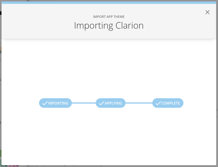
5. The modal displays the three steps—importing, applying, and complete. When the import is complete, close the modal.
4. Search for and select the app with the custom theme you want to apply. Select **Import Theme**.
5. The modal displays the three steps—importing, applying, and complete. When the import is complete, close the modal.
 6. Select **Save** in the app editor to ensure your theme changes are complete.