> ## Documentation Index
> Fetch the complete documentation index at: https://domoinc-openapi-sync-dataflows.mintlify.site/llms.txt
> Use this file to discover all available pages before exploring further.

# Dependency Gantt Chart

export const InlineImage = ({src, alt = '', height = '1.6em'}) => {
  return <img noZoom src={src} alt={alt} style={{
    display: 'inline',
    verticalAlign: 'start',
    height: height,
    margin: '0'
  }} />;
};

### Intro

Dependency Gantt charts are used to illustrate project schedules. Each task in a project is represented as a horizontal bar with a start date and an end date. Tasks are represented along the vertical axis, and dates are represented along the horizontal axis. You can break tasks down by project, in which case each project is shown in a different color and appears as a legend item. However, projects are optional in Gantt charts. The Dependency Gantt chart handles changes in dates for you and gives many new display options to communicate project timelines.

This article describes how to power a Dependency Gantt chart and the unique properties available for this chart in Analyzer.

***

### Power a Dependency Gantt Chart

Domo Dependency Gantt charts require three columns or rows of data from your DataSet—one for items (tasks), one with start dates for each task, and one for the duration of each task. You can also add other optional columns, such as one for project category data. Adding project category data causes the bars for each category to appear in different colors, including multiple projects, and adds a legend to the chart showing which project category is which.

This table describes each of the three required fields for the Dependency Gantt chart and the five optional ones, displayed above the chart editor in Analyzer.

<Frame>
  <img alt="" src="https://mintcdn.com/domoinc-openapi-sync-dataflows/v5mFCMke9U0SrJSJ/images/kb/ka0Vq000000HLCv-00N5w00000Ri7BU-0EMVq00000979m9.jpg?fit=max&auto=format&n=v5mFCMke9U0SrJSJ&q=85&s=5c462845602860bdfbd1bac93acafac8" style={{width: 846, height: 98}} width="1864" height="216" data-path="images/kb/ka0Vq000000HLCv-00N5w00000Ri7BU-0EMVq00000979m9.jpg" />
</Frame>

<table border="1" cellpadding="1" cellspacing="1" data-aura-rendered-by="33:209;a">
  <thead>
    <tr>
      <th colspan="1" rowspan="1">
        <p> Field Name </p>
      </th>

      <th colspan="1" rowspan="1">
        <p> Data Type </p>
      </th>

      <th colspan="1" rowspan="1">
        <p> Required </p>
      </th>

      <th colspan="1" rowspan="1">
        <p> Description </p>
      </th>

      <th colspan="1" rowspan="1">
        <p> Notes </p>
      </th>
    </tr>
  </thead>

  <tbody>
    <tr>
      <td colspan="1" rowspan="1">
        <p> Item </p>
      </td>

      <td colspan="1" rowspan="1">
        <p> Text </p>
      </td>

      <td colspan="1" rowspan="1">
        <p>
          <InlineImage src="/images/kb/ka0Vq000000HLCv-00N5w00000Ri7BU-0EMVq0000096wli.jpg" />
        </p>
      </td>

      <td colspan="1" rowspan="1">
        <p> Row label and unique key </p>
      </td>

      <td colspan="1" rowspan="1">
        <p> N/A </p>
      </td>
    </tr>

    <tr>
      <td colspan="1" rowspan="1">
        <p> Start date </p>
      </td>

      <td colspan="1" rowspan="1">
        <p> Date </p>
      </td>

      <td colspan="1" rowspan="1">
        <p>
          <InlineImage src="/images/kb/ka0Vq000000HLCv-00N5w00000Ri7BU-0EMVq0000096wli.jpg" />
        </p>
      </td>

      <td colspan="1" rowspan="1">
        <p> Horizontal start of the bar </p>
      </td>

      <td colspan="1" rowspan="1">
        <p> ISO (YYY-MM-DD) or locale-appropriate dates </p>
      </td>
    </tr>

    <tr>
      <td colspan="1" rowspan="1">
        <p> Duration </p>
      </td>

      <td colspan="1" rowspan="1">
        <p> Number </p>
      </td>

      <td colspan="1" rowspan="1">
        <p>
          <InlineImage src="/images/kb/ka0Vq000000HLCv-00N5w00000Ri7BU-0EMVq0000096wli.jpg" />
        </p>
      </td>

      <td colspan="1" rowspan="1">
        <p> Bar length (<em> End </em> = <em> Start </em> + <em> Duration </em> ) </p>
      </td>

      <td colspan="1" rowspan="1">
        <p> 0 renders a milstone (diamond) </p>
      </td>
    </tr>

    <tr>
      <td colspan="1" rowspan="1">
        <p> Dependency </p>
      </td>

      <td colspan="1" rowspan="1">
        <p> Text </p>
      </td>

      <td colspan="1" rowspan="1">
        <p> Optional </p>
      </td>

      <td colspan="1" rowspan="1">
        <p> Draws red arrows connecting predecessor → successor and automatically shifts successors when
        predecessors move </p>
      </td>

      <td colspan="1" rowspan="1">
        <p> Leave blank for tasks without predecessors </p>
      </td>
    </tr>

    <tr>
      <td colspan="1" rowspan="1">
        <p> Category </p>
      </td>

      <td colspan="1" rowspan="1">
        <p> Text </p>
      </td>

      <td colspan="1" rowspan="1">
        <p> Optional </p>
      </td>

      <td colspan="1" rowspan="1">
        <p> Bar color, legend entries, and an easy filter dimension </p>
      </td>

      <td colspan="1" rowspan="1">
        <p> Keep values concise and consistent (for example, <em> Planning </em> and <em> Execution </em> ) </p>
      </td>
    </tr>

    <tr>
      <td colspan="1" rowspan="1">
        <p> Percent complete </p>
      </td>

      <td colspan="1" rowspan="1">
        <p> Number (0-1 or 0-100) </p>
      </td>

      <td colspan="1" rowspan="1">
        <p> Optional </p>
      </td>

      <td colspan="1" rowspan="1">
        <p> Fill-pattern proportion inside each bar </p>
      </td>

      <td colspan="1" rowspan="1">
        <p> N/A </p>
      </td>
    </tr>

    <tr>
      <td colspan="1" rowspan="1">
        <p> Resource </p>
      </td>

      <td colspan="1" rowspan="1">
        <p> Text </p>
      </td>

      <td colspan="1" rowspan="1">
        <p> Optional </p>
      </td>

      <td colspan="1" rowspan="1">
        <p> Displays in tooltips and can be added as a filter (who's responsible) </p>
      </td>

      <td colspan="1" rowspan="1">
        <p> Helpful for workload or team-based views </p>
      </td>
    </tr>

    <tr>
      <td colspan="1" rowspan="1">
        <p> Scale </p>
      </td>

      <td colspan="1" rowspan="1">
        <p> Number </p>
      </td>

      <td colspan="1" rowspan="1">
        <p> Optional </p>
      </td>

      <td colspan="1" rowspan="1">
        <p> Vertical size of each individual bar. The larger the value, the thicker the bar/taller the row. </p>
      </td>

      <td colspan="1" rowspan="1">
        <p> Great for spotlighting critical tasks (for example, set <em> Development </em> to 3, minor tasks to
        1\). Combine with <em> Grid </em><i> ▸ Row Height </i> for overall spacing. </p>
      </td>
    </tr>
  </tbody>
</table>

<Note>
  **Note:** To learn about value, category, and series data, see [Understanding Chart Data](/s/article/360043428693 "Understanding Chart Data"). For more information about choosing data columns to power your chart, see [Applying DataSet Columns to Your Chart](/s/article/360043428713 "Applying DataSet Columns to Your Chart").
</Note>

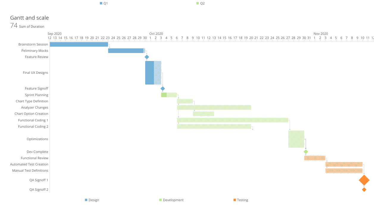
The following graphic shows how the data looks when displayed in the card Details view of the chart.

<Frame>
  <img alt="Gantt_Details_View.png" src="https://mintcdn.com/domoinc-openapi-sync-dataflows/3WBVqiq9QkFE9G7d/images/kb/ka05w00000129sg-00N5w00000Ri7BU-0EM5w000005wKn6.png?fit=max&auto=format&n=3WBVqiq9QkFE9G7d&q=85&s=8b86177de0453e35e6d7216c5da3ca36" style={{width: 895, height: 498}} width="1257" height="699" data-path="images/kb/ka05w00000129sg-00N5w00000Ri7BU-0EM5w000005wKn6.png" />
</Frame>

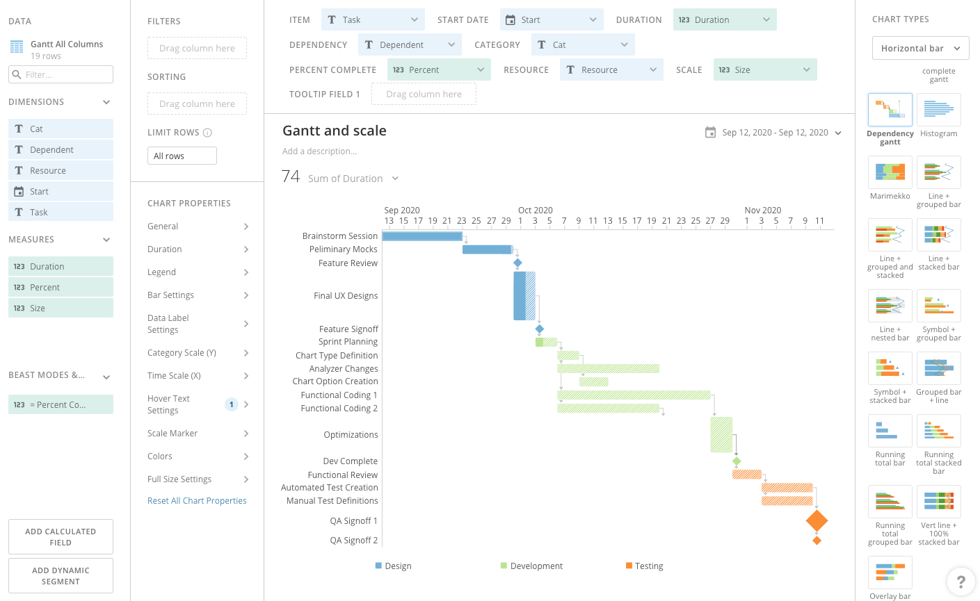
The following graphic shows how the data looks inside Analyzer when creating a chart.
<Frame>
  <img alt="Gantt_Analyzer_View.png" src="https://mintcdn.com/domoinc-openapi-sync-dataflows/v5mFCMke9U0SrJSJ/images/kb/ka0Vq000000HLCv-00N5w00000Ri7BU-0EM5w000005vP2m.png?fit=max&auto=format&n=v5mFCMke9U0SrJSJ&q=85&s=070e03a17e9037fc039057c762f297ce" style={{width: 899, height: 552}} width="1409" height="865" data-path="images/kb/ka0Vq000000HLCv-00N5w00000Ri7BU-0EM5w000005vP2m.png" />
</Frame>

### Customize a Dependency Gantt Chart

You can customize the appearance of a Dependency Gantt chart by editing its **Chart Properties**. For information about all chart properties, see [Chart Properties](/s/topic/0TO5w000000ZaodGAC "Chart Properties").

Unique properties of Dependency Gantt charts include the following:

<table border="1" cellpadding="1" cellspacing="1" data-aura-rendered-by="33:209;a">
  <thead>
    <tr>
      <th colspan="1" rowspan="1">
        <p> Property </p>
      </th>

      <th colspan="1" rowspan="1">
        <p> Description </p>
      </th>

      <th colspan="1" rowspan="1">
        <p> Example (s) </p>
      </th>
    </tr>
  </thead>

  <tbody>
    <tr>
      <td colspan="1" rowspan="1"> Time Scale (X) > Show Label </td>
      <td colspan="1" rowspan="1"> Hides or shows time scale labels. Labels are shown by default. </td>

      <td colspan="1" rowspan="1">
        <a href="https://domohelp.domo.com/@api/deki/files/564/gantt_no_time_scale.png" target="_blank" title="/@api/deki/files/564/gantt_no_time_scale.png">
          <img alt="gantt_no_time_scale.png" src="https://mintcdn.com/domoinc-openapi-sync-dataflows/KRKoASQJgRuO8wHw/images/kb/ka05w00000123nu-00N5w00000Ri7BU-0EM5w000005vP9c.png?fit=max&auto=format&n=KRKoASQJgRuO8wHw&q=85&s=6b364d84636bb03d21995a78e5afdfb1" width="716" height="332" data-path="images/kb/ka05w00000123nu-00N5w00000Ri7BU-0EM5w000005vP9c.png" />
        </a>
      </td>
    </tr>

    <tr>
      <td colspan="1" rowspan="1"> Hover Text Settings > Text </td>

      <td colspan="1" rowspan="1">
        <p> Lets you replace the default hover text with your own custom text. You can insert any of a variety
        of macros to reference the start date, percent of completion, category, etc. For more information,
        see <a href="/s/article/360043429693" target="_self" title="Formatting Data Label and Hover Text in Your Chart"> Formatting Data Label and Hover Text
        in Your Chart </a>. </p>
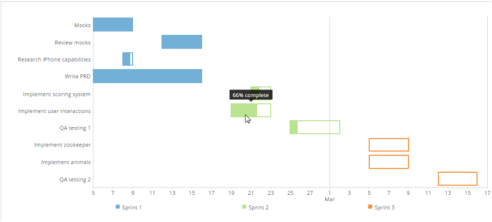
        <p> In the example at right, the user replaced the default hover text with the following macro:
        <code> %\_PERCENT\_COMPLETE% complete </code>. </p>
      </td>

      <td colspan="1" rowspan="1">
        <img alt="gantt_custom_macro.png" src="https://mintcdn.com/domoinc-openapi-sync-dataflows/KRKoASQJgRuO8wHw/images/kb/ka05w00000123nu-00N5w00000Ri7BU-0EM5w000005vP9e.png?fit=max&auto=format&n=KRKoASQJgRuO8wHw&q=85&s=20426f1d702cceb5ce9a760d1307e570" width="708" height="320" data-path="images/kb/ka05w00000123nu-00N5w00000Ri7BU-0EM5w000005vP9e.png" />
      </td>
    </tr>
  </tbody>
</table>