> ## Documentation Index
> Fetch the complete documentation index at: https://domoinc-openapi-sync-dataflows.mintlify.site/llms.txt
> Use this file to discover all available pages before exploring further.

# Drilling into Data

export const InlineImage = ({src, alt = '', height = '1.6em'}) => {
  return <img noZoom src={src} alt={alt} style={{
    display: 'inline',
    verticalAlign: 'start',
    height: height,
    margin: '0'
  }} />;
};

## Intro

In any KPI Card, by clicking on graph elements such as bars, points on a line, bubbles, etc., you can "drill down" to see filtered views or underlying data for those elements. The number of views in a drill path depends on the number of drill layers that have been incorporated into the Card; for example, if the Card designer added three drill layers into the Card, you would be able to see three unique filtered views for the Card.

Drilldown is available in both the Details view and in Pages with Domo Stories Dashboards enabled. For drilldown to be available in a Dashboard, you must first go into the **Interaction settings** for the Card and enable **Drill in place**. For more information, see Setting Card Interactions. Many drilldown options are available only when drilling from the Details view, such as the ability to remove filters in a drill view.

By default, the final view in a drill path is a table showing the underlying data for all of the filtered elements. If no drill layers have been incorporated into the Card, this is the view you see when you click any element in the chart. This table view provides many options for changing how the data displays, including applying Filters and sorting, grouping and ungrouping like rows, changing the date grain and formatting, and so on. The table view is available *only* when drilling down in the Details view for a Card; it is *not* available when drilling from the Page view.

<Note>
  **Note:** Drilldown is *not* available in Funnel graphs.
</Note>

***

<Tip>
  **Tip:** You can filter to show the underlying data for any item in a Heat Map by clicking its scale label. For more information about Heat Maps, see [Heat Map](/s/article/360042924634 "Heat Map").
</Tip>

In the Details view only, while drilling down through data layers in a Card, you can temporarily remove Filters to show more information. Only you see the data with the removed Filter, and when you exit the drill view the Filters reset.

If the content in a Card is filtered due to PDP policies, those Filters are retained when you drill down. For example, if you were a member of a PDP policy allowing you to see only the data in western states, you would still see only data relevant to you upon drilldown. For more information about PDP, see Personalized Data Permissions (PDP)").

You can also export data from a drill layer into Excel or CSV (Details view only).

This topic discusses drilling down into a Card and the options available when drilling. It does *not* discuss adding drill layers to a KPI Card. For information about adding drill layers, see Adding Drill Path to Your Chart.

Domo also provides other means of performing in-depth data analysis, such as applying Filters. For more information, see [Filtering Data in a Card Details View](/s/article/360042924014 "Filtering Data in a Card Details View").

## Example Scenario of Drilling Down

The following scenario shows how a user might navigate through a typical series of drill layers. Note that this scenario is specific to the Details view.

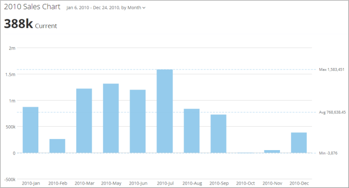
The KPI Card, "2010 Sales Chart," shows sales for a certain company throughout 2010. The top layer consists of a series of bars representing sales for each month of the year.

<Frame>
  <img alt="" src="https://mintcdn.com/domoinc-openapi-sync-dataflows/DfXQTn5UA-Ig8rT5/images/kb/ka05w00000124LT-00N5w00000Ri7BU-0EM5w000005vPIr.png?fit=max&auto=format&n=DfXQTn5UA-Ig8rT5&q=85&s=7cd1893b9115fe7a9d8d23b4b1a8959d" style={{width: 718, height: 387}} width="718" height="387" data-path="images/kb/ka05w00000124LT-00N5w00000Ri7BU-0EM5w000005vPIr.png" />
</Frame>

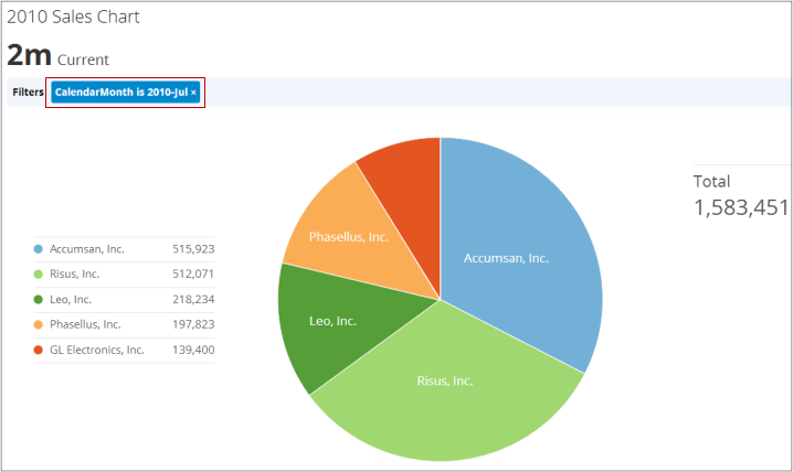
The user clicks the bar for July. A view appears, showing customers in a pie chart. In addition, a Filter is applied for the month of July. With the Filter, the chart shows only those customers who made purchases in July. If the user had clicked the bar for June, the view would be a pie chart of customers who made purchases in June. (The Card designer specifically designed the first drill layer to show sales by customer. The month is determined by the Filter.)
<Frame>
  <img alt="" src="https://mintcdn.com/domoinc-openapi-sync-dataflows/DfXQTn5UA-Ig8rT5/images/kb/ka05w00000124LT-00N5w00000Ri7BU-0EM5w000005vPJ5.png?fit=max&auto=format&n=DfXQTn5UA-Ig8rT5&q=85&s=72e4c645fd6a0d5ce555b173e40f8fa3" style={{width: 718, height: 428}} width="718" height="428" data-path="images/kb/ka05w00000124LT-00N5w00000Ri7BU-0EM5w000005vPJ5.png" />
</Frame>

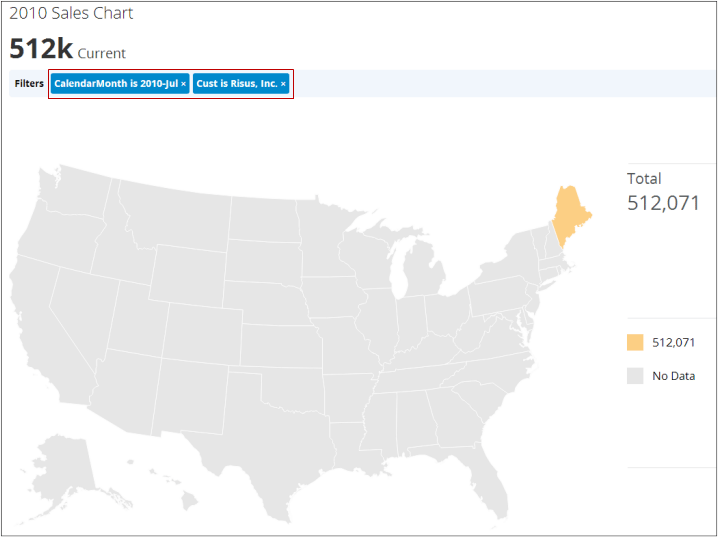
The user clicks the pie wedge for "Risus, Inc." A third view appears, showing purchases by state. (Because the Card designer defined this view to show amounts by state, the view is always a map with both the month and customer determined by the Filters.) Due to the Filters, Maine is the only state that appears in the third view.
<Frame>
  <img alt="" src="https://mintcdn.com/domoinc-openapi-sync-dataflows/DfXQTn5UA-Ig8rT5/images/kb/ka05w00000124LT-00N5w00000Ri7BU-0EM5w000005vPJQ.png?fit=max&auto=format&n=DfXQTn5UA-Ig8rT5&q=85&s=2aec1a1e04e521746a8fe0fbaedb7bdd" style={{width: 718, height: 537}} width="718" height="537" data-path="images/kb/ka05w00000124LT-00N5w00000Ri7BU-0EM5w000005vPJQ.png" />
</Frame>

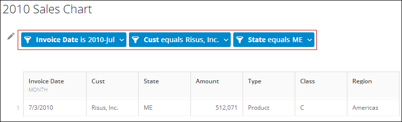
The user clicks the state of Maine in the map. The last view appears, showing a table with all the filtered data. (The last view is a default view that is not defined by the Card designer.)
<Frame>
  <img alt="" src="https://mintcdn.com/domoinc-openapi-sync-dataflows/DfXQTn5UA-Ig8rT5/images/kb/ka05w00000124LT-00N5w00000Ri7BU-0EM5w000005vPIt.png?fit=max&auto=format&n=DfXQTn5UA-Ig8rT5&q=85&s=8423d6ca2c50739b56adb58ceb5962ff" style={{width: 817, height: 249}} width="817" height="249" data-path="images/kb/ka05w00000124LT-00N5w00000Ri7BU-0EM5w000005vPIt.png" />
</Frame>

The final table view is available only when drilling from the Details view; it is not available in the Page view.

## Removing Filters while Drilling

When you navigate through drill layers within a Card, a new Filter is applied for every new level of drilldown. So, for example, the top level in a drill path might display a bar graph with sales for each month in the year. Clicking on the bar for a month might open a new view with a pie chart, with each slice in the pie showing amounts gained from different customers. In this case, a Filter for the month you clicked would be applied. As you drill deeper, new Filters would be applied *in addition* to those already added.

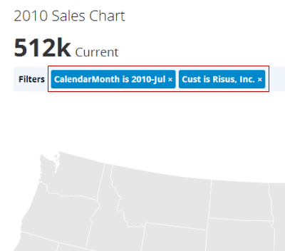
In any view in a drill path, you can remove any Filters to show more information. (This option is available only in the Details view.) You do this by clicking the "x" on the right side of the Filter bar. Filter bars are blue and are displayed above the chart, as follows:
<Frame>
  <img alt="" src="https://mintcdn.com/domoinc-openapi-sync-dataflows/DfXQTn5UA-Ig8rT5/images/kb/ka05w00000124LT-00N5w00000Ri7BU-0EM5w000005vPJU.png?fit=max&auto=format&n=DfXQTn5UA-Ig8rT5&q=85&s=e11a5634ed033592ba224f6054c7fb3c" style={{width: 400, height: 352}} width="400" height="352" data-path="images/kb/ka05w00000124LT-00N5w00000Ri7BU-0EM5w000005vPJU.png" />
</Frame>

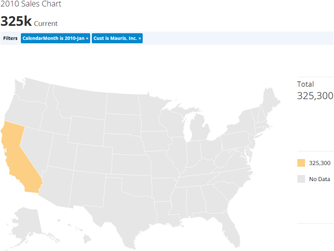
In the following sequential example, the user has drilled down two levels into a chart showing sales for 2010. In the first level, a Filter was applied for the month of January, and in the second level, an additional Filter was applied for the customer "Mauris, Inc." In the resulting map shown below, the only state that passes the Filters is California.
<Frame>
  <img alt="" src="https://mintcdn.com/domoinc-openapi-sync-dataflows/DfXQTn5UA-Ig8rT5/images/kb/ka05w00000124LT-00N5w00000Ri7BU-0EM5w000005vPJS.png?fit=max&auto=format&n=DfXQTn5UA-Ig8rT5&q=85&s=dba4b13e372f3b75e6a1bbdba4ce4797" style={{width: 688, height: 517}} width="688" height="517" data-path="images/kb/ka05w00000124LT-00N5w00000Ri7BU-0EM5w000005vPJS.png" />
</Frame>

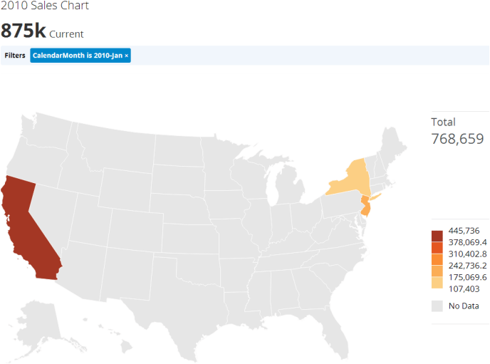
Because this view does not contain much information, the user broadens the scope by removing the "Cust" Filter to show all states with customers who made purchases in the month of January:
<Frame>
  <img alt="" src="https://mintcdn.com/domoinc-openapi-sync-dataflows/DfXQTn5UA-Ig8rT5/images/kb/ka05w00000124LT-00N5w00000Ri7BU-0EM5w000005vPJW.png?fit=max&auto=format&n=DfXQTn5UA-Ig8rT5&q=85&s=37daaf941e94176d7852bf7a12141211" style={{width: 688, height: 511}} width="688" height="511" data-path="images/kb/ka05w00000124LT-00N5w00000Ri7BU-0EM5w000005vPJW.png" />
</Frame>

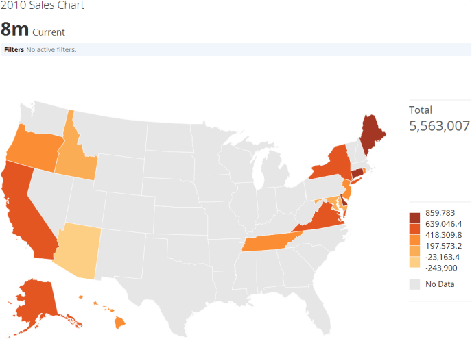
The user removes the remaining Filter. The map shows all states with customers for the entire year:
<Frame>
  <img alt="" src="https://mintcdn.com/domoinc-openapi-sync-dataflows/DfXQTn5UA-Ig8rT5/images/kb/ka05w00000124LT-00N5w00000Ri7BU-0EM5w000005vPJK.png?fit=max&auto=format&n=DfXQTn5UA-Ig8rT5&q=85&s=a12abe0d0fba28d806d091a209218ad5" style={{width: 688, height: 495}} width="688" height="495" data-path="images/kb/ka05w00000124LT-00N5w00000Ri7BU-0EM5w000005vPJK.png" />
</Frame>

<Note>
  **Note:** Removing Filters from a drill path affects the view only for you. When you leave the view, the Filters reset.
</Note>

## Understanding the Options in the End-of-Drill Table View

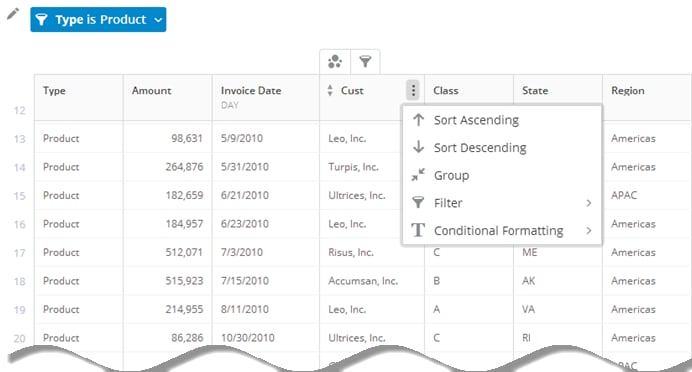
In the table view that appears at the end of a drill path (Details view only), you have various options for manipulating and formatting the data in the columns. These options are the same as those in **Column View** for a Sumo Card. For more information about Sumo, see [Adding a Sumo Card](/s/article/360042925674 "Adding a Sumo Card").

<Frame>
  <img alt="" src="https://mintcdn.com/domoinc-openapi-sync-dataflows/DfXQTn5UA-Ig8rT5/images/kb/ka05w00000124LT-00N5w00000Ri7BU-0EM5w000005vPIv.png?fit=max&auto=format&n=DfXQTn5UA-Ig8rT5&q=85&s=b5c0d8bd9fa86b2523c99e8a320ef73a" style={{width: 692, height: 372}} width="692" height="372" data-path="images/kb/ka05w00000124LT-00N5w00000Ri7BU-0EM5w000005vPIv.png" />
</Frame>

Mousing over any column causes two icons to appear. You can click <InlineImage src="/images/kb/ka05w00000123Ti-00N5w00000Ri7BU-0EM5w000005vOHb.png" /> to sort a column. Clicking the icon once sorts the column alphabetically; clicking it a second time applies a descending sort; and clicking it a third time turns off sorting in the column.

Click <InlineImage src="/images/kb/ka05w00000123Ti-00N5w00000Ri7BU-0EM5w000005vOHh.png" /> to access options for manipulating the data in a column. Available options include the following:

<table border="1" cellpadding="1" cellspacing="1" data-aura-rendered-by="33:208;a"><thead><tr><th colspan="1" rowspan="1"><p> Option </p></th><th colspan="1" rowspan="1"><p> Description </p></th></tr></thead><tbody><tr><td colspan="1" rowspan="1"><p> Sort Ascending/Sort Descending </p></td><td colspan="1" rowspan="1"><p> Allows you to sort columns using an ascending or descending sort. You can have only one column sort at a time. For example, you could not sort by date and then have a separate sort for your values column for each represented date. </p></td></tr><tr><td colspan="1" rowspan="1"><p> Group </p></td><td colspan="1" rowspan="1"><p> Combines all rows with like headings for the column you apply it to and aggregates the data in those rows. Cells in columns that cannot be aggregated display a value of "Unique" by default, which is a count of all unique items within that column. For example, if a column with salesperson names contained five instances of the name "Bob Jones," that name would only be counted once in the "Unique" aggregation. You can change the aggregation type by clicking in the second row or by choosing <b> Change Aggregate </b> in the column dropdown menu and selecting the desired aggregation type. This option is available for all columns <em> except </em> date columns. </p></td></tr><tr><td colspan="1" rowspan="1"><p> Ungroup </p></td><td colspan="1" rowspan="1"><p> Breaks apart rows that have been grouped. </p></td></tr><tr><td colspan="1" rowspan="1"><p> Date Grain </p></td><td colspan="1" rowspan="1"><p> Lets you change how date data is represented, either by day, week, quarter, month, or year. </p></td></tr><tr><td colspan="1" rowspan="1"><p> Change Aggregate </p></td><td colspan="1" rowspan="1"><p> Appears in the column dropdown menus after you have rolled up one or more columns (except for the column(s) you rolled up). <br /> You can also change how your column totals are aggregated. You do this by clicking the aggregation indicator in a "Total" cell to pop up a list of alternate aggregation types. If you change the total aggregation type for a column that has itself been aggregated (by applying a "Group" or "Date Grain" to the table), the aggregation type for the column is also changed. Otherwise, changing the aggregation type affects only the total for the column. <br /> Available aggregations include the following: </p><ul><li><p><b> Total </b>: Totals all values in the rows for this column. </p></li><li><p><b> Average </b>: Shows the average value for all rows. </p></li><li><p><b> Unique </b>: Shows the number of unique items in the column. </p></li><li><p><b> Count </b>: Shows the number of all items in the column. </p></li><li><p><b> Min </b>: Shows the smallest value in the column. </p></li><li><p><b> Max </b>: Shows the largest value in the column. </p></li></ul></td></tr><tr><td colspan="1" rowspan="1"><p> Filter </p></td><td colspan="1" rowspan="1"><p> Filters rows. For a text column, you select the specific items that you want to appear in the table. For a value column, you select the desired value range from a number of comparisons like "greater than," "less than," etc. For a date column, you select a date range from a number of options. When you add a Filter, a bar for that Filter appears above the table. You can click the bar to open the Filter for editing or removal. </p></td></tr><tr><td colspan="1" rowspan="1"><p> Formatting </p></td><td colspan="1" rowspan="1"><p> Lets you apply different formatting to numbers in value and date columns. </p></td></tr><tr><td colspan="1" rowspan="1"><p> Conditional Formatting </p></td><td colspan="1" rowspan="1"><p> Lets you set rules for a value or string column so that any values or strings that meet certain conditions appear with a different text color and/or background. </p></td></tr></tbody></table>

## Exporting Data from a Drill Path

In a KPI Card, you can export the filtered data from any layer in a drill path to Microsoft Excel or CSV (Details view only).

For information about exporting Cards, see [Exporting KPI Cards](/s/article/360043437813 "Exporting KPI Cards").

**To export data from a drill path layer,**

1. Open the Details view for the chart and drill down to the layer you want to export data from.
2. Click the **Export** button in the top right corner of the Details view.
3. Select **Excel** or **CSV**.  The filtered version of the data is exported to Excel or CSV.

## Drilling from the Page View

You can drill down into Cards from the Page view if the following conditions are met:

* Drill path has been enabled on the Card. For more information, see
  [Adding Drill Path to Your Chart](/s/article/360042924094 "Adding Drill Path to Your Chart").
* The Card is found in a Domo Stories Dashboard (but *not* in the Appendix). For more information, see [Creating Domo Stories](/s/article/360043428433 "Creating Domo Stories").
* You have enabled "Drill in place" in the Interaction Settings for the Card. For more information, see Setting Card Interactions in
  [Creating Domo Dashboards](/s/article/360043428433 "Creating Domo Stories").

Page drilldown has fewer options than Details drilldown. For example, you cannot see or interact with drilldown filters while drilling into a Card. However, you can still apply Card-to-Card Filters to change the view as you drill. For more information about Card-to-Card Filters, see [Applying Card-to-Card Filters](https://knowledge.domo.com/Optimize/Filtering_Data/02Applying_Page-Level_Filters#Applying_Card-to-Card_Filters "Applying Page-Level Filters").
