> ## Documentation Index
> Fetch the complete documentation index at: https://domoinc-openapi-sync-dataflows.mintlify.site/llms.txt
> Use this file to discover all available pages before exploring further.
# Bullet Chart
## Intro
Like gauges, bullet charts are used to depict progress towards a goal, and contain ranges so that values can be classified accordingly. For example, a bullet chart could have three ranges—"poor," "average," and "excellent." Each value would fall into one of these ranges. Bullet charts are more complex and powerful than standard gauges in that they can be used to measure multiple data values in a smaller space, providing a richer and more meaningful viewing experience.
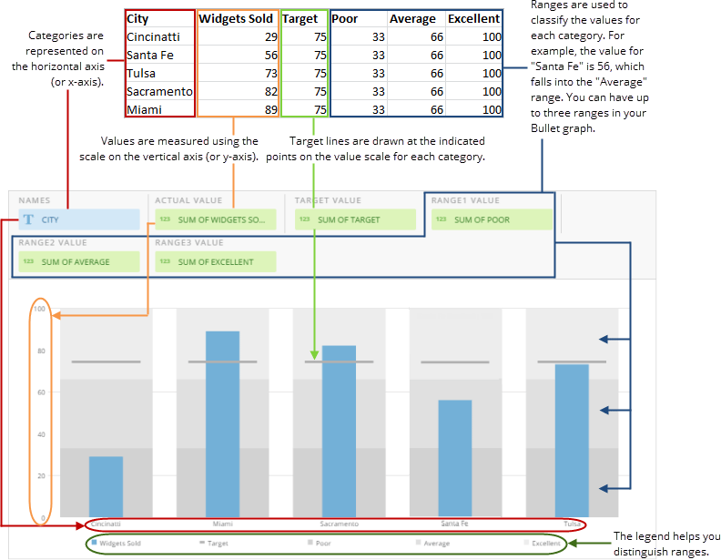
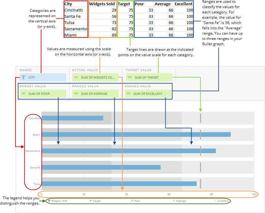
Bullet charts are available in both vertical and horizontal sub-types. In vertical bullet charts, categories are represented along the horizontal axis (or x-axis) and values are measured on the vertical axis (or y-axis). horizontal bullet charts are the opposite, with categories along the vertical axis and values measured on the horizontal axis.
**Video - Building a Bullet Chart**
## Powering bullet charts
Bullet charts require only two columns or rows of data from your DataSet in order to be powered up—however, if you want to include key features such as ranges and target values, you will need to specify additional columns. A bullet chart with target values and three ranges requires six data columns—one for values, one for categories, one for target values, and one for each of the three ranges. Boundaries for each range are determined using the specified range value and the value of the next lowest range, or 0 for **Range1**. For example, if the value for **Range1** was "33," the value for **Range2** was "66," and the value for **Range3** was "100," the boundaries of the lowest range would be 0 and 33; the boundaries of the middle range would be 34 and 66, and the values of the highest range would be 67 and 100.
For information about value, category, and series data, see [Understanding Chart Data](/s/article/360043428693 "Understanding Chart Data").
In the Analyzer, you choose the columns containing the data for your bullet chart. For more information about choosing data columns, see [Applying DataSet Columns to Your Chart](/s/article/360043428713 "Applying DataSet Columns to Your Chart").
For more information about formatting charts in the Analyzer, see [KPI Card Building Part 2: The Analyzer](/s/topic/0TO5w000000ZaoUGAS "KPI Card Building Part 2: The Card Builder").
The following graphic shows you how the data from a typical column-based spreadsheet is converted into a vertical bullet chart:
 The following graphic shows you how the data from a typical column-based spreadsheet is converted into a horizontal bullet chart:
 ## Customizing bullet charts
You can customize the appearance of a bullet chart by editing its **Chart Properties**. For information about all chart properties, see [Chart Properties](/s/topic/0TO5w000000ZaodGAC "Chart Properties").
## Customizing bullet charts
You can customize the appearance of a bullet chart by editing its **Chart Properties**. For information about all chart properties, see [Chart Properties](/s/topic/0TO5w000000ZaodGAC "Chart Properties").