 ***
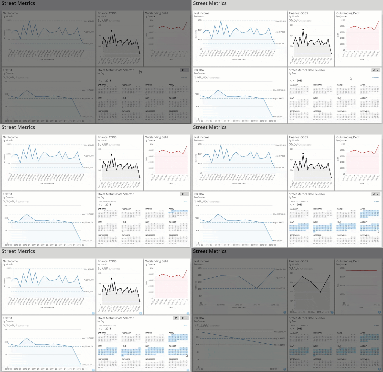
Date Selector Cards are a type of Filter Cards. Learn about the other Filter Card types:
* [Slicer, Checkbox Selector, and Radio Button Selector Cards](/s/article/360043429313 "Slicer, Checkbox, and Radio Button Cards")
* [Range Selector Card](/s/article/360042924954 "Range Card")
***
### Power Date Selector Cards
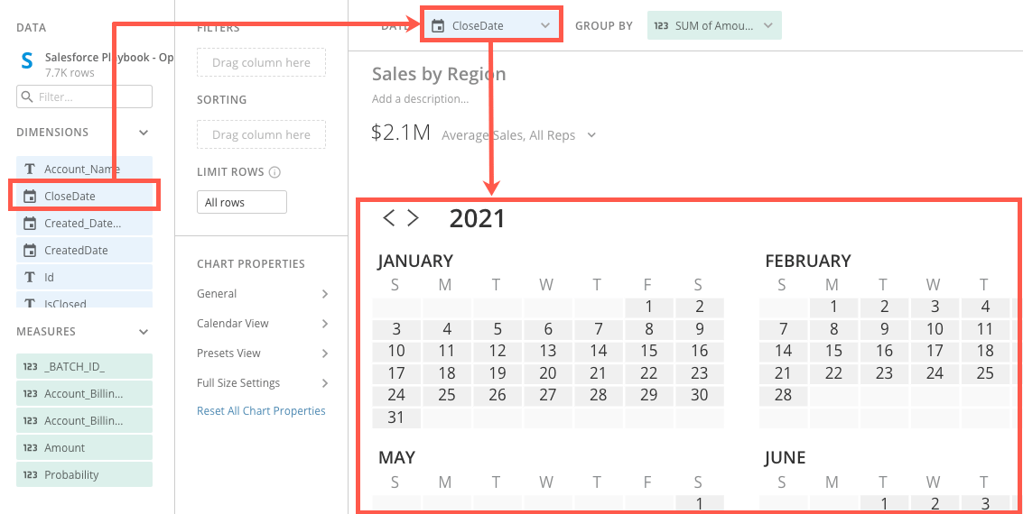
In Analyzer, creating a Date Selector Card requires two columns or rows of data from your DataSet. One is a date column. Drag a date column to the **Date** field above the chart.
The other required column/row belongs in the **Group By** field. Though this field is required to power the card, it doesn't necessarily matter what column/row you place here. If you need to aggregate the data, you can use this field to do so.
For example, if the date column is duplicated in your DataSet, you can make the dates unique by aggregating.
***
Date Selector Cards are a type of Filter Cards. Learn about the other Filter Card types:
* [Slicer, Checkbox Selector, and Radio Button Selector Cards](/s/article/360043429313 "Slicer, Checkbox, and Radio Button Cards")
* [Range Selector Card](/s/article/360042924954 "Range Card")
***
### Power Date Selector Cards
In Analyzer, creating a Date Selector Card requires two columns or rows of data from your DataSet. One is a date column. Drag a date column to the **Date** field above the chart.
The other required column/row belongs in the **Group By** field. Though this field is required to power the card, it doesn't necessarily matter what column/row you place here. If you need to aggregate the data, you can use this field to do so.
For example, if the date column is duplicated in your DataSet, you can make the dates unique by aggregating.
 Learn more about choosing data columns in [Applying DataSet Columns to Your Chart](/s/article/360043428713 "Applying DataSet Columns to Your Chart").
Learn how to format charts in Analyzer in our [Analyzer documentation](https://domo-support.domo.com/s/topic/0TO5w000000ZaoUGAS/analyzer?language=en_US).
### Customize Date Selector Cards
You can customize the appearance of a Date Selector Card by editing its chart properties. Learn about all available [Chart Properties](/s/topic/0TO5w000000ZaodGAC "Chart Properties").
This table details the unique properties of Date Selector Cards:
Learn more about choosing data columns in [Applying DataSet Columns to Your Chart](/s/article/360043428713 "Applying DataSet Columns to Your Chart").
Learn how to format charts in Analyzer in our [Analyzer documentation](https://domo-support.domo.com/s/topic/0TO5w000000ZaoUGAS/analyzer?language=en_US).
### Customize Date Selector Cards
You can customize the appearance of a Date Selector Card by editing its chart properties. Learn about all available [Chart Properties](/s/topic/0TO5w000000ZaodGAC "Chart Properties").
This table details the unique properties of Date Selector Cards:
Property
Description
Example
General > Selected Color
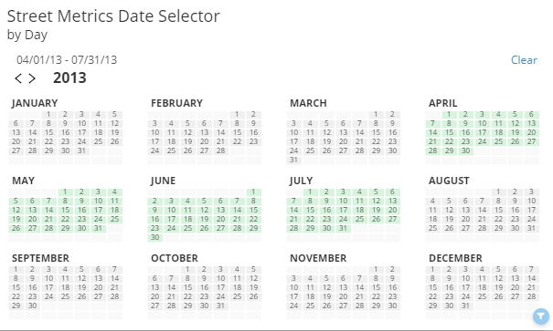
Lets you change the highlight color used when you select a range of calendar dates in the card.
Calendar view > Highlight today
When checked, a box appears around today's date in the calendar. In the example at right, the date of "July 25" is highlighted.
Calendar view > View
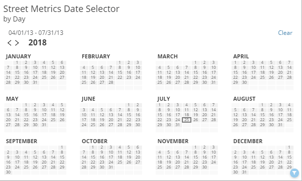
Determines the calendar view that is used. The following options are available:
Auto (Default) — The view is determined automatically based on your data. For example, if you had at least a year's worth of data in your date column, a yearly view would be used.
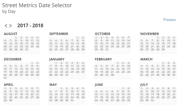
Last Year Rolling — The calendar shows dates from a year ago up until the current month. This is the option shown in the example at right.
Next Year Rolling — The calendar shows dates from the current month up until a year from now.
Year — The current year is shown.
Month — The current month is shown.
Calendar view > Dates from
Specifies whether the dates that appear in the calendar are based on the current date, are automatically determined based on your data, or are user-specified (in which case, you will enter the date parameters in the Year , Selected Year , and Month fields.
—
Calendar view > Year
Determines whether the year shown in the calendar is the current year, the previous year, or the next year. You can also specify a year by selecting Specified and entering the desired year in the Selected Year field. This option is only available when Dates From is set to User Specified .
—
Calendar view > Selected year
Lets you enter a specific year to be shown in the calendar. This option is only available when Dates From is set to User Specified and Year is set to Specified .
—
Calendar view > Month
Lets you enter a specific month to be shown in the calendar. This option is only available when Dates From is set to User Specified and View is set to Month .
—
Calendar view > First day of week
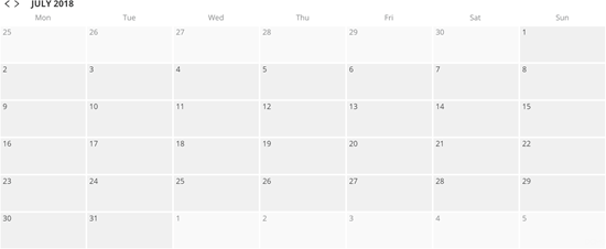
Lets you select the first day of the week to be shown in your calendar. In the example at right, the first day of the week is Monday.
Calendar view > First month displayed
Lets you select the first month of the year to be shown in your calendar. This option is only available when Year is selected in the View menu.
—