 ## Limitations
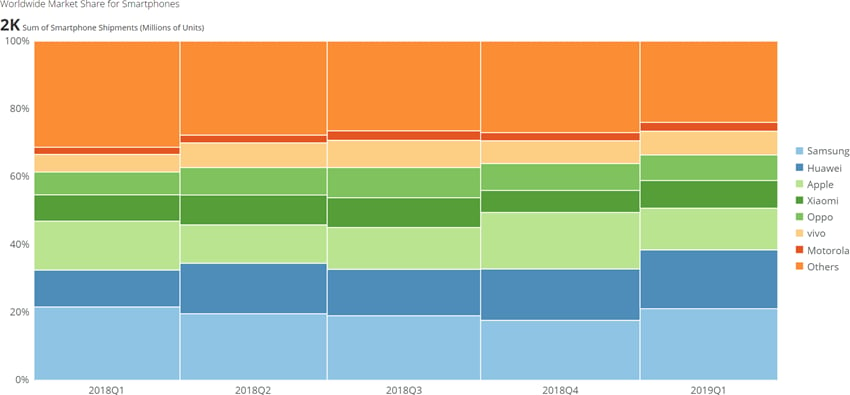
Note that Marimekko charts may be hard to read, especially when there are many segments. Also, because segments do not have a common baseline, it can be difficult for viewers to make accurate comparisons between segments. Therefore, Marimekko charts are usually better for providing a more general overview of the data.
## Powering Marimekko charts
A Marimekko chart requires three data columns or rows from your DataSet—one for categories, one for the series in each category, and one for values. For information about value, category, and series data, see [Understanding Chart Data](/s/article/360043428693 "Understanding Chart Data").
In the Analyzer, you choose the columns containing the data for your Marimekko chart. For more information about choosing data columns, see [Applying DataSet Columns to Your Chart](/s/article/360043428713 "Applying DataSet Columns to Your Chart").
For more information about formatting charts in the Analyzer, see [KPI Card Building Part 2: The Analyzer](/s/article/360043428673 "KPI Card Building Part 2: The Analyzer").
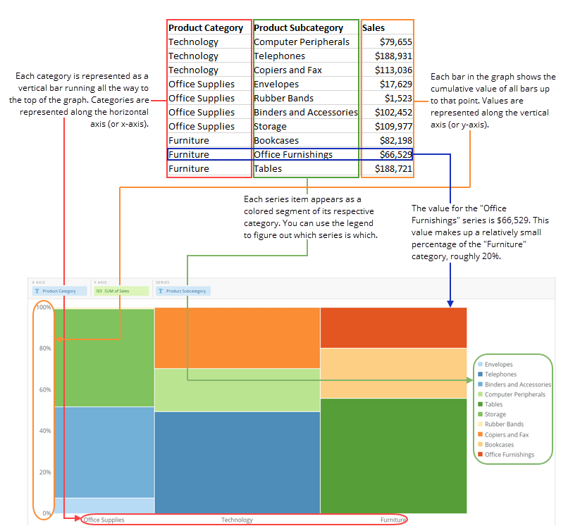
The following graphic shows you how the data from a typical column-based spreadsheet is converted into a vertical Marimekko chart:
## Limitations
Note that Marimekko charts may be hard to read, especially when there are many segments. Also, because segments do not have a common baseline, it can be difficult for viewers to make accurate comparisons between segments. Therefore, Marimekko charts are usually better for providing a more general overview of the data.
## Powering Marimekko charts
A Marimekko chart requires three data columns or rows from your DataSet—one for categories, one for the series in each category, and one for values. For information about value, category, and series data, see [Understanding Chart Data](/s/article/360043428693 "Understanding Chart Data").
In the Analyzer, you choose the columns containing the data for your Marimekko chart. For more information about choosing data columns, see [Applying DataSet Columns to Your Chart](/s/article/360043428713 "Applying DataSet Columns to Your Chart").
For more information about formatting charts in the Analyzer, see [KPI Card Building Part 2: The Analyzer](/s/article/360043428673 "KPI Card Building Part 2: The Analyzer").
The following graphic shows you how the data from a typical column-based spreadsheet is converted into a vertical Marimekko chart:
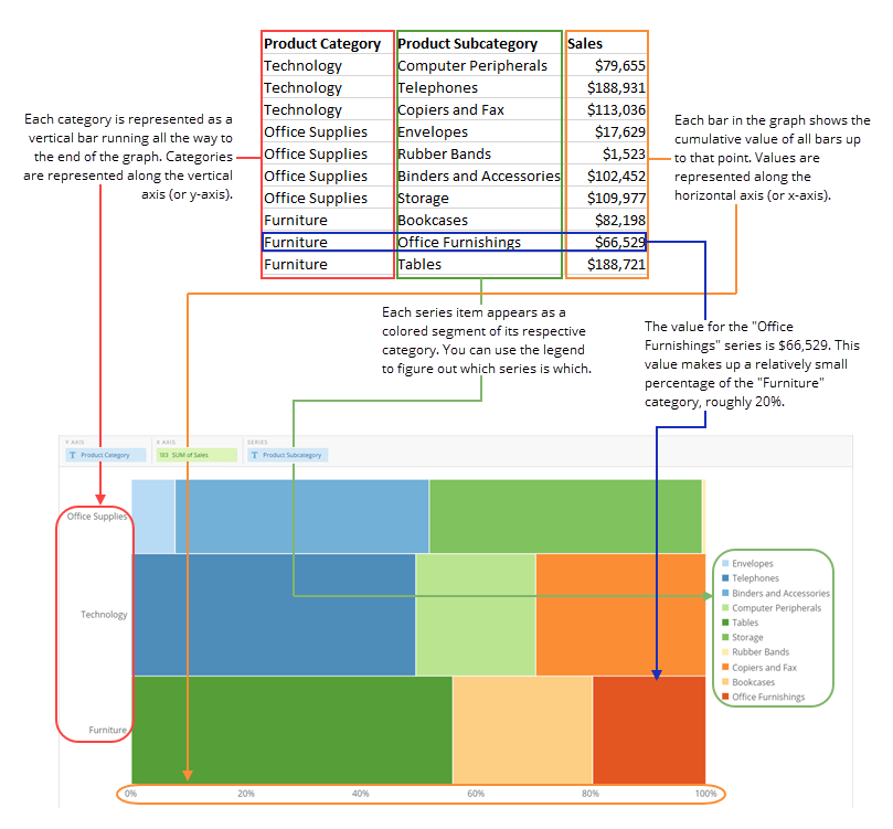
 The following graphic shows you how the data from a typical column-based spreadsheet is converted into a horizontal Marimekko chart:
 ## Customizing Marimekko charts
You can customize the appearance of a Marimekko chart by editing its **Chart Properties**. For information about all chart properties, see [Chart Properties](/s/article/360042925154 "Chart Properties"). Unique properties of Marimekko charts include the following:
## Customizing Marimekko charts
You can customize the appearance of a Marimekko chart by editing its **Chart Properties**. For information about all chart properties, see [Chart Properties](/s/article/360042925154 "Chart Properties"). Unique properties of Marimekko charts include the following:
| Property | Description |
|---|---|
| General > Sort on Totals | Allows you to sort categories in many kinds of bar and lollipop charts by their total values, in either ascending or descending order. If you select Default , the default sort is applied. This option does not work when the chart has automatic time scaling applied. (You can turn off automatic time scaling by checking the box for Category Scale > Never Use Time Scale . |