> ## Documentation Index
> Fetch the complete documentation index at: https://domoinc-openapi-sync-dataflows.mintlify.site/llms.txt
> Use this file to discover all available pages before exploring further.

# Multi-Line Chart

## Intro

A multi-line chart is a basic [line chart](/s/article/360042924274 "Line Graph") with one or more additional lines that represent comparison trends.

## Powering multi-line charts

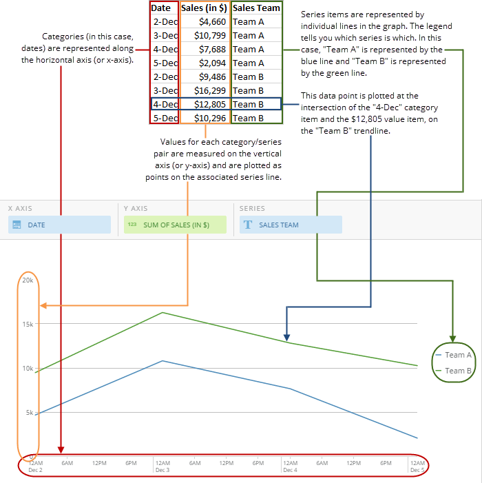
This type of chart requires three columns or rows from your DataSet—one for categories (generally dates), one for values, and one for series items. You should have at least two different series in your DataSet, each of which is represented in the chart as a line. If you have more than two series, each additional series is implemented as an additional line in the chart. If your DataSet includes any series items with only one occurrence, those items appear as dots in the chart.

For information about value, category, and series data, see [Understanding Chart Data](/s/article/360043428693 "Understanding Chart Data").

In the Analyzer, you choose the columns containing the data for your multi-line chart. For more information about choosing data columns, see [Applying DataSet Columns to Your Chart](/s/article/360043428713 "Applying DataSet Columns to Your Chart").

For more information about formatting charts in the Analyzer, see [KPI Card Building Part 2: The Analyzer](/s/article/360043428673 "KPI Card Building Part 2: The Card Builder").

The following graphic shows you how the data from a typical column-based spreadsheet is converted into a multi-line chart:

<Frame>
  <img alt="" src="https://mintcdn.com/domoinc-openapi-sync-dataflows/D4XP-ZUu0hZKYNDT/images/kb/ka05w00000123ms-00N5w00000Ri7BU-0EM5w000005vP6B.png?fit=max&auto=format&n=D4XP-ZUu0hZKYNDT&q=85&s=cfa5557ab4ae7735be499ed62136bbe4" style={{width: 700, height: 701}} width="700" height="701" data-path="images/kb/ka05w00000123ms-00N5w00000Ri7BU-0EM5w000005vP6B.png" />
</Frame>

## Customizing multi-line charts

You can customize the appearance of a multi-line chart by editing its **Chart Properties**. For information about all chart properties, see [Chart Properties](/s/article/360042925154 "Chart Properties"). Unique properties of multi-line charts include the following. You can click a thumbnail image to see a larger image.

**Note:** Though **Last Value Projection** properties appear in the **Chart Properties** for multi-line charts, they work only when the chart contains only one series.

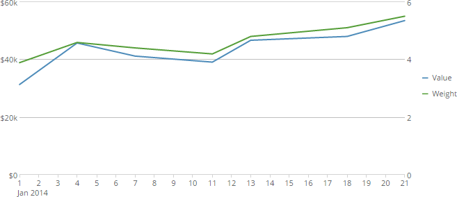
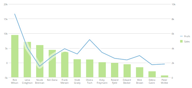
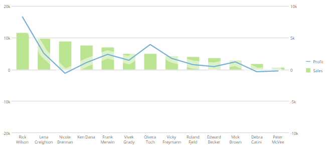
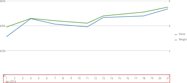
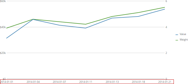
<table border="1" cellpadding="1" cellspacing="1" data-aura-rendered-by="33:209;a"><thead><tr><th colspan="1" rowspan="1"><p> Property </p></th><th colspan="1" rowspan="1"><p> Description </p></th><th colspan="1" rowspan="1"><p> Example </p></th></tr></thead><tbody><tr><td colspan="1" rowspan="1"><p> General > Show Right Scale </p></td><td colspan="1" rowspan="1"><p> Includes a second vertical scale in most kinds of multi-line charts, with or without date or time data. This is useful in situations where you want to display lines with vastly different value increments in the same chart. In the example at right, the left scale shows values in increments of \$20,000 and the right scale shows values in increments of 2. Because two scales are present, both lines can be interpreted independently on their own scales. If there was only one scale, the \$20,000 increments would be used for both lines, so one of the lines would appear flat. </p></td><td colspan="1" rowspan="1"><p><a target="_blank" title="/@api/deki/files/420/dual_axis_line_chart.png"><img alt="" src="https://mintcdn.com/domoinc-openapi-sync-dataflows/U1MglXZKeJZebGlP/images/kb/ka05w00000123lK-00N5w00000Ri7BU-0EM5w000005vP11.png?fit=max&auto=format&n=U1MglXZKeJZebGlP&q=85&s=84e024c4669cb84f17812b5b005c6468" width="657" height="284" data-path="images/kb/ka05w00000123lK-00N5w00000Ri7BU-0EM5w000005vP11.png" /></a></p></td></tr><tr><td colspan="1" rowspan="1"><p> General > Lines on Left Scale </p></td><td colspan="1" rowspan="1"><p> When <b> Show Right Scale </b> is checked, determines how many of the lines in the chart are measured on the left scale. All additional lines are measured on the right scale. If <b> Show Right Scale </b> is not checked, this property does not work. </p></td><td colspan="1" rowspan="1"><p> — </p></td></tr><tr><td colspan="1" rowspan="1"><p> General > Sync Zero Lines </p></td><td colspan="1" rowspan="1"><p> Syncs the zero lines in dual-scale charts with negative values so the "0" values match. For multi-line charts, this only works when <b> General > Show Right Scale </b> is checked. </p><p> The first example at right shows a dual-scale chart with scales that do not match. The right-side chart is being used to measure sales, which are always going to be positive; hence the scale starts at 0. However, the left-side scale is being used to measure profit, which may dip below 0. In this case the scale starts at -2000. Because the scales do not match, the chart is difficult to interpret. </p><p> The second example shows the same chart with the zero lines synced. Even though the other values do not match, the viewer can easily use the zero line as a reference point to interpret the line and bars simultaneously. </p></td><td colspan="1" rowspan="1"><p><a target="_blank" title="/@api/deki/files/1317/zero_line_unsynced.png"><img alt="" src="https://mintcdn.com/domoinc-openapi-sync-dataflows/U1MglXZKeJZebGlP/images/kb/ka05w00000123lK-00N5w00000Ri7BU-0EM5w000005vP14.png?fit=max&auto=format&n=U1MglXZKeJZebGlP&q=85&s=21b8bfd059c580f3e815b7c2d9242a45" width="659" height="303" data-path="images/kb/ka05w00000123lK-00N5w00000Ri7BU-0EM5w000005vP14.png" /></a></p><p><a target="_blank" title="/@api/deki/files/1318/zero_line_synced.png"><img alt="" src="https://mintcdn.com/domoinc-openapi-sync-dataflows/U1MglXZKeJZebGlP/images/kb/ka05w00000123lK-00N5w00000Ri7BU-0EM5w000005vP0d.png?fit=max&auto=format&n=U1MglXZKeJZebGlP&q=85&s=50d1285ac6a5ba764257ceee8d02a6f0" width="652" height="297" data-path="images/kb/ka05w00000123lK-00N5w00000Ri7BU-0EM5w000005vP0d.png" /></a></p></td></tr><tr><td colspan="1" rowspan="1"><p> General > Show as Running Totals </p></td><td colspan="1" rowspan="1"><p> Lets you specify whether lines appear with running totals in most kinds of Line charts. In other words, each point in a series line displays the cumulative total of all points in the line up to that point. </p><p> The example screenshots show the same curved line chart without and with running totals. In the first example, <b> Show as Running Totals </b> is off so the chart appears with each data point reflecting only the new data up to that point. In the second example, <b> Show as Running Totals </b> is on so each data point reflects all of the data in the line up to that point. </p><p> This property is available for the following kinds of line charts: multi-line, curved line, symbol line, and curved symbol Line. </p></td><td colspan="1" rowspan="1"><p><a target="_blank" title="/@api/deki/files/1325/running_totals_off.png"><img alt="" src="https://mintcdn.com/domoinc-openapi-sync-dataflows/U1MglXZKeJZebGlP/images/kb/ka05w00000123lK-00N5w00000Ri7BU-0EM5w000005vP1I.png?fit=max&auto=format&n=U1MglXZKeJZebGlP&q=85&s=7074aaf1f20a2f762936d00845e15804" width="684" height="288" data-path="images/kb/ka05w00000123lK-00N5w00000Ri7BU-0EM5w000005vP1I.png" /></a></p><p><a target="_blank" title="/@api/deki/files/1324/running_totals_on.png"><img alt="" src="https://mintcdn.com/domoinc-openapi-sync-dataflows/U1MglXZKeJZebGlP/images/kb/ka05w00000123lK-00N5w00000Ri7BU-0EM5w000005vP13.png?fit=max&auto=format&n=U1MglXZKeJZebGlP&q=85&s=63bc55ce12fa21315eafb69e9a929746" width="684" height="288" data-path="images/kb/ka05w00000123lK-00N5w00000Ri7BU-0EM5w000005vP13.png" /></a></p></td></tr><tr><td colspan="1" rowspan="1"><p> Category Scale > Never Use Time Scale </p></td><td colspan="1" rowspan="1"><p> Determines which type of timeline is used in line and multi-line charts. </p><p> By default, when time data is used in these charts, Domo automatically makes it appear using a <a class="confluence-link" href="http://wiki.domo.com/confluence/pages/viewpage.action?pageId=37466650" target="_blank" title="Adding Filters to Your Chart"> date grain </a> appropriate for your data. This is shown in the first example at right, in which the timeline takes date data spanning several months and shows it by month. </p><p> If you check this box, however, date data appears as it does in your DataSet. This is shown in the second example at right, in which the time scale uses individual dates, as in the DataSet. </p></td><td colspan="1" rowspan="1"><p><a target="_blank" title="/@api/deki/files/1343/timescales_on.png"><img alt="" src="https://mintcdn.com/domoinc-openapi-sync-dataflows/D4XP-ZUu0hZKYNDT/images/kb/ka05w00000123ms-00N5w00000Ri7BU-0EM5w000005vP6n.png?fit=max&auto=format&n=D4XP-ZUu0hZKYNDT&q=85&s=ec118aabd88a90046f1f33d33e98b0bd" width="650" height="288" data-path="images/kb/ka05w00000123ms-00N5w00000Ri7BU-0EM5w000005vP6n.png" /></a></p><p><a target="_blank" title="/@api/deki/files/1344/timescales_off.png"><img alt="" src="https://mintcdn.com/domoinc-openapi-sync-dataflows/D4XP-ZUu0hZKYNDT/images/kb/ka05w00000123ms-00N5w00000Ri7BU-0EM5w000005vP6c.png?fit=max&auto=format&n=D4XP-ZUu0hZKYNDT&q=85&s=285f4910167c3325d2377b0058b5d68d" width="650" height="290" data-path="images/kb/ka05w00000123ms-00N5w00000Ri7BU-0EM5w000005vP6c.png" /></a></p></td></tr><tr><td colspan="1" rowspan="1"><p> Grid Lines > Remove Min/Max/Avg Lines </p></td><td colspan="1" rowspan="1"><p> Removes the minimum, maximum, and average lines that normally display on mouse-over in standard bar and line charts. </p></td><td colspan="1" rowspan="1"><p> — </p></td></tr><tr><td colspan="1" rowspan="1"><p> Outlier FIltering > Show When Points Above </p></td><td colspan="1" rowspan="1"><p> Filters your line chart to show only those lines with any values above the value you specify. Note that <em> any </em> values above this threshold count toward this filter. So if you entered <span class="mt-font-courier-new"> 5000 </span> for this value, and only one point exceeded 5000, the line would still appear. </p><p> If you enter a value in <b> Show When Points Above </b> that is less than the value you enter in <b> Show When Points Below </b>, only lines with <em> all </em> points between these two values are displayed. </p><p> For more information about this property, including examples, see <a href="/s/article/360042925234" target="_blank" title="Filtering Outliers in a Line Graph"> Filtering Outliers in a Line chart </a>. </p></td><td colspan="1" rowspan="1"> — </td></tr><tr><td colspan="1" rowspan="1"> Outlier FIltering > Show When Points Below </td><td colspan="1" rowspan="1"><p> Filters your line chart to show only those lines with any values below the value you specify. Note that <em> any </em> values below this threshold count toward this filter. So if you entered <span class="mt-font-courier-new"> 5000 </span> for this value, and only one point fell below 5000, the line would still appear. </p><p> If you enter a value in <b> Show When Points Below </b> that is greater than the value you enter in <b> Show When Points Above </b>, only lines with <em> all </em> points between these two values are displayed. </p><p> For more information about this property, including examples, see <a href="/s/article/360042925234" target="_blank" title="Filtering Outliers in a Line Graph"> Filtering Outliers in a Line chart </a>. </p></td><td colspan="1" rowspan="1"> — </td></tr></tbody></table>