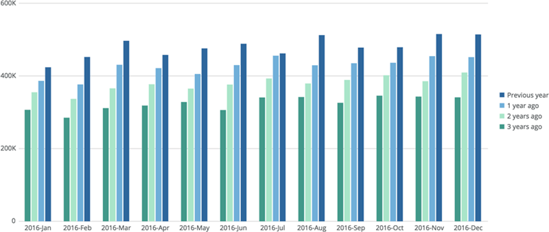
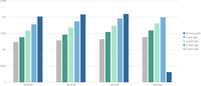
 In this example, earnings for the previous year are represented by a dark blue bar. Earnings for the three years before that are also represented as bars. All years are included in the legend so you can tell which is which.
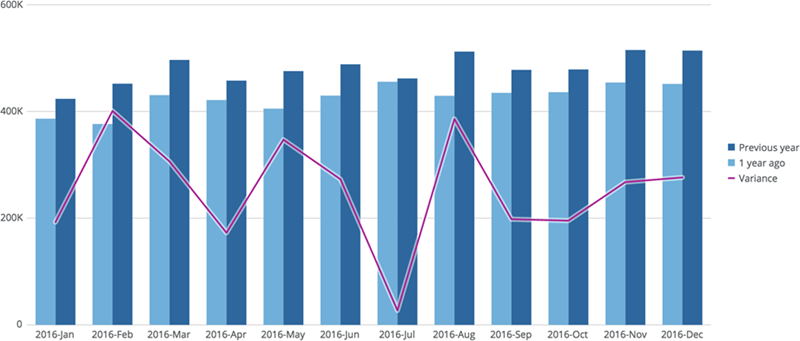
You can also include variance amounts in period-over-period charts. The following screenshot shows a similar chart as the one above, with a line for variance values:
In this example, earnings for the previous year are represented by a dark blue bar. Earnings for the three years before that are also represented as bars. All years are included in the legend so you can tell which is which.
You can also include variance amounts in period-over-period charts. The following screenshot shows a similar chart as the one above, with a line for variance values:
 You build period-over-period charts in the Analyzer in Domo by selecting one of several special period-over-period chart types, applying columns for the x- and y-axes, then setting up your comparison in the date filter menu.
Period-over-Period Chart Type
Description
Screenshot
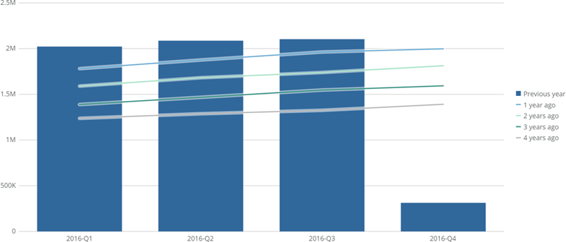
Bar Line
Period being compared is shown as bars; all other periods are shown as lines.
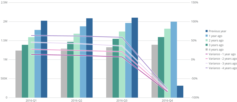
Variance Bar Line
Periods are shown as bars and variance values are shown as lines.
Line Bar
Period being compared is shown as a line; all other periods are shown as bars.
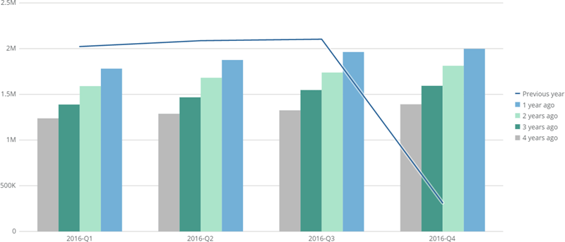
Variance Line Bar
Periods are shown as lines and variance values are shown as bars.
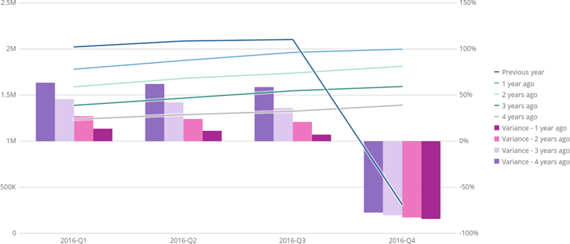
Trendline
All periods are shown as lines.
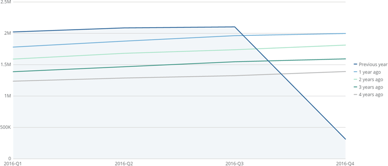
Variance Trendline
All periods and variance values are shown as lines.
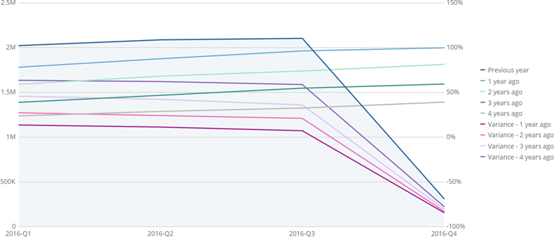
Grouped Bar
All periods are shown as bars.
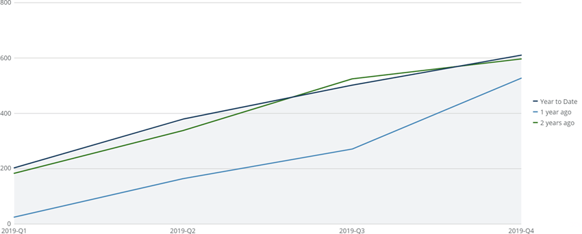
Running Total Line
All periods are split into running total lines .
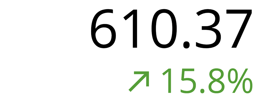
Multi-Value Gauge
Shows the value for the selected date range, with the percent change from the selected comparison timeframe (e.g. the quarter-to-date value with the percent change from one quarter ago for comparison). For more information about these gauges, see Multi-Value Gauge .
Shape Gauge
Shows a different shape depending on your chart properties and the percent of change from the selected comparison timeframe compared to the selected date range. For more information about these gauges, see Shape Gauge .

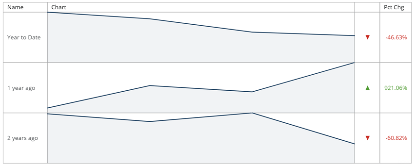
Flex Table
All periods are shown as individual rows within the table, with their own spark line or spark bar chart, percent of change, etc. For more information about these tables, see Flex Table .
Filled Gauge
Gauge shows the value for the selected date range, while labels indicate this value along with the value for the selected comparison timeframe. For more information about these gauges, see Filled Gauge .

Progress Bar
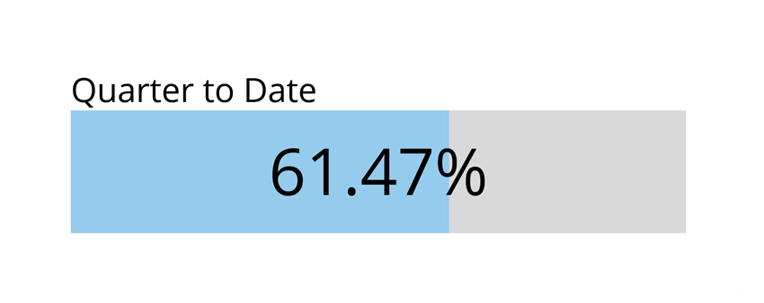
Gauge shows the percent change for the selected comparison timeframe. For more information about these gauges, see Progress Bar Gauge .
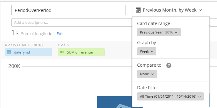 To enable period-over-period functionality in a chart, you must set options in three of the sub-menus in the date filter menu— **Card date range**, **Compare to**, and **chart by**.
### Card date range
In the **Card date range** menu, you select the primary time period you want to compare. For period-over-period to work, you should select a period from either the **Current**, **Previous**, or **Next** sections of the menu. If you select **All Time** or **Between**, the **Compare to** menu is grayed out and unavailable.
### Compare to
In the **Compare to** menu, you specify the time period(s) the period you selected in **Card date range** is being compared to. For this menu to be available, all of the following criteria must apply:
* A period-over-period chart type must be selected in the Chart Picker.
* A date/time column must be applied to your chart's x-axis.
* A **Current, Previous** or **Next** value must be selected in the **Card date range** menu.
* The **chart by** menu must not be set to **None**.
Options may or may not be available in the **Compare to** menu, depending on the time period selected in **Card date range** and the date-time data available in your chart.
For any selectable period under **Compare to**, you can select any of the four most recent instances of that period. For example, if you selected **This Month** under **Card date range** and the current month was November 2016, and you then checked **Month** under **Compare to**, you would then be able to select any of the four months prior to November (July, August, September, or October) for comparison.
You can check **Align** **By Day of Week** options (if available) to show data for 4, 12, or 52 weeks previous to the period selected in **Card date range**.
### Graph by
In the **Graph** **by** menu, you select how the chart data is to be broken down, timewise. For example, if you select **Week**, data points are shown for each week. This is sometimes called "date grain" and is discussed in more detail in [Adding Filters to Your Chart](/s/article/360042924074 "Adding Filters to Your Chart").
You *must* select an option in **Graph by** for your period-over-period chart to work (otherwise, **Compare to** will not be available).
## Changing the chart type in the Details view
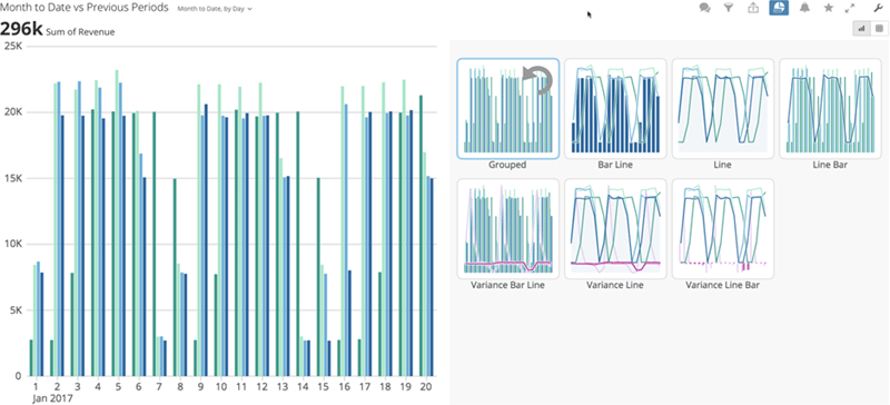
You can change your period-over-period chart type in the Details view using the Chart Type Picker. When you open the Chart Type Picker for a period-over-period chart, you can see thumbnails for the chart as it would appear for each period-over-period chart type, with your data already applied. Click a thumbnail for a chart type to switch your chart over to that chart type.
In the following example, the user opens the Details view for a Variance Bar Line chart. When he opens the Chart Type Picker, thumbnails display for the chart as it would appear with each chart type applied.
To enable period-over-period functionality in a chart, you must set options in three of the sub-menus in the date filter menu— **Card date range**, **Compare to**, and **chart by**.
### Card date range
In the **Card date range** menu, you select the primary time period you want to compare. For period-over-period to work, you should select a period from either the **Current**, **Previous**, or **Next** sections of the menu. If you select **All Time** or **Between**, the **Compare to** menu is grayed out and unavailable.
### Compare to
In the **Compare to** menu, you specify the time period(s) the period you selected in **Card date range** is being compared to. For this menu to be available, all of the following criteria must apply:
* A period-over-period chart type must be selected in the Chart Picker.
* A date/time column must be applied to your chart's x-axis.
* A **Current, Previous** or **Next** value must be selected in the **Card date range** menu.
* The **chart by** menu must not be set to **None**.
Options may or may not be available in the **Compare to** menu, depending on the time period selected in **Card date range** and the date-time data available in your chart.
For any selectable period under **Compare to**, you can select any of the four most recent instances of that period. For example, if you selected **This Month** under **Card date range** and the current month was November 2016, and you then checked **Month** under **Compare to**, you would then be able to select any of the four months prior to November (July, August, September, or October) for comparison.
You can check **Align** **By Day of Week** options (if available) to show data for 4, 12, or 52 weeks previous to the period selected in **Card date range**.
### Graph by
In the **Graph** **by** menu, you select how the chart data is to be broken down, timewise. For example, if you select **Week**, data points are shown for each week. This is sometimes called "date grain" and is discussed in more detail in [Adding Filters to Your Chart](/s/article/360042924074 "Adding Filters to Your Chart").
You *must* select an option in **Graph by** for your period-over-period chart to work (otherwise, **Compare to** will not be available).
## Changing the chart type in the Details view
You can change your period-over-period chart type in the Details view using the Chart Type Picker. When you open the Chart Type Picker for a period-over-period chart, you can see thumbnails for the chart as it would appear for each period-over-period chart type, with your data already applied. Click a thumbnail for a chart type to switch your chart over to that chart type.
In the following example, the user opens the Details view for a Variance Bar Line chart. When he opens the Chart Type Picker, thumbnails display for the chart as it would appear with each chart type applied.
 For more information about the Chart Type Picker, see [Using Card Interaction Tools in a Card Details View](/s/article/360043428653 "Using Card Interaction Tools in a Card Details View").
## Use cases
This section discusses how to use period-over-period chart types to accomplish a variety of commonly needed use cases.
### Use case #1: Year-over-year
**To create a year-over-year chart,**
1. Open the Analyzer, either for an existing Card or in the workflow for building a new Card.
The Card *must* be powered by a DataSet that has at least one date-time column.
2. In the Chart Picker, click the icon for period-over-period charts.
For more information about the Chart Type Picker, see [Using Card Interaction Tools in a Card Details View](/s/article/360043428653 "Using Card Interaction Tools in a Card Details View").
## Use cases
This section discusses how to use period-over-period chart types to accomplish a variety of commonly needed use cases.
### Use case #1: Year-over-year
**To create a year-over-year chart,**
1. Open the Analyzer, either for an existing Card or in the workflow for building a new Card.
The Card *must* be powered by a DataSet that has at least one date-time column.
2. In the Chart Picker, click the icon for period-over-period charts.
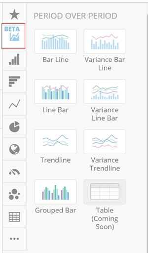 3. Select the desired period-over-period chart type from the Chart Picker.
4. Drag a date column into the **X Axis** field.
5. Drag a value column into the **Y Axis** field.
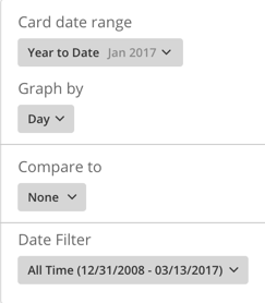
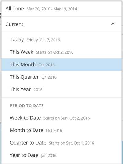
6. Open the date range picker and select **Year to Date** in the **Card date range** menu.
3. Select the desired period-over-period chart type from the Chart Picker.
4. Drag a date column into the **X Axis** field.
5. Drag a value column into the **Y Axis** field.
6. Open the date range picker and select **Year to Date** in the **Card date range** menu.
 7. In the **Compare to** menu, expand the **Previous** section then check the box for **Year over Year**.
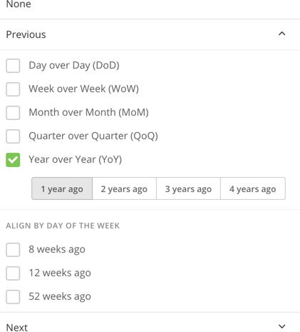 8. (Optional) If you want your chart to show data for additional past years, you can select them by clicking **1 year ago**, **2 years ago**, etc.
You can select as many of the available years as you wish.
9. Under **Graph By**, select the desired date grain for the chart.
Your period-over-period chart is now complete. This chart will roll, so when data becomes available for another day it will be captured in that month and the previous year.
### Use case #2: Year-over-year and month-over-month combined
**To create a chart with both year-over-year and month-over-month,**
1. Open the Analyzer, either for an existing Card or in the workflow for building a new Card.
The Card *must* be powered by a DataSet that has at least one date-time column.
2. In the Chart Picker, click the icon for period-over-period charts.
8. (Optional) If you want your chart to show data for additional past years, you can select them by clicking **1 year ago**, **2 years ago**, etc.
You can select as many of the available years as you wish.
9. Under **Graph By**, select the desired date grain for the chart.
Your period-over-period chart is now complete. This chart will roll, so when data becomes available for another day it will be captured in that month and the previous year.
### Use case #2: Year-over-year and month-over-month combined
**To create a chart with both year-over-year and month-over-month,**
1. Open the Analyzer, either for an existing Card or in the workflow for building a new Card.
The Card *must* be powered by a DataSet that has at least one date-time column.
2. In the Chart Picker, click the icon for period-over-period charts.
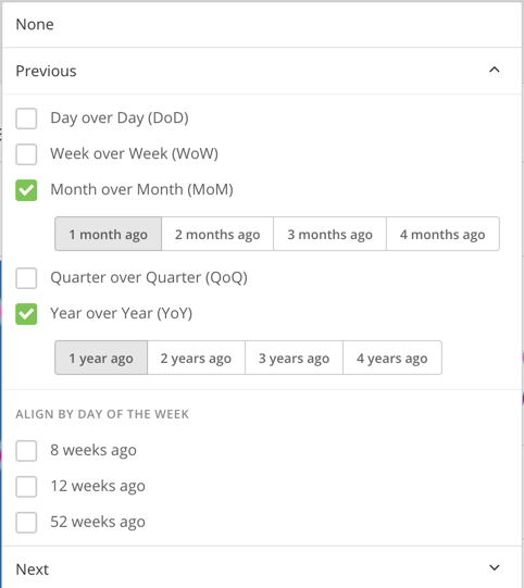
 7. In the **Compare to** menu, expand the **Previous** section then check the boxes for **Month over Month** and **Year over Year**.
 8. Under **Graph By**, select **Week** or **Day** as the date grain.
Your period-over-period chart is now complete. This chart will roll, so when data becomes available for another day it will be captured in that month and the previous year.
### Use case #3: This month vs. 1 week ago, 4 weeks ago, and 52 weeks ago
**To create a POP chart for Last 12 Weeks vs. Previous Weeks,**
1. Open the Analyzer, either for an existing Card or in the workflow for building a new Card.
The Card *must* be powered by a DataSet that has at least one date-time column.
2. In the Chart Picker, click the icon for period-over-period charts.
8. Under **Graph By**, select **Week** or **Day** as the date grain.
Your period-over-period chart is now complete. This chart will roll, so when data becomes available for another day it will be captured in that month and the previous year.
### Use case #3: This month vs. 1 week ago, 4 weeks ago, and 52 weeks ago
**To create a POP chart for Last 12 Weeks vs. Previous Weeks,**
1. Open the Analyzer, either for an existing Card or in the workflow for building a new Card.
The Card *must* be powered by a DataSet that has at least one date-time column.
2. In the Chart Picker, click the icon for period-over-period charts.
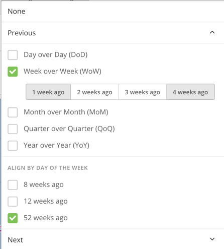 11. Under **Graph by**, select **Week** or **Day**.
Your period-over-period chart is now complete. This chart will roll, so when data becomes available for another day it will be captured in that month and the previous year.
### Use Case #4: Marketing Event Compare To
**To create a Marketing Event Compare To chart,**
1. Open the Analyzer, either for an existing Card or in the workflow for building a new Card.
The Card *must* be powered by a DataSet that has at least one date-time column.
2. In the Chart Picker, click the new icon for POP charts.
11. Under **Graph by**, select **Week** or **Day**.
Your period-over-period chart is now complete. This chart will roll, so when data becomes available for another day it will be captured in that month and the previous year.
### Use Case #4: Marketing Event Compare To
**To create a Marketing Event Compare To chart,**
1. Open the Analyzer, either for an existing Card or in the workflow for building a new Card.
The Card *must* be powered by a DataSet that has at least one date-time column.
2. In the Chart Picker, click the new icon for POP charts.
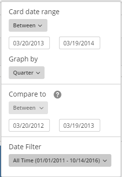 10. Under **Graph** **by**, select **Day**.
Your Marketing Event Compare To chart is now complete. This chart is fixed, so the dates do not change unless you modify them.
### Use Case #5: "Last" time period
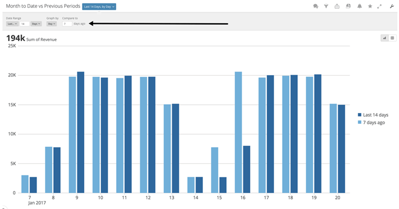
You can use the **Last** option to select any last time period. For example, you could have a chart showing the last 2 weeks, charted by day, with a comparison showing the last 7 days. This use case shows you how to do this to an already-created Period-over-Period chart in the Details view for the chart.
**To include a "Last" time period in a period-over-period chart,**
1. Open the Details view for your period-over-period chart.
2. Click the date range dropdown next to the chart name.
3. Under **Date Range**, select **Last** in the first dropdown menu, enter a value for the number of time periods in the field, then select the desired time period in the last dropdown.
4. Select the desired date grain under **Graph by.**
5. Under **Compare To**, enter the number of time periods to show as a comparison. (The time period used here will always be the same as the one you select under **chart by**.)
10. Under **Graph** **by**, select **Day**.
Your Marketing Event Compare To chart is now complete. This chart is fixed, so the dates do not change unless you modify them.
### Use Case #5: "Last" time period
You can use the **Last** option to select any last time period. For example, you could have a chart showing the last 2 weeks, charted by day, with a comparison showing the last 7 days. This use case shows you how to do this to an already-created Period-over-Period chart in the Details view for the chart.
**To include a "Last" time period in a period-over-period chart,**
1. Open the Details view for your period-over-period chart.
2. Click the date range dropdown next to the chart name.
3. Under **Date Range**, select **Last** in the first dropdown menu, enter a value for the number of time periods in the field, then select the desired time period in the last dropdown.
4. Select the desired date grain under **Graph by.**
5. Under **Compare To**, enter the number of time periods to show as a comparison. (The time period used here will always be the same as the one you select under **chart by**.)
 ## Multiple series in period-over-period charts
The Analyzer currently includes options only for a single series when building period-over-period charts. However, many options are available for doing this using DataFlows and Beast Mode calculations. Here is one method for doing so using a DataFlow:
1. Identify the year of the date field, such as year(`DATE FIELD`).
2. Identify the year of the current date, such as year(curdate).
3. Use the formula year(`DATE FIELD`) - year(curdate) to create an offset between the current date and the date field.
So if year(curdate)) = 2017 and year(`DATE FIELD`) = 2016, the year offset would be -1.
4. Create the following Beast Mode calculations:
* Current Year: Case when `Year Offset` = 0 then `Amount` end
* Prior Year: Case when `Year Offset` = -1 then `Amount` end
For more information about DataFlows, see [Data Transformation](/s/topic/0TO5w000000ZamzGAC).
## Multiple series in period-over-period charts
The Analyzer currently includes options only for a single series when building period-over-period charts. However, many options are available for doing this using DataFlows and Beast Mode calculations. Here is one method for doing so using a DataFlow:
1. Identify the year of the date field, such as year(`DATE FIELD`).
2. Identify the year of the current date, such as year(curdate).
3. Use the formula year(`DATE FIELD`) - year(curdate) to create an offset between the current date and the date field.
So if year(curdate)) = 2017 and year(`DATE FIELD`) = 2016, the year offset would be -1.
4. Create the following Beast Mode calculations:
* Current Year: Case when `Year Offset` = 0 then `Amount` end
* Prior Year: Case when `Year Offset` = -1 then `Amount` end
For more information about DataFlows, see [Data Transformation](/s/topic/0TO5w000000ZamzGAC).