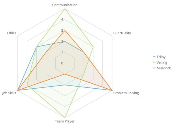
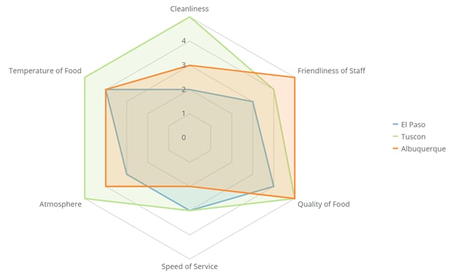
 * As a restaurant franchise owner, you could use a radar chart to compare aspects of different franchise locations:
 ### Limitations
Radar charts may be difficult to interpret, especially as more and more series are added. If you need to show more than 3 series, you may want to consider a different chart type. Further, it is hard to visually compare lengths of different spokes, because radial distances are hard to judge.
An easier-to-read alternative to radar charts is the line chart. This chart type is especially helpful for showing time series.
## Powering radar charts
Radar charts require three columns or rows of data from your DataSet—one for categories (generally dates), one for values, and one for series data. At least three categories must be present in a radar chart. For information about value, category, and series data, see [Understanding Chart Data](/s/article/360043428693 "Understanding Chart Data").
In the Analyzer, you choose the columns containing the data for your radar chart. For more information about choosing data columns, see [Applying DataSet Columns to Your Chart](/s/article/360043428713 "Applying DataSet Columns to Your Chart").
For more information about formatting charts in the Analyzer, see [KPI Card Building Part 2: The Analyzer](/s/article/360043428673 "KPI Card Building Part 2: The Card Builder").
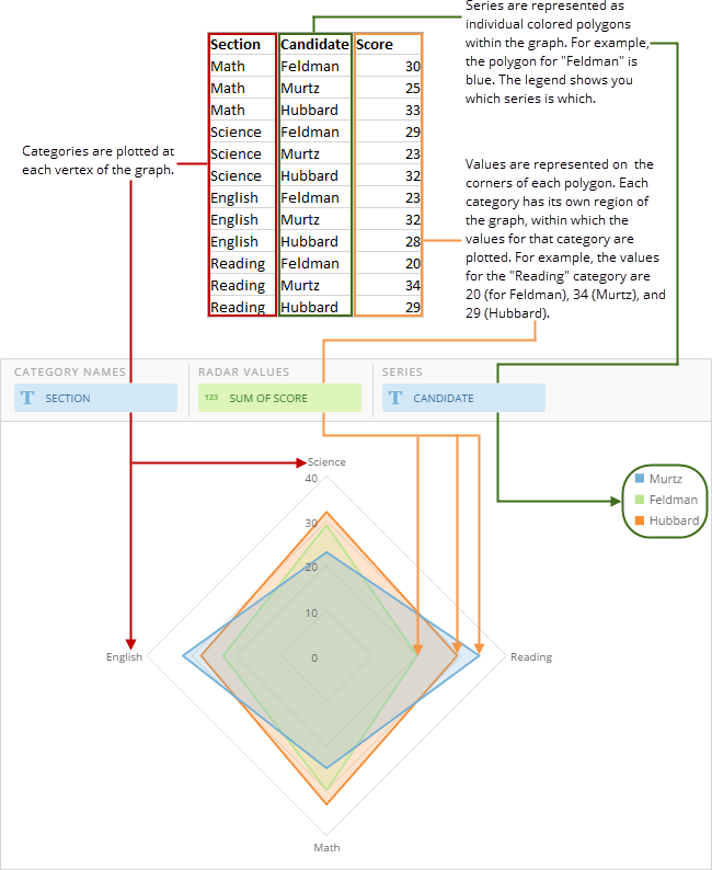
The following graphic shows you how the data from a typical column-based spreadsheet is converted into a radar chart:
### Limitations
Radar charts may be difficult to interpret, especially as more and more series are added. If you need to show more than 3 series, you may want to consider a different chart type. Further, it is hard to visually compare lengths of different spokes, because radial distances are hard to judge.
An easier-to-read alternative to radar charts is the line chart. This chart type is especially helpful for showing time series.
## Powering radar charts
Radar charts require three columns or rows of data from your DataSet—one for categories (generally dates), one for values, and one for series data. At least three categories must be present in a radar chart. For information about value, category, and series data, see [Understanding Chart Data](/s/article/360043428693 "Understanding Chart Data").
In the Analyzer, you choose the columns containing the data for your radar chart. For more information about choosing data columns, see [Applying DataSet Columns to Your Chart](/s/article/360043428713 "Applying DataSet Columns to Your Chart").
For more information about formatting charts in the Analyzer, see [KPI Card Building Part 2: The Analyzer](/s/article/360043428673 "KPI Card Building Part 2: The Card Builder").
The following graphic shows you how the data from a typical column-based spreadsheet is converted into a radar chart:
 ## Customizing radar charts
You can customize the appearance of a radar chart by editing its **Chart Properties**. For information about all chart properties, see [Chart Properties](/s/article/360042925154 "Chart Properties"). Unique properties of radar charts include the following. You can click a thumbnail image to see a larger image.
## Customizing radar charts
You can customize the appearance of a radar chart by editing its **Chart Properties**. For information about all chart properties, see [Chart Properties](/s/article/360042925154 "Chart Properties"). Unique properties of radar charts include the following. You can click a thumbnail image to see a larger image.
Property
Description
Example
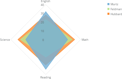
General > Series Transparency
Determines the transparency for the fill areas in a radar chart. You can specify any value between 0 and 100 , where 0 means the fill areas are completely opaque and 100 means they have no fill at all. In the example, the transparency has been set to 20 .
Category Scale > Wrap Width
Allows you to specify the number of pixels at which category labels will wrap in radar charts.
—