> ## Documentation Index
> Fetch the complete documentation index at: https://domoinc-openapi-sync-dataflows.mintlify.site/llms.txt
> Use this file to discover all available pages before exploring further.
# Symbol Overlay Chart
## Intro
Symbol Overlay charts are similar to [Symbol charts](/s/article/360043429553 "Stacked Bar Graph"), the difference being that in a Symbol chart, symbols in a given series are shown side by side rather than overlaid on top of each other.
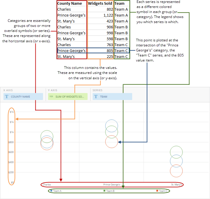
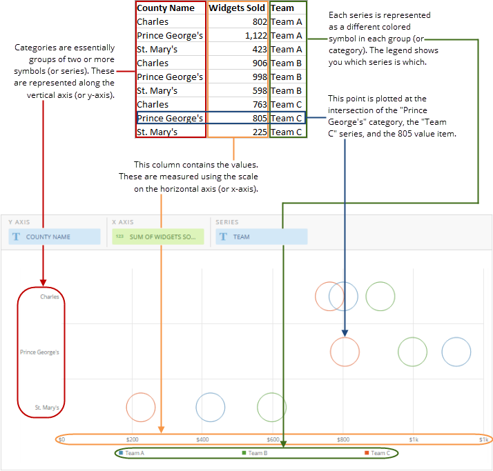
Symbol Overlay charts include both vertical and horizontal subtypes. In a vertical Symbol Overlay chart, categories are represented along the horizontal axis (or x-axis) and values are measured on the vertical axis (or y-axis). A horizontal Symbol Overlay chart has the same overall concept, but the categories are represented along the vertical axis and the values are represented along the horizontal axis.
## Powering Symbol Overlay charts
A Symbol Overlay chart requires three data columns or rows from your DataSet—one for categories, one for the series in each category, and one for values. For information about value, category, and series data, see [Understanding Chart Data](/s/article/360043428693 "Understanding Chart Data").
In the Analyzer, you choose the columns containing the data for your Symbol Overlay chart. For more information about choosing data columns, see [Applying DataSet Columns to Your Chart](/s/article/360043428713 "Applying DataSet Columns to Your Chart").
For more information about formatting charts in the Analyzer, see [Visualization Card Building Part 2: The Analyzer](/s/topic/0TO5w000000ZaoUGAS "KPI Card Building Part 2: The Card Builder").
The following graphic shows you how the data from a typical column-based spreadsheet is converted into a vertical Symbol Overlay chart:
 The following graphic shows you how the data from a typical column-based spreadsheet is converted into a horizontal Symbol Overlay chart:
 ## Customizing Symbol Overlay charts
You can customize the appearance of a Symbol chart by editing its **Chart Properties**. For information about all chart properties, see [Chart Properties](/s/topic/0TO5w000000ZaodGAC "Chart Properties").
## Customizing Symbol Overlay charts
You can customize the appearance of a Symbol chart by editing its **Chart Properties**. For information about all chart properties, see [Chart Properties](/s/topic/0TO5w000000ZaodGAC "Chart Properties").