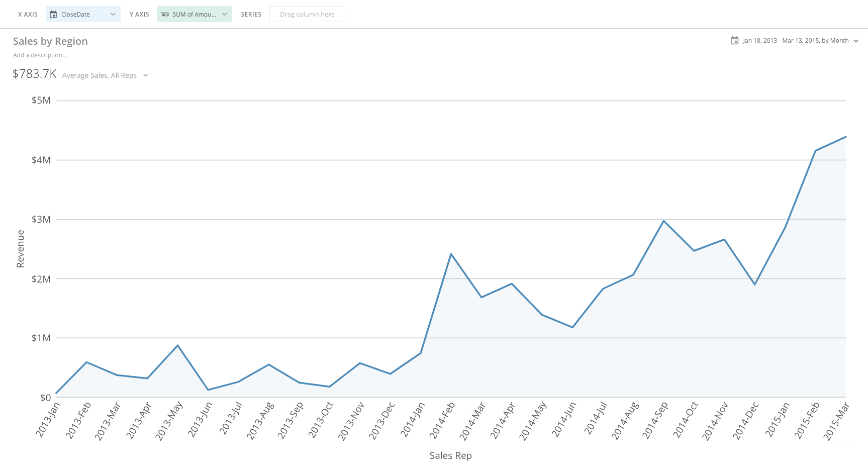
 You add scale marker ranges to charts in the **Chart Properties**.
**Video - Dynamic Scale Markers**
## Available properties
The following table lists and describes all properties of scale marker ranges available in the **Chart Properties**:
You add scale marker ranges to charts in the **Chart Properties**.
**Video - Dynamic Scale Markers**
## Available properties
The following table lists and describes all properties of scale marker ranges available in the **Chart Properties**:
Property | Description | Required? |
|---|---|---|
| Text | Lets you specify text to replace the default word "GOAL" that normally appears above the top left corner of the chart when a scale marker has been set. If the chart contains a legend, an item for the scale marker is added to the legend with this text (unless you hide it by checking the Scale Marker > Hide in Legend box). | No |
| Scale | In dual-scale charts, lets you specify whether the goal in the chart is associated with the left or right scale. | Yes (for dual-scale charts) |
| Type | Lets you specify whether the scale marker is a line or a range of values. | Yes |
| Value Type | Lets you determine how the scale marker line is calculated. A range of options is available, such as minimum and maximum, average, standard deviation, and more. If you select Manual (the default), you enter the desired value in the Value field. Otherwise the value is calculated from the data in the chart. | Yes |
| Value | Lets you specify the value of your scale marker line when you have selected Manual (or Default) for Value Type . This option is only available when you select Line in the Type menu. | Yes (for Line markers) |
| Percentile Value | Lets you calculate the value of your line based on a specified percentile value between 0 and 100. This option is available only when you select Line in the Type menu and Percentile in the Value Type menu. | Yes (for Line markers when Percentile is selected) |
| Percentage Of | Lets you specify whether your percentage is derived from the maximum, minimum, average, or median value of the chart. This option is available only when you select Line in the Type menu and Percentage in the Value Type menu. | Yes (for Line markers when Percentage is selected) |
| Percentage Value | Lets you specify the percentage value calculated from the maximum, minimum, average, or median value of the chart (as selected in the Percentage Of field). This option is available only when you select Line in the Type menu and Percentage in the Value Type menu. | Yes (for Line markers when Percentage is selected) |
| Standard Deviations | Lets you calculate your scale marker value based on a specified number of standard deviations from the mean. If you enter a positive value, your scale marker value will be above the mean. If you enter a negative value, your scale marker value will be below the mean. This option is available only when you select Line in the Type menu and Standard Deviations in the Value Type menu. | Yes (for Line markers when Standard Deviations is selected) |
Color | Lets you specify the color of your scale marker line, together with the color of the goal value that appears above the top left corner of the chart. If you do not select a color, your line defaults to black. This option is only available when you select Line in the Type menu. | No |
| Width | Lets you specify the width of your scale marker line—either Thin (the default), Medium , and Thick . This option is only available when you select Line in the Type menu. | No |
| Style | Lets you select whether your scale marker line appears solid (default) or dashed. This option is only available when you select Line in the Type menu. | No |
| Upper Value Type | Lets you determine how the upper boundary of your scale marker range is calculated. A range of options is available, such as minimum and maximum, average, standard deviation, and more. If you select Manual (the default), you enter the desired value in the Upper Value field. Otherwise the value is calculated from the data in the chart. | Yes (for Range markers) |
| Upper Value | Lets you select the value for the upper line in your scale marker range. This option is only available when you select Range in the Type menu. | Yes (for Range markers) |
| Upper Percentile Value | Lets you calculate the value of your range's upper boundary based on a specified percentile value between 0 and 100. This option is available only when you select Range in the Type menu and Percentile in the Upper Value Type menu. | Yes (for Range markers when Percentile is selected) |
| Upper Percentage Of | Lets you specify whether the percentage for your range's upper boundary is derived from the maximum, minimum, average, or median value of the chart. This option is available only when you select Range in the Type menu and Percentage in the Upper Value Type menu. | Yes (for Range markers when Percentage is selected) |
| Upper Percentage Value | Lets you specify the percentage value for your range's upper boundary calculated from the maximum, minimum, average, or median value of the chart (as selected in the Upper Percentage Of field). This option is available only when you select Range in the Type menu and Percentage in the Upper Value Type menu. | Yes (for Range markers when Percentage is selected) |
| Upper Standard Deviations | Lets you calculate your upper range boundary's value based on a specified number of standard deviations from the mean. If you enter a positive value, your scale marker value will be above the mean. If you enter a negative value, your scale marker value will be below the mean. | Yes (for Range markers when Standard Deviations is selected) |
| Lower Value | Lets you select the value for the lower line in your scale marker range. This option is only available when you select Range in the Type menu. | Yes (for Range markers) |
| Lower Percentile Value | Lets you calculate the value of your range's lower boundary based on a specified percentile value between 0 and 100. This option is available only when you select Range in the Type menu and Percentile in the Lower Value Type menu. | Yes (for Range markers when Percentile is selected) |
| Lower Percentage Of | Lets you specify whether the percentage for your range's lower boundary is derived from the maximum, minimum, average, or median value of the chart. This option is available only when you select Range in the Type menu and Percentage in the Lower Value Type menu. | Yes (for Range markers when Percentage is selected) |
| Lower Percentage Value | Lets you specify the percentage value for your range's lower boundary calculated from the maximum, minimum, average, or median value of the chart (as selected in the Lower Percentage Of field). This option is available only when you select Range in the Type menu and Percentage in the Lower Value Type menu. | Yes (for Range markers when Percentage is selected) |
| Lower Standard Deviations | Lets you calculate your lower range boundary's value based on a specified number of standard deviations from the mean. If you enter a positive value, your scale marker value will be above the mean. If you enter a negative value, your scale marker value will be below the mean. | Yes (for Range markers when Standard Deviations is selected) |
| Fill Color | Lets you select the fill color for your scale marker range. If you do not select a fill color, a default gray color is used. This option is only available when you select Range in the Type menu. | No |
| Fill Transparency Percent | Lets you enter an transparency percentage for the fill in your scale marker range. This should be a value between 0 and 100. The higher the value, the more transparent the fill. This option is only available when you select Range in the Type menu. | No |
| Border Color | Lets you select the border color for your scale marker range. This option is only available when you select Range in the Type menu. | No |
| Border Style | Lets you select whether the borders of your scale marker range appear solid (default) or dashed. This option is only available when you select Range in the Type menu. | No |
| Number of Quantiles | Lets you specify the number of quantiles that appear in your chart. You can specify any number between 3 and 10. This option is only available when you select Quantiles in the Type menu. | Yes (when you select Quantiles in the Type menu) |
| Quantile Line Color | Lets you specify the color for your quantiles. The default is gray. This option is only available when you select Quantiles in the Type menu. | No |
| Quantile Line Style | Lets you specify whether your quantiles are solid (default) or dashed. This option is only available when you select Quantiles in the Type menu. | No |
| Quantile Fill Color | Lets you select a fill color for the spaces between your quantiles. If you select Default , no fill color is applied. This option is only available when you select Quantiles in the Type menu. | No |
| Quantile Fill Transparency Percent Start | Lets you select the transparency for the upper portion of your quantiles. You can enter a value from 0 (totally opaque) to 100 (totally transparent). This option is only available when you select Quantiles in the Type menu. | No |
| Quantile Fill Transparency Percent End | Lets you select the transparency for the lower portion of your quantiles. You can enter a value from 0 (totally opaque) to 100 (totally transparent). This option is only available when you select Quantiles in the Type menu. | No |
| Decimal Places | Lets you specify the number of decimal places in the goal value, both in the title as well as in the hover text. | No |
| Value Abbreviation | Lets you specify whether values are abbreviated based on the scale marker abbreviation (default) or 3 significant digits. | No |
| Hide in Legend | Lets you prevent a scale marker item from being added to the legend (if the chart contains a legend). | No |
| Hide Title | Hides the goal text and value that normally appear over the top left corner of the chart. | No |
 #### Maximum
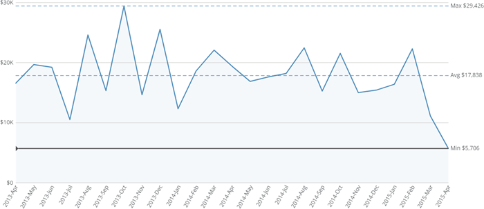
When you select **Maximum** as the value type for a scale marker, the marker line corresponds to the maximum value in the chart.
#### Maximum
When you select **Maximum** as the value type for a scale marker, the marker line corresponds to the maximum value in the chart.
 #### Average
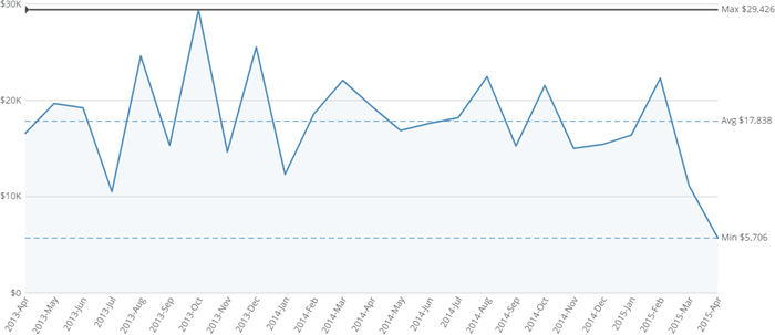
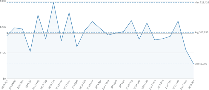
When you select **Average** as the value type for a scale marker, the marker line corresponds to the average value in the chart.
#### Average
When you select **Average** as the value type for a scale marker, the marker line corresponds to the average value in the chart.
 #### Median
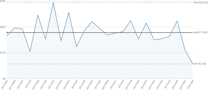
When you select **Median** as the value type for a scale marker, the marker line corresponds to the median value in the chart.
#### Median
When you select **Median** as the value type for a scale marker, the marker line corresponds to the median value in the chart.
 #### Percentile
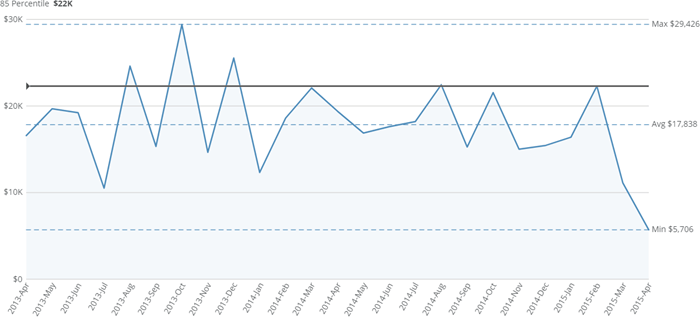
When you select **Percentile** as the value type for a scale marker, the marker line corresponds to a given percentile value, which you specify in the **Percentile Value** field for a line marker and the **Lower Percentile Value** / **Upper Percentile Value** fields for a range marker. In the example below, the percentile value has been set to 85.
#### Percentile
When you select **Percentile** as the value type for a scale marker, the marker line corresponds to a given percentile value, which you specify in the **Percentile Value** field for a line marker and the **Lower Percentile Value** / **Upper Percentile Value** fields for a range marker. In the example below, the percentile value has been set to 85.
 #### Percentage
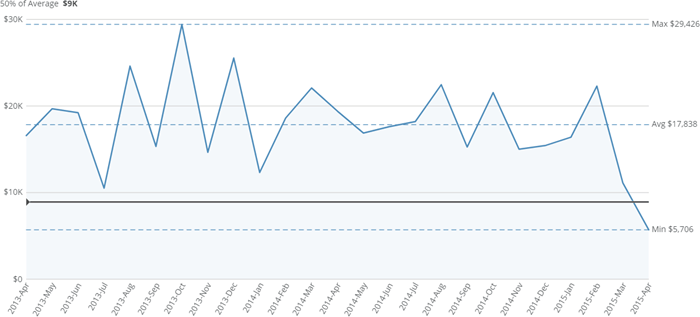
When you select **Percentage** as the value type for a scale marker, you are asked to enter a percentage value (in the **Percentage Value** field for a line marker or the **Lower Percentage Value** / **Upper Percentage** **Value** fields for a range marker) as well as select whether the percentage is derived from the maximum (default), minimum, average, or median value of the chart (in the **Percentage Of** dropdown menu for a line marker or the **Lower Percentage Of** / **Upper Percentage Of** menus for a range marker).
In the example below, the user entered 50 for the **Percentage Value** and selected **Average** in the **Percentage Of** menu, so the chart shows the scale marker on the line corresponding to 50% of the average value of the chart.
#### Percentage
When you select **Percentage** as the value type for a scale marker, you are asked to enter a percentage value (in the **Percentage Value** field for a line marker or the **Lower Percentage Value** / **Upper Percentage** **Value** fields for a range marker) as well as select whether the percentage is derived from the maximum (default), minimum, average, or median value of the chart (in the **Percentage Of** dropdown menu for a line marker or the **Lower Percentage Of** / **Upper Percentage Of** menus for a range marker).
In the example below, the user entered 50 for the **Percentage Value** and selected **Average** in the **Percentage Of** menu, so the chart shows the scale marker on the line corresponding to 50% of the average value of the chart.
 #### Standard deviation
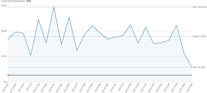
When you select **Standard Deviation** as the value type for a scale marker, you are asked to enter the number of standard deviations from the mean (in the **Standard Deviations** field for a line marker or the **Lower Standard Deviations** / **Upper Standard Deviations** fields for a range marker). If you enter a positive number, your marker appears above the mean; if you enter a negative number, your marker appears below the mean.
In the example below, the user entered -3 in the **Standard Deviations** field, so the marker corresponds to the line 3 standard deviations below the median.
#### Standard deviation
When you select **Standard Deviation** as the value type for a scale marker, you are asked to enter the number of standard deviations from the mean (in the **Standard Deviations** field for a line marker or the **Lower Standard Deviations** / **Upper Standard Deviations** fields for a range marker). If you enter a positive number, your marker appears above the mean; if you enter a negative number, your marker appears below the mean.
In the example below, the user entered -3 in the **Standard Deviations** field, so the marker corresponds to the line 3 standard deviations below the median.
 ### Quantile markers
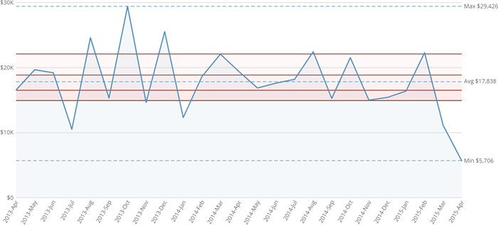
Quantiles divide the area between your chart's minimum and maximum values into regions of equal value, depending on the data in the chart. In the below example, the user has chosen to include 5 quantiles (quintiles). This divides the chart into 5 regions, with the 3 regions closest to average appearing shaded.
### Quantile markers
Quantiles divide the area between your chart's minimum and maximum values into regions of equal value, depending on the data in the chart. In the below example, the user has chosen to include 5 quantiles (quintiles). This divides the chart into 5 regions, with the 3 regions closest to average appearing shaded.
 As with all of the non-default value types for line and range scale markers, quantiles are dynamic and will update when your chart data updates.
To add a basic set of quantiles as scale markers to your chart, you simply go into Chart Properties for your chart and select **Scale Marker > Type** **> Quantiles**. Then choose the desired number of quantiles in the **Number of Quantiles** menu. There are a number of other properties you can use to customize your quantiles, all optional. To learn more about these, see [Available Properties](#h_2e0c9590-db4a-49b8-a8a5-3210ca3ee23b "Adding Scale Markers to Your Chart"), above.
Quantiles are currently available only for single-series bar charts and basic single-series and multiple-series line charts.
As with all of the non-default value types for line and range scale markers, quantiles are dynamic and will update when your chart data updates.
To add a basic set of quantiles as scale markers to your chart, you simply go into Chart Properties for your chart and select **Scale Marker > Type** **> Quantiles**. Then choose the desired number of quantiles in the **Number of Quantiles** menu. There are a number of other properties you can use to customize your quantiles, all optional. To learn more about these, see [Available Properties](#h_2e0c9590-db4a-49b8-a8a5-3210ca3ee23b "Adding Scale Markers to Your Chart"), above.
Quantiles are currently available only for single-series bar charts and basic single-series and multiple-series line charts.