> ## Documentation Index
> Fetch the complete documentation index at: https://domoinc-openapi-sync-dataflows.mintlify.site/llms.txt
> Use this file to discover all available pages before exploring further.

# Country Map

## Intro

In Domo, you can add maps representing data for states, provinces, or prefectures in individual countries.

Country maps only require two data columns or rows from your DataSet:

1. One column or row contains the name (or abbreviation, for certain countries) of the state, province, or prefecture, and the other contains the values for each such region.
2. Values for each region.

These values are represented in your map by varying shades of color, each of which corresponds to a specific range. Ranges are determined automatically based on the distribution of values in your DataSet and are represented by a legend, which is automatically included beside the map.

For information about the value, category, and series data, see [Understanding Chart Data](/s/article/360043428693 "Understanding Chart Data").

<Note>
  **Note:** If a DataSet contains multiple values for the same region, the map will show a single sum of the values. For example, if your DataSet contained three rows for "Georgia," the values for the rows would be combined, and the Georgia region in the map would show the total value. You *cannot* turn off this automatic aggregation in maps.
</Note>

## Powering Country Maps

In **Analyzer**, you choose the columns containing the data for your map.

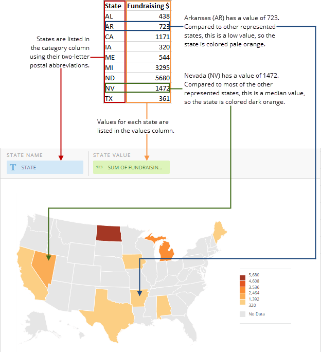
The following graphic shows you how data from a typical column-based spreadsheet is converted into a U.S. map:

<Frame>
  <img alt="" src="https://mintcdn.com/domoinc-openapi-sync-dataflows/9GmyphKXosOtxL2U/images/kb/ka05w00000123yl-00N5w00000Ri7BU-0EM5w000005vWFA.png?fit=max&auto=format&n=9GmyphKXosOtxL2U&q=85&s=e675f8b63bd6a4a167a389827f2edac3" style={{width: 624, height: 684}} width="624" height="684" data-path="images/kb/ka05w00000123yl-00N5w00000Ri7BU-0EM5w000005vWFA.png" />
</Frame>

For more information about choosing data columns, see [Applying DataSet Columns to Your Chart](/s/article/360043428713 "Applying DataSet Columns to Your Chart").

## Customizing Country Maps

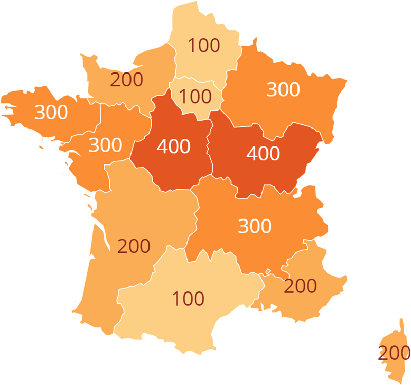
You can customize the appearance of a country map by editing its **Chart Properties**. The table below describes customization options. You can click a thumbnail image to see a larger image.

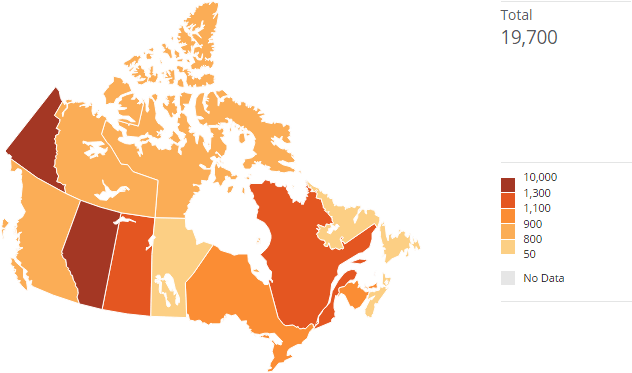
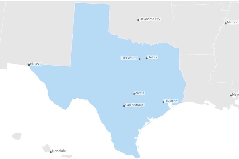
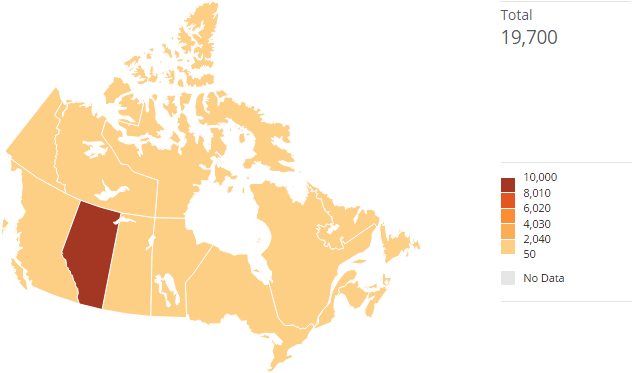
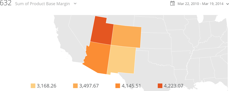
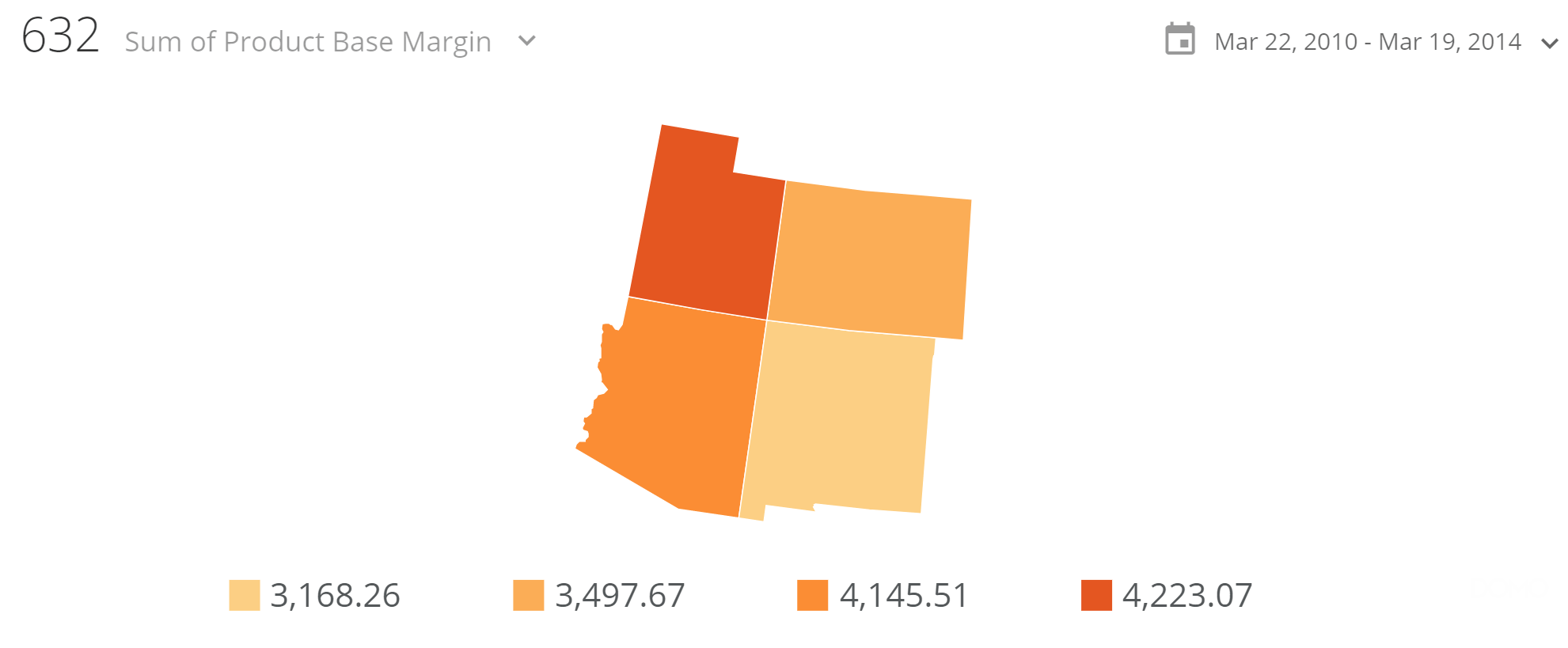
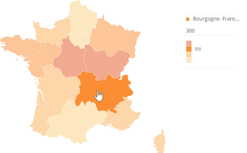
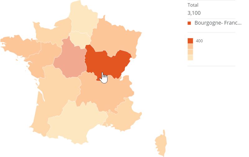
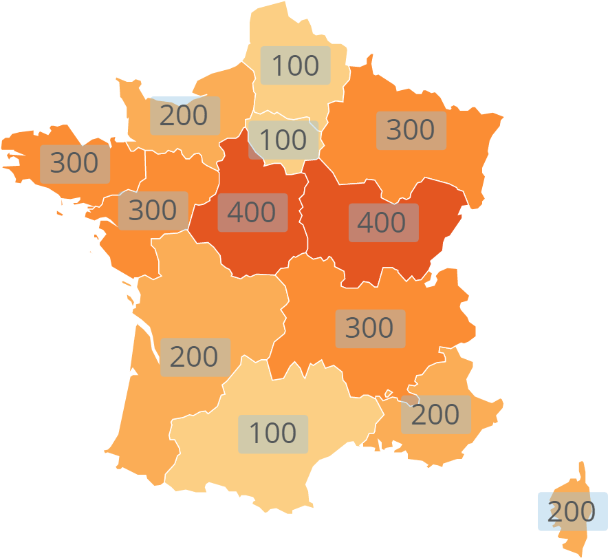
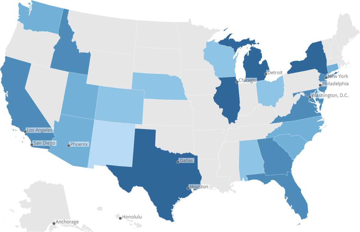
<table border="1" cellpadding="1" cellspacing="1" data-aura-rendered-by="33:202;a"><thead><tr><th colspan="1" rowspan="1"><p> Property </p></th><th colspan="1" rowspan="1"><p> Description </p></th><th colspan="1" rowspan="1"><p> Examples </p></th></tr></thead><tbody><tr><td colspan="1" rowspan="1"><p> Theme > Theme </p></td><td colspan="1" rowspan="1"><p> Allows you to change the color theme for the map. For more information about setting colors, see <a href="/s/article/360043429653" target="_self" title="Changing the Default Colors in Your Chart"> Changing the Default Colors in Your Chart </a>. </p></td><td colspan="1" rowspan="1"><p> — </p></td></tr><tr><td colspan="1" rowspan="1"><p> General > Balanced Distribution </p></td><td colspan="1" rowspan="1"><p> Adjusts maps to include a balanced number of items within each range. This is helpful in spreading values across each range when your data contains extreme outliers. </p><p> The pair of maps in the screenshots at right how <b> Balanced Distribution </b> works. In these maps, the values of most of the Canadian provinces are in the range of 100 to 1500. The outlier, Alberta, has a value of 10,000. <b> Balanced Distribution </b> has not been turned on in the top map, so a skewed version of the data is shown—Alberta appears dark and all of the other provinces appear light. </p><p> In the bottom map, the user has turned on <b> Balanced Distribution </b>, so Alberta is grouped into the same range as the province with the next highest value. </p></td><td colspan="1" rowspan="1"><p><a target="_blank" title="/@api/deki/files/113/balanced_distribution_off.png"><img alt="" src="https://mintcdn.com/domoinc-openapi-sync-dataflows/D4XP-ZUu0hZKYNDT/images/kb/ka05w00000123lV-00N5w00000Ri7BU-0EM5w000005vP1n.png?fit=max&auto=format&n=D4XP-ZUu0hZKYNDT&q=85&s=df099a8007a5e27fe8537a20ea390b95" width="632" height="373" data-path="images/kb/ka05w00000123lV-00N5w00000Ri7BU-0EM5w000005vP1n.png" /></a></p><p><a target="_blank" title="/@api/deki/files/114/balanced_distribution_on.png"><img alt="" src="https://mintcdn.com/domoinc-openapi-sync-dataflows/D4XP-ZUu0hZKYNDT/images/kb/ka05w00000123lV-00N5w00000Ri7BU-0EM5w000005vP1u.png?fit=max&auto=format&n=D4XP-ZUu0hZKYNDT&q=85&s=e0bc28e083250335bb1c5b2c830f9513" width="632" height="373" data-path="images/kb/ka05w00000123lV-00N5w00000Ri7BU-0EM5w000005vP1u.png" /></a></p></td></tr><tr><td colspan="1" rowspan="1"><p> General > Auto Zoom to Data </p></td><td colspan="1" rowspan="1"><p> Zooms in on the region of your map with data. In the example at right, the only states with data are Utah, Arizona, Colorado, and New Mexico, so the map zooms on them automatically. This option is only applicable if all regions with data are next to each other. For example, if the map at right showed Oregon as having data, the auto-zoom would not work because Oregon is not adjacent to any of the other states with data. </p></td><td colspan="1" rowspan="1"><p><a target="_blank" title="/@api/deki/files/5247/map_auto_zoom_to_data.png"><img alt="map_auto_zoom_to_data.png" src="https://mintcdn.com/domoinc-openapi-sync-dataflows/D4XP-ZUu0hZKYNDT/images/kb/ka05w00000123lV-00N5w00000Ri7BU-0EM5w000005vP28.png?fit=max&auto=format&n=D4XP-ZUu0hZKYNDT&q=85&s=7999e8b835b7c9ffa8f769f7551a889e" width="800" height="320" data-path="images/kb/ka05w00000123lV-00N5w00000Ri7BU-0EM5w000005vP28.png" /></a></p></td></tr><tr><td colspan="1" rowspan="1"><p> General> Hide No Data Items </p></td><td colspan="1" rowspan="1"><p> Hides all items in your map without data. In the example at right, the only states with data are Utah, Arizona, Colorado, and New Mexico, so the map hides all other states. Unlike the "Auto Zoom to Data" property, this will work even if there are regions not adjacent to other regions. </p></td><td colspan="1" rowspan="1"><p><a target="_blank" title="/@api/deki/files/5246/map_hide_no_data_items.png"><img alt="map_hide_no_data_items.png" src="https://mintcdn.com/domoinc-openapi-sync-dataflows/D4XP-ZUu0hZKYNDT/images/kb/ka05w00000123lV-00N5w00000Ri7BU-0EM5w000005vP1s.png?fit=max&auto=format&n=D4XP-ZUu0hZKYNDT&q=85&s=e6fbf0d9c9ec0dbf704eb1551bf00535" width="1981" height="819" data-path="images/kb/ka05w00000123lV-00N5w00000Ri7BU-0EM5w000005vP1s.png" /></a></p></td></tr><tr><td colspan="1" rowspan="1"><p> General > Hide Abbreviated Legend </p></td><td colspan="1" rowspan="1"><p> Hides the legend shown at the bottom of maps in some views. </p></td><td colspan="1" rowspan="1"><p> — </p></td></tr><tr><td colspan="1" rowspan="1"><p> General > Override Maximum Value </p></td><td colspan="1" rowspan="1"><p> Lets you specify the maximum value for a map or Heat Map. </p><p> By default, Domo uses the highest value in the DataSet as the maximum value. However, by setting this property you can override this value. </p></td><td colspan="1" rowspan="1"><p> — </p></td></tr><tr><td colspan="1" rowspan="1"><p> Hover Legend > Hide Legend </p></td><td colspan="1" rowspan="1"><p> Hides the legend that normally appears on the right side of a map in the Details view. </p></td><td colspan="1" rowspan="1"><p> — </p></td></tr><tr><td colspan="1" rowspan="1"><p> Hover Legend > Hide Total </p></td><td colspan="1" rowspan="1"><p> Hides the "Total" section of the legend that appears on the right side of a map in the Details view. The example shows a map in which this has been done. </p></td><td colspan="1" rowspan="1"><p><a target="_blank" title="/@api/deki/files/5251/map_data_labels_hide_total.png"><img alt="map_data_labels_hide_total.png" src="https://mintcdn.com/domoinc-openapi-sync-dataflows/D4XP-ZUu0hZKYNDT/images/kb/ka05w00000123lV-00N5w00000Ri7BU-0EM5w000005vP24.png?fit=max&auto=format&n=D4XP-ZUu0hZKYNDT&q=85&s=41749557f65727262304bc844950c7d1" width="800" height="494" data-path="images/kb/ka05w00000123lV-00N5w00000Ri7BU-0EM5w000005vP24.png" /></a></p></td></tr><tr><td colspan="1" rowspan="1"><p> Hover Legend > Hide Values </p></td><td colspan="1" rowspan="1"><p> Hides the value and percent of total value in the legend that appears on the right side of a map in the Details view. The example shows a map in which this has been done. </p></td><td colspan="1" rowspan="1"><p><a target="_blank" title="/@api/deki/files/5252/map_data_labels_hide_values.png"><img alt="map_data_labels_hide_values.png" src="https://mintcdn.com/domoinc-openapi-sync-dataflows/D4XP-ZUu0hZKYNDT/images/kb/ka05w00000123lV-00N5w00000Ri7BU-0EM5w000005vP1x.png?fit=max&auto=format&n=D4XP-ZUu0hZKYNDT&q=85&s=78805cdf16870e8f7b49ca1e90e966ac" width="800" height="504" data-path="images/kb/ka05w00000123lV-00N5w00000Ri7BU-0EM5w000005vP1x.png" /></a></p></td></tr><tr><td colspan="1" rowspan="1"><p> Data Label Settings > Text </p></td><td colspan="1" rowspan="1"><p> Specifies text for the data labels. This property is the "on switch" for data labels—you must specify text for them to appear. </p></td><td colspan="1" rowspan="1"><p> — </p></td></tr><tr><td colspan="1" rowspan="1"><p> Data Label Settings > Font Size </p></td><td colspan="1" rowspan="1"><p> Allows you to increase or decrease the data label font size. The "Default" font size falls between the largest and second-smallest font sizes. For more information, see <a href="/s/article/360042925214" target="_blank" title="Changing the Font Size in Your Chart"> Changing the Font Size in Your Chart </a>. </p></td><td colspan="1" rowspan="1"><p> — </p></td></tr><tr><td colspan="1" rowspan="1"><p> Data Label Settings > Text Color </p></td><td colspan="1" rowspan="1"><p> Lets you determine the text color for your map data labels. If you select "Default," the color will be automatically determined based on the background color. This is shown in the example at right, in which the data labels on darker areas appear white and those on lighter areas appear dark red. </p></td><td colspan="1" rowspan="1"><p><a target="_blank" title="/@api/deki/files/5254/map_data_labels_text_color.png"><img alt="map_data_labels_text_color.png" src="https://mintcdn.com/domoinc-openapi-sync-dataflows/D4XP-ZUu0hZKYNDT/images/kb/ka05w00000123lV-00N5w00000Ri7BU-0EM5w000005vP1o.png?fit=max&auto=format&n=D4XP-ZUu0hZKYNDT&q=85&s=1e13fd5cf9f2969e3b102ec76f87a4ae" width="800" height="749" data-path="images/kb/ka05w00000123lV-00N5w00000Ri7BU-0EM5w000005vP1o.png" /></a></p></td></tr><tr><td colspan="1" rowspan="1"><p> Data Label Settings > Value Abbreviation </p></td><td colspan="1" rowspan="1"><p> Determines whether data label values are abbreviated (the default being 3 significant digits) or not. </p></td><td colspan="1" rowspan="1"><p> — </p></td></tr><tr><td colspan="1" rowspan="1"><p> Data Label Settings > Fill </p></td><td colspan="1" rowspan="1"><p> Lets you add a colored fill to your map data labels. The example at right shows a chart in which a pale blue fill color with 60% transparency has been added. </p></td><td colspan="1" rowspan="1"><p><a target="_blank" title="/@api/deki/files/5253/map_data_labels_fill.png"><img alt="map_data_labels_fill.png" src="https://mintcdn.com/domoinc-openapi-sync-dataflows/U1MglXZKeJZebGlP/images/kb/ka05w00000123lV-00N5w00000Ri7BU-0EM5w000005vP1l.png?fit=max&auto=format&n=U1MglXZKeJZebGlP&q=85&s=37d6316fb84225768a7b15c136c49387" width="884" height="811" data-path="images/kb/ka05w00000123lV-00N5w00000Ri7BU-0EM5w000005vP1l.png" /></a></p></td></tr><tr><td colspan="1" rowspan="1"><p> Data Label Settings > Fill Color </p></td><td colspan="1" rowspan="1"><p> Lets you specify the color for the fill in your map data labels. This property is only available when you check the <b> Fill </b> box. </p></td><td colspan="1" rowspan="1"><p> — </p></td></tr><tr><td colspan="1" rowspan="1"><p> Data Label Settings > Fill Transparency Percent </p></td><td colspan="1" rowspan="1"><p> Lets you specify the fill transparency for map data labels. You can specify any number between 0 and 100, in which 0 is completely opaque and 100 is completely transparent. This property is only available when you check the <b> Fill </b> box. </p></td><td colspan="1" rowspan="1"><p> — </p></td></tr><tr><td colspan="1" rowspan="1"><p> Hover Text > Hover Text </p></td><td colspan="1" rowspan="1"><p> Lets you set the text that appears in map hovers. A variety of macros for showing map values in your hovers is available. For more information and a list of available macros, see <a href="/s/article/360043429693" target="_blank" title="Formatting Data Label and Hover Text in Your Chart"> Formatting Data Label and Hover Text in Your Chart </a>. </p></td><td colspan="1" rowspan="1"><p> — </p></td></tr><tr><td colspan="1" rowspan="1"><p> Hover Text > Always Show Over Map </p></td><td colspan="1" rowspan="1"><p> Specifies whether hover text specified using the <b> Hover Text </b> option is turned on for your chart. </p></td><td colspan="1" rowspan="1"><p> — </p></td></tr><tr><td colspan="1" rowspan="1"><p> Values > Label Format </p></td><td colspan="1" rowspan="1"><p> Determines the general number format for hover text and legend items in maps. </p></td><td colspan="1" rowspan="1"><p> — </p></td></tr><tr><td colspan="1" rowspan="1"><p> Values > Decimal Places </p></td><td colspan="1" rowspan="1"><p> Determines the number of decimal places used in decimal values in hover text and legend items in maps. </p></td><td colspan="1" rowspan="1"><p> — </p></td></tr><tr><td colspan="1" rowspan="1"><p> Values > Negative Numbers </p></td><td colspan="1" rowspan="1"><p> Determines the format for negative numbers in hover text and legend items in maps </p></td><td colspan="1" rowspan="1"><p> — </p></td></tr><tr><td colspan="1" rowspan="1"> Cities > Cities </td><td colspan="1" rowspan="1"><p> Shows whether cities and city names are shown on the map. The closer a map is zoomed, the more cities are shown. </p><p> The first example at right shows an "unzoomed" map of the United States. Note that only two cities are shown in Texas. In the second example, the map is zoomed to show only Texas, and many more cities are shown. </p></td><td colspan="1" rowspan="1"><p><a target="_blank" title="/@api/deki/files/5442/country_map_with_cities.png"><img alt="country_map_with_cities.png" src="https://mintcdn.com/domoinc-openapi-sync-dataflows/9GmyphKXosOtxL2U/images/kb/ka05w00000123xT-00N5w00000Ri7BU-0EM5w000005vWF2.png?fit=max&auto=format&n=9GmyphKXosOtxL2U&q=85&s=079f6b0bc96531f43cfa0538e2dc3b32" width="1169" height="754" data-path="images/kb/ka05w00000123xT-00N5w00000Ri7BU-0EM5w000005vWF2.png" /></a></p><p /><p><a target="_blank" title="/@api/deki/files/5441/country_map_with_cities_zoomed.png"><img alt="country_map_with_cities_zoomed.png" src="https://mintcdn.com/domoinc-openapi-sync-dataflows/9GmyphKXosOtxL2U/images/kb/ka05w00000123xT-00N5w00000Ri7BU-0EM5w000005vWEv.png?fit=max&auto=format&n=9GmyphKXosOtxL2U&q=85&s=14b2e8ca5bbcf68208d427ef88df94fb" width="800" height="531" data-path="images/kb/ka05w00000123xT-00N5w00000Ri7BU-0EM5w000005vWEv.png" /></a></p></td></tr></tbody></table>
Properties for all chart types are listed and described in [Chart Properties](/s/topic/0TO5w000000ZaodGAC "Chart Properties").

**Video - Map Charts**

<iframe allowfullscreen="" frameborder="1" height="315" src="//www.youtube-nocookie.com/embed/ahzrs6FI3uk" width="560" />

If you want a map for a country not available in Domo's default map list, you can add it as a custom chart. For more information, see [Custom Charts](/s/article/360042924454 "Custom Charts").

For information about world maps, see [Latitude-Longitude Map](/s/article/360043429213 "World Map").

If you are experiencing issues, see [Troubleshooting.](/s/article/360043427473 "Troubleshooting")

## More Map Options

With both U.S. state maps and latitude-longitude maps in which U.S. cities are represented, you can create "zoomed" drill layers by drilling down to the same map.

For example, if you had a latitude-longitude map showing values per state and you added the same map as a drill layer, clicking any point in the country-level map would bring up a "zoomed in" state or region level that displayed all of the original data points from that state or region.

Results from using this technique vary depending on the map type, your DataSet, and the specific columns you apply.

For more information about adding drill layers to charts, see [Latitude-Longitude Map](/s/article/360043429213 "Adding Drill Path to Your Chart").

## Adding Other Maps to Domo

If you want to install a map for a country not available in Domo, you can download it from any of a number of websites, such as [http://www.amcharts.com/svg-maps/](http://www.amcharts.com/svg-maps/ "http://www.amcharts.com/svg-maps/") and [https://simplemaps.com/resources/svg-maps](https://simplemaps.com/resources/svg-maps "https://simplemaps.com/resources/svg-maps"). These sites also include maps for overseas territories such as French Guiana, Aruba, and so on. Once you have downloaded one of these maps, you can immediately upload it to Domo—there is no need to manipulate the XML (unless you are planning to divide it into subregions). For more information about uploading maps to Domo and building your own custom maps, see [Custom Charts](/s/article/360042924454 "Custom Charts").