> ## Documentation Index
> Fetch the complete documentation index at: https://domoinc-openapi-sync-dataflows.mintlify.site/llms.txt
> Use this file to discover all available pages before exploring further.

# Properties for Filter Chart Types

## Intro

Find out about chart properties available for charts in the "Filter" category in Chart Picker.

## Properties for Slicer, Checkbox Selector, and Radio Button Selector Cards

The properties in the following table are all for Slicer, Checkbox, and Radio Button Cards and are found in the **General** category in Chart Properties. For more information about Slicer, Checkbox, and Radio Button Cards, see [Slicer, Checkbox Selector, and Radio Button](/s/article/360043429313 "Slicer, Checkbox, and Radio Button Cards") [Selector](/s/article/360043429313 "Slicer, Checkbox, and Radio Button Cards") [Cards](/s/article/360043429313 "Slicer, Checkbox, and Radio Button Cards").

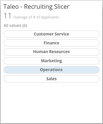
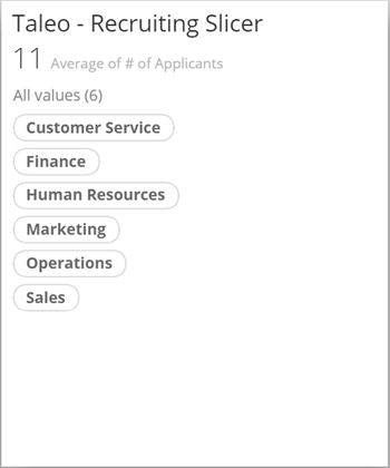
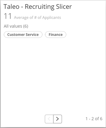
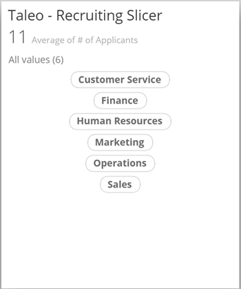
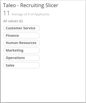
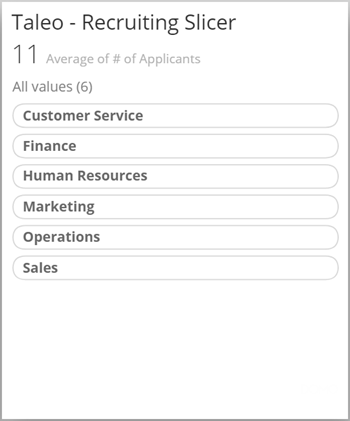
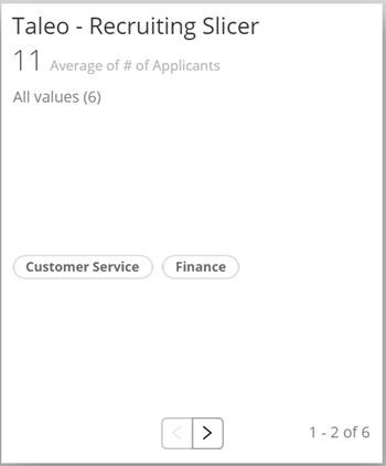
<table class="mt-responsive-table" data-aura-rendered-by="33:202;a"><thead><tr><th colspan="1" rowspan="1"><p> Option </p></th><th class="mt-column-width-40" colspan="1" rowspan="1"><p> Description </p></th><th class="mt-column-width-30" colspan="1" rowspan="1"><p> Examples </p></th></tr></thead><tbody><tr><td colspan="1" rowspan="1"> General > Show Search </td><td class="mt-column-width-40" colspan="1" rowspan="1"> Determines when a search bar is displayed for Slicer, Checkbox, and Radio Button Cards. When the default option, <b> Auto </b>, is selected, a search bar appears anytime there are more filter items than will fit in the Card view. If you select <b> Always </b>, the search bar always appears, no matter how many filter items there are. If you select <b> Never </b>, the search bar never appears. </td><td class="mt-column-width-30 mt-align-center" colspan="1" rowspan="1"> — </td></tr><tr><td colspan="1" rowspan="1"><p> General > Font Size </p></td><td class="mt-column-width-40" colspan="1" rowspan="1"><p> Lets you increase of decrease the font size for the filters in your Slicer, Checkbox, or Radio Button Card. </p></td><td class="mt-column-width-30" colspan="1" rowspan="1"><p class="mt-align-center"> — </p></td></tr><tr><td colspan="1" rowspan="1"><p> General > Unsorted Data </p></td><td class="mt-column-width-40" colspan="1" rowspan="1"><p> Lets you determine whether the filters in your Slicer, Checkbox, or Radio Button Card are sorted alphabetically (default) or if the order is determined based on the order in your DataSet. </p></td><td class="mt-column-width-30" colspan="1" rowspan="1"><p class="mt-align-center"> — </p></td></tr><tr><td colspan="1" rowspan="1"><p> General > Number of Columns (Checkbox and Radio Button Cards only) </p></td><td class="mt-column-width-40" colspan="1" rowspan="1"><p> Lets you specify the number of filter columns in your Checkbox or Radio Button Card. Note that this option requires the <b> Use Paging </b> option to be selected. </p></td><td class="mt-column-width-30" colspan="1" rowspan="1"><p class="mt-align-center"> — </p></td></tr><tr><td colspan="1" rowspan="1"><p> General > Single Column (Slicer Card only) </p></td><td class="mt-column-width-40" colspan="1" rowspan="1"><p> Determines whether the filters in your Slicer Card are displayed in a single column. By default the filters are left-aligned unless you choose to center them using the <b> Center Horizontally </b> option. They are also fitted to their individual "bubbles" unless you choose the <b> Equal Width Items </b> option. </p><p> The screenshot at right shows a Slicer Card in which this option is being used. </p></td><td class="mt-column-width-30" colspan="1" rowspan="1"><p><img alt="slicer_card_single_column.png" src="https://mintcdn.com/domoinc-openapi-sync-dataflows/9GmyphKXosOtxL2U/images/kb/ka05w00000123xY-00N5w00000Ri7BU-0EM5w000005vWKR.jpg?fit=max&auto=format&n=9GmyphKXosOtxL2U&q=85&s=f1e97f2218f9fa5022a6dc43ae2e2545" width="350" height="420" data-path="images/kb/ka05w00000123xY-00N5w00000Ri7BU-0EM5w000005vWKR.jpg" /></p></td></tr><tr><td colspan="1" rowspan="1"><p> General > Single Row </p></td><td class="mt-column-width-40" colspan="1" rowspan="1"><p> Determines whether the filters in your Slicer, Checkbox, or Radio Button Card are displayed in a row instead of a column. By default the filters appear at the top of the Card unless you choose to center them using the <b> Center Vertically </b> option. </p><p> The screenshot at right shows a Slicer Card in which this option is being used (with a pagination control to view filters that don't fit in the Card). </p></td><td class="mt-column-width-30" colspan="1" rowspan="1"><p><img alt="slicer_card_single_row.png" src="https://mintcdn.com/domoinc-openapi-sync-dataflows/9GmyphKXosOtxL2U/images/kb/ka05w00000123xY-00N5w00000Ri7BU-0EM5w000005vWKq.jpg?fit=max&auto=format&n=9GmyphKXosOtxL2U&q=85&s=3a311f891c23fd0545ac4e30e41b5559" width="350" height="423" data-path="images/kb/ka05w00000123xY-00N5w00000Ri7BU-0EM5w000005vWKq.jpg" /></p></td></tr><tr><td colspan="1" rowspan="1"><p> General > Center Horizontally (Slicer Card only) </p></td><td class="mt-column-width-40" colspan="1" rowspan="1"><p> Determines whether the filters in your Slicer Card are centered horizontally on the Card. This option is available only when you check the box for <b> Single Column </b>. </p><p> The screenshot at right shows a Slicer Card in which this option has been set. </p></td><td class="mt-column-width-30" colspan="1" rowspan="1"><p><img alt="slicer_card_center_horizontal.png" src="https://mintcdn.com/domoinc-openapi-sync-dataflows/9GmyphKXosOtxL2U/images/kb/ka05w00000123xY-00N5w00000Ri7BU-0EM5w000005vWKW.jpg?fit=max&auto=format&n=9GmyphKXosOtxL2U&q=85&s=c4a02522639a597ba099a2efee271620" width="350" height="419" data-path="images/kb/ka05w00000123xY-00N5w00000Ri7BU-0EM5w000005vWKW.jpg" /></p></td></tr><tr><td colspan="1" rowspan="1"><p> General > Equal Width Items (Slicer Card only) </p></td><td class="mt-column-width-40" colspan="1" rowspan="1"><p> Determines whether the "bubbles" for filters in a Slicer Card are the same width; otherwise they are fitted to the width of the filters. This option is available only when you check the box for <b> Single Column </b>. </p><p> The screenshot at right shows a Slicer Card in which this option has been set. </p></td><td class="mt-column-width-30" colspan="1" rowspan="1"><p><img alt="slicer_card_equal_width.png" src="https://mintcdn.com/domoinc-openapi-sync-dataflows/9GmyphKXosOtxL2U/images/kb/ka05w00000123xY-00N5w00000Ri7BU-0EM5w000005vWKb.jpg?fit=max&auto=format&n=9GmyphKXosOtxL2U&q=85&s=4848ba5268e1b672b13aa85cafbb6a25" width="350" height="421" data-path="images/kb/ka05w00000123xY-00N5w00000Ri7BU-0EM5w000005vWKb.jpg" /></p></td></tr><tr><td colspan="1" rowspan="1"><p> General > Fill Width (Slicer Card only) </p></td><td class="mt-column-width-40" colspan="1" rowspan="1"><p> Determines whether the "bubbles" for filters in a Slicer Card fill the entire width of the Card. This option is available only when you check the box for <b> Single Column </b>. </p><p> The screenshot at right shows a Slicer Card in which this option has been set. </p></td><td class="mt-column-width-30" colspan="1" rowspan="1"><p><img alt="slicer_card_fill_width.png" src="https://mintcdn.com/domoinc-openapi-sync-dataflows/9GmyphKXosOtxL2U/images/kb/ka05w00000123xY-00N5w00000Ri7BU-0EM5w000005vWKl.jpg?fit=max&auto=format&n=9GmyphKXosOtxL2U&q=85&s=ccf1537d8a903d5080b8393e1086fe52" width="350" height="421" data-path="images/kb/ka05w00000123xY-00N5w00000Ri7BU-0EM5w000005vWKl.jpg" /></p></td></tr><tr><td colspan="1" rowspan="1"><p> General > Center Text (Slicer Card only) </p></td><td class="mt-column-width-40" colspan="1" rowspan="1"><p> Centers the text within each "bubble" in a Slicer Card. This option is available only when you check the box for <b> Single Column </b>. </p><p> The screenshot at right shows a Slicer Card in which this option has been set (along with <b> Fill Width </b> ). </p></td><td class="mt-column-width-30" colspan="1" rowspan="1"><p><img alt="slicer_card_center_text.png" src="https://mintcdn.com/domoinc-openapi-sync-dataflows/9GmyphKXosOtxL2U/images/kb/ka05w00000123xY-00N5w00000Ri7BU-0EM5w000005vWIW.jpg?fit=max&auto=format&n=9GmyphKXosOtxL2U&q=85&s=32b577db5207ebfab3207cb98e789e40" width="350" height="421" data-path="images/kb/ka05w00000123xY-00N5w00000Ri7BU-0EM5w000005vWIW.jpg" /></p></td></tr><tr><td colspan="1" rowspan="1"><p> General > Center Vertically </p></td><td class="mt-column-width-40" colspan="1" rowspan="1"><p> Determines whether the filters in your Slicer, Checkbox, or Radio Button Card are centered vertically on the Card. This option is available only when you check the box for <b><b> Single Row </b></b>. </p><p> The screenshot at right shows a Slicer Card in which this option has been set. </p></td><td class="mt-column-width-30" colspan="1" rowspan="1"><p><img alt="slicer_card_center_vertical.png" src="https://mintcdn.com/domoinc-openapi-sync-dataflows/9GmyphKXosOtxL2U/images/kb/ka05w00000123xY-00N5w00000Ri7BU-0EM5w000005vWKv.jpg?fit=max&auto=format&n=9GmyphKXosOtxL2U&q=85&s=d00a0afade5f1e6fdda0208adac692fe" style={{width: 142, height: 171}} width="350" height="422" data-path="images/kb/ka05w00000123xY-00N5w00000Ri7BU-0EM5w000005vWKv.jpg" /></p></td></tr><tr><td colspan="1" rowspan="1"><p> General > Selected Color </p></td><td class="mt-column-width-40" colspan="1" rowspan="1"><p> Determines the color of the filter bubbles in a Slicer, Checkbox, or Radio Button Card when someone mouses over them. </p></td><td class="mt-column-width-30" colspan="1" rowspan="1"><p> — </p></td></tr></tbody></table>
## Properties for Range Cards

The properties in the following table are all for Range Cards and are found in the **General** category in Chart Properties. For more information about Range Cards, see [Range Selector Card](/s/article/360042924954 "Range Card").

<table class="mt-responsive-table" data-aura-rendered-by="33:202;a"><thead><tr><th colspan="1" rowspan="1"><p> Option </p></th><th colspan="1" rowspan="1"><p> Description </p></th><th colspan="1" rowspan="1"><p> Example </p></th></tr></thead><tbody><tr><td colspan="1" rowspan="1"><p> General > Date Output Format </p></td><td colspan="1" rowspan="1"><p> Lets you change the date format used in your Range Card slider if you have applied date columns in your <b><b> Minimum </b></b> and <b><b> Maximum </b></b> fields. For example, if you entered MMMM dd, yyyy in this field, dates would appear in the format shown in the example at right. For a list of macros you can use for formatting dates, see <a href="/s/article/360043429633" target="_self" title="Changing the Date Format in Your Chart"> Changing the Date Format in Your Chart </a>. </p></td><td colspan="1" rowspan="1"><p><a href="https://domohelp.domo.com/@api/deki/files/5937/range_card_date_output_format.png" target="_blank" title="/@api/deki/files/5937/range_card_date_output_format.png"><img alt="range_card_date_output_format.png" src="https://mintcdn.com/domoinc-openapi-sync-dataflows/2K-MJunolF8arvf9/images/kb/ka0Vq00000017sH-00N5w00000Ri7BU-0EM5w000005vP0U.png?fit=max&auto=format&n=2K-MJunolF8arvf9&q=85&s=f66785557fc6fc72ad1ca4b8f7b9f4b0" width="600" height="246" data-path="images/kb/ka0Vq00000017sH-00N5w00000Ri7BU-0EM5w000005vP0U.png" /></a></p></td></tr></tbody></table>

## Properties for Date Selector Cards

The properties in the following table are all for Date Selector Cards and are found in the **General** category in Chart Properties. For more information about Date Selector Cards, see [Date Selector Card](/s/article/360042924474 "Date Selector Card").

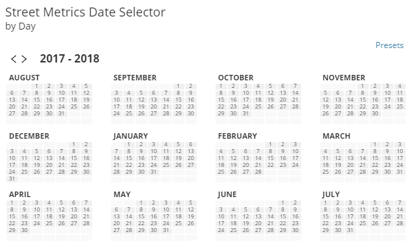
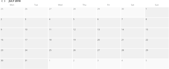
<table class="mt-responsive-table" data-aura-rendered-by="33:202;a"><thead><tr><th class="mt-column-width-15" colspan="1" rowspan="1"><p> Option </p></th><th class="mt-column-width-35" colspan="1" rowspan="1"><p> Description </p></th><th class="mt-column-width-20" colspan="1" rowspan="1"><p> Examples </p></th></tr></thead><tbody><tr><td class="mt-column-width-15" colspan="1" rowspan="1"><p> General > Selected Color </p></td><td class="mt-column-width-35" colspan="1" rowspan="1"><p> Lets you change the highlight color used when you select a range of calendar dates in the Card. </p></td><td class="mt-column-width-20" colspan="1" rowspan="1"><p class="mt-align-center"><a href="https://domohelp.domo.com/@api/deki/files/5789/date_selector_selection_color.png" target="_blank" title="@api/deki/files/5789/date_selector_selection_color.png"><img alt="date_selector_selection_color.png" src="https://mintcdn.com/domoinc-openapi-sync-dataflows/2K-MJunolF8arvf9/images/kb/ka0Vq00000017sH-00N5w00000Ri7BU-0EM5w000005vP0S.png?fit=max&auto=format&n=2K-MJunolF8arvf9&q=85&s=515b771a6f9da3a74de951dc6abc024b" width="605" height="363" data-path="images/kb/ka0Vq00000017sH-00N5w00000Ri7BU-0EM5w000005vP0S.png" /></a></p></td></tr><tr><td class="mt-column-width-15" colspan="1" rowspan="1"><p> General > Highlight Today </p></td><td class="mt-column-width-35" colspan="1" rowspan="1"><p> When checked, a box appears around today's date in the calendar. In the example at right, the date of "July 25" is highlighted. </p></td><td class="mt-column-width-20" colspan="1" rowspan="1"><p><a href="https://domohelp.domo.com/@api/deki/files/5790/date_selector_highlighted_today.png" target="_blank" title="@api/deki/files/5790/date_selector_highlighted_today.png"><img alt="date_selector_highlighted_today.png" src="https://mintcdn.com/domoinc-openapi-sync-dataflows/2K-MJunolF8arvf9/images/kb/ka0Vq00000017sH-00N5w00000Ri7BU-0EM5w000005vP0Z.png?fit=max&auto=format&n=2K-MJunolF8arvf9&q=85&s=05337dc789d346bfcf8cb9e04e8ef331" width="606" height="363" data-path="images/kb/ka0Vq00000017sH-00N5w00000Ri7BU-0EM5w000005vP0Z.png" /></a></p></td></tr><tr><td class="mt-column-width-15" colspan="1" rowspan="1"><p> General > View </p></td><td class="mt-column-width-35" colspan="1" rowspan="1"><p> Determines the calendar view that is used. The following options are available: </p><ul><li><p><b> Auto </b> (Default). The view is determined automatically based on your data. For example, if you had at least a year's worth of data in your date column, a yearly view would be used. </p></li><li><p><b> Last Year Rolling </b>. The calendar shows dates from a year ago up until the current month. This is the option shown in the example at right. </p></li><li><p><b> Next Year Rolling </b>. The calendar shows dates from the current month up until a year from now. </p></li><li><p><b> Year </b>. The current year is shown. </p></li><li><p><b> Month </b>. The current month is shown. </p></li></ul></td><td class="mt-column-width-20" colspan="1" rowspan="1"><p><img alt="date_selector_rolling_year.png" src="https://mintcdn.com/domoinc-openapi-sync-dataflows/2K-MJunolF8arvf9/images/kb/ka0Vq00000017sH-00N5w00000Ri7BU-0EM5w000005vP0Y.png?fit=max&auto=format&n=2K-MJunolF8arvf9&q=85&s=43957e908c304d29e4ab6d0d09ea6959" width="605" height="351" data-path="images/kb/ka0Vq00000017sH-00N5w00000Ri7BU-0EM5w000005vP0Y.png" /></p></td></tr><tr><td class="mt-column-width-15" colspan="1" rowspan="1"><p> General > Dates From </p></td><td class="mt-column-width-35" colspan="1" rowspan="1"><p> Specifies whether the dates that appear in the calendar are based on the current date, are automatically determined based on your data, or are user-specified (in which case, you will enter the date parameters in the <b> Year </b>, <b> Selected Year </b>, and <b> Month </b> fields. </p></td><td class="mt-column-width-20" colspan="1" rowspan="1"><p> — </p></td></tr><tr><td class="mt-column-width-15" colspan="1" rowspan="1"><p> General > Year </p></td><td class="mt-column-width-35" colspan="1" rowspan="1"><p> Determines whether the year shown in the calendar is the current year, the previous year, or the next year. You can also specify a year by selecting <b> Specified </b> and entering the desired year in the <b> Selected Year </b> field. This option is only available when <b> Dates From </b> is set to <b> User Specified </b>. </p></td><td class="mt-column-width-20" colspan="1" rowspan="1"><p> — </p></td></tr><tr><td class="mt-column-width-15" colspan="1" rowspan="1"><p> General > Selected Year </p></td><td class="mt-column-width-35" colspan="1" rowspan="1"><p> Lets you enter a specific year to be shown in the calendar. This option is only available when <b> Dates From </b> is set to <b> User Specified </b> and <b> Year </b> is set to <b> Specified </b>. </p></td><td class="mt-column-width-20" colspan="1" rowspan="1"><p> — </p></td></tr><tr><td class="mt-column-width-15" colspan="1" rowspan="1"><p> General > Month </p></td><td class="mt-column-width-35" colspan="1" rowspan="1"><p> Lets you enter a specific month to be shown in the calendar. This option is only available when <b> Dates From </b> is set to <b> User Specified </b> and <b> View </b> is set to <b> Month </b>. </p></td><td class="mt-column-width-20" colspan="1" rowspan="1"><p> — </p></td></tr><tr><td class="mt-column-width-15" colspan="1" rowspan="1"><p> General > First Day of Week </p></td><td class="mt-column-width-35" colspan="1" rowspan="1"><p> Lets you select the first day of the week to be shown in your calendar. In the example at right, the first day of the week is Monday. </p></td><td class="mt-column-width-20" colspan="1" rowspan="1"><p><img alt="date_selector_first_day_of_week.png" src="https://mintcdn.com/domoinc-openapi-sync-dataflows/2K-MJunolF8arvf9/images/kb/ka0Vq00000017sH-00N5w00000Ri7BU-0EM5w000005vP0P.png?fit=max&auto=format&n=2K-MJunolF8arvf9&q=85&s=5da3d907c65cdf92b52bd3b819744ecf" width="550" height="226" data-path="images/kb/ka0Vq00000017sH-00N5w00000Ri7BU-0EM5w000005vP0P.png" /></p></td></tr><tr><td class="mt-column-width-15" colspan="1" rowspan="1"> General > First Month Displayed </td><td class="mt-column-width-35" colspan="1" rowspan="1"> Lets you select the first month of the year to be shown in your calendar. This option is only available when <b> Year </b> is selected in the <b> View </b> menu. </td><td class="mt-column-width-20" colspan="1" rowspan="1"> — </td></tr></tbody></table>